

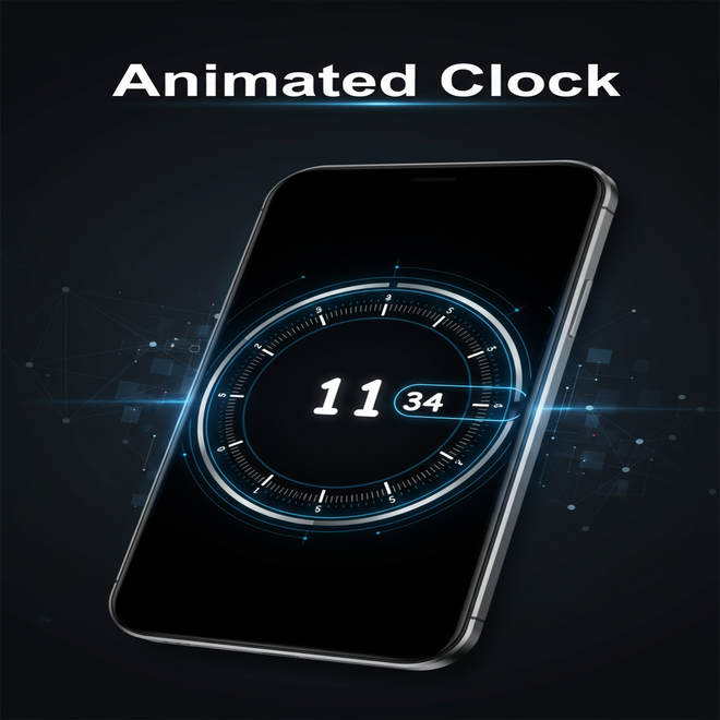
In this easy guide you will learn how to make a stylish 3D digital clock using HTML, CSS and JavaScript.The clock shows hours, minutes, and seconds on different sides of a cube with smooth animations and a dark background.You will use a digital font, 3D effects and simple code to create a modern and eye-catching design.Full code is included so you can build it step by step.
Overview
This project I will be building a unique animated 3D clock using just HTML, CSS and JavaScript.The goal is to keep everything simple and beginner-friendly, so you can follow along even if you are still learning the basics.I will explain it in parts from HTML to styling with CSS then adding live time updates with JavaScript.
At the end you will see a digital clock with an amazing vissually that you can preview using the “View Demo” button and download with the “Download Source Code” button to try it out yourself or customize it further.
3D Digital Clock Features
1. Custom Digital Font
Uses the ‘Digital-7’ font to give the clock a classic digital display look.
2. Real-Time Updates
JavaScript updates the hour, minute, and second values every second using setTimeout.
3. 3D Cube Design
HTML and CSS create a rotating 3D cube with each face showing a different time unit (hour, minute, second).
4. Smooth Animations
CSS transitions and transforms provide smooth rotation effects when the user hovers over the clock.
5. Dark Mode Theme
The entire design features a dark background with glowing digital numbers for a modern appearance.
6. Color Transition Animation
Digits animate between blue and red using keyframes to give a dynamic and pulsing effect.
7. Responsive Centering
The clock is centered on the page using absolute positioning and transform for consistent layout on all screens.
8. Lightweight and JS
Built with no external libraries just pure HTML, CSS and JavaScript for easy customization.
Requirements
I- Basic Knowledge of Web Languages
HTML: For structuring the clock elements (hour, minute and second).
CSS: For styling, 3D transforms and animations.
JavaScript: For updating the clock in real-time.
II- Code Editor
Any text editor downloaded and using like VS Code, Sublime Text or Notepad++.
III- Modern Web Browser
A browser that supports CSS 3D transforms and JavaScript like (Chrome, Firefox, Microsoft Edge or Safari).
IV- File Structure
A single HTML file (or optionally separate CSS/JS files).
V- No External Libraries Needed
This project is built entirely with HTML, CSS and JavaScript.No frameworks or libraries required.
HTML Structure
<html>
  <head>
  <!--Coded by codeweave24-->
    <title> 3D clock</title>
    <link rel="stylesheet" href="style.css" />
  </head>
  <body>
    <figure>
      <div class="face top"><p id="s"></p></div>
      <div class="face front"><p id="m"></p></div>
      <div class="face left"><p id="h"></p></div>
    </figure>
    <script src="main.js"></script>
  </body>
</html>
Explanation
<title>: Sets the name of the page that appears in a browser tab.
<link>: Connect CSS file(style.css) to add styles.
<figure>: Is a container that holds the 3D cube faces.
<div class=”face top”>, <div class=”face front”>, <div class=”face left”>: these divs represent sides of the cube (top, front and left).
<p id=”s”>, <p id=”m”>, <p id=”h”>: These are placeholders that tell or shown where the second, minute and hours will appear.

CSS with Styling
      @font-face {
        font-family: 'Digital-7';
        src: url('https://s3-us-west-2.amazonaws.com/s.cdpn.io/184191/Digital-7.eot?#iefix')
            format('embedded-opentype'),
          url('https://s3-us-west-2.amazonaws.com/s.cdpn.io/184191/Digital-7.woff')
            format('woff'),
          url('https://s3-us-west-2.amazonaws.com/s.cdpn.io/184191/Digital-7.ttf')
            format('truetype'),
          url('https://s3-us-west-2.amazonaws.com/s.cdpn.io/184191/Digital-7.svg#Digital-7')
            format('svg');
        font-weight: normal;
        font-style: normal;
      }
      ::selection {
        background: #333;
      }
      ::-moz-selection {
        background: #111;
      }
      *,
      html {
        margin: 0;
      }
      body {
        background: #000;
      }
      figure {
        width: 210px;
        height: 210px;
        position: absolute;
        top: 50%;
        left: 50%;
        margin-top: -105px;
        margin-left: -105px;
        transform-style: preserve-3d;
        -webkit-transform-style: preserve-3d;
        -webkit-transform: rotateX(-35deg) rotateY(45deg);
        transform: rotateX(-35deg) rotateY(45deg);
        transition: 2s;
      }
      figure:hover {
        -webkit-transform: rotateX(-50deg) rotateY(45deg);
        transform: rotateX(-50deg) rotateY(45deg);
      }
      .face {
        width: 100%;
        height: 100%;
        position: absolute;
        -webkit-transform-origin: center;
        transform-origin: center;
        background: #000;
        text-align: center;
      }
      p {
        font-size: 180px;
        font-family: 'Digital-7';
        margin-top: 20px;
        color: #2982ff;
        text-shadow: 0px 0px 5px #000;
        -webkit-animation: color 10s infinite;
        animation: color 10s infinite;
        line-height: 180px;
      }
      .front {
        -webkit-transform: translate3d(0, 0, 105px);
        transform: translate3d(0, 0, 105px);
        background: #111;
      }
      .left {
        -webkit-transform: rotateY(-90deg) translate3d(0, 0, 105px);
        transform: rotateY(-90deg) translate3d(0, 0, 105px);
        background: #151515;
      }
      .top {
        -webkit-transform: rotateX(90deg) translate3d(0, 0, 105px);
        transform: rotateX(90deg) translate3d(0, 0, 105px);
        background: #222;
      }
      @keyframes color {
        0% {
          color: #2982ff;
          text-shadow: 0px 0px 5px #000;
        }
        50% {
          color: #cc4343;
          text-shadow: 0px 0px 5px #ff0000;
        }
      }
      @-webkit-keyframes color {
        0% {
          color: #2982ff;
          text-shadow: 0px 0px 5px #000;
        }
        50% {
          color: #cc4343;
          text-shadow: 0px 0px 5px #ff0000;
        }
      }
Explanation
 @font-face {
        font-family: 'Digital-7';
        src: url('https://s3-us-west-2.amazonaws.com/s.cdpn.io/184191/Digital-7.eot?#iefix')
            format('embedded-opentype'),
          url('https://s3-us-west-2.amazonaws.com/s.cdpn.io/184191/Digital-7.woff')
            format('woff'),
          url('https://s3-us-west-2.amazonaws.com/s.cdpn.io/184191/Digital-7.ttf')
            format('truetype'),
          url('https://s3-us-west-2.amazonaws.com/s.cdpn.io/184191/Digital-7.svg#Digital-7')
            format('svg');
        font-weight: normal;
        font-style: normal;
      }
This loads a font called Digital-7 to give the clock a classic LED display.
      ::selection {
        background: #333;
      }
      ::-moz-selection {
        background: #111;
      }
Changes the background color when text is selected.
The ::moz-selection targets firefox specifically.
 *,
  html {
     margin: 0;
  }
  body {
     background: #000;
 }
Removes default browser spacing.
Sets the page background to black.
      figure {
        width: 210px;
        height: 210px;
        position: absolute;
        top: 50%;
        left: 50%;
        margin-top: -105px;
        margin-left: -105px;
        transform-style: preserve-3d;
        -webkit-transform-style: preserve-3d;
        -webkit-transform: rotateX(-35deg) rotateY(45deg);
        transform: rotateX(-35deg) rotateY(45deg);
        transition: 2s;
      }
      figure:hover {
        -webkit-transform: rotateX(-50deg) rotateY(45deg);
        transform: rotateX(-50deg) rotateY(45deg);
      }
Positioned the cube in the center of the screen.
Applies a 3D transformation to create perspective.
On hover the cube tilts(bend over) more for an interactive effect.
      .face {
        width: 100%;
        height: 100%;
        position: absolute;
        -webkit-transform-origin: center;
        transform-origin: center;
        background: #000;
        text-align: center;
      }
Each face of the cube is the same size as the cube.
Positioned in 3D space with specific styles.
      p {
        font-size: 180px;
        font-family: 'Digital-7';
        margin-top: 20px;
        color: #2982ff;
        text-shadow: 0px 0px 5px #000;
        -webkit-animation: color 10s infinite;
        animation: color 10s infinite;
        line-height: 180px;
      }
Display large digital style numbers.
Text color changes in an animated loop.
Text-shadow gives a glowing effect.
      .front {
        -webkit-transform: translate3d(0, 0, 105px);
        transform: translate3d(0, 0, 105px);
        background: #111;
      }
      .left {
        -webkit-transform: rotateY(-90deg) translate3d(0, 0, 105px);
        transform: rotateY(-90deg) translate3d(0, 0, 105px);
        background: #151515;
      }
      .top {
        -webkit-transform: rotateX(90deg) translate3d(0, 0, 105px);
        transform: rotateX(90deg) translate3d(0, 0, 105px);
        background: #222;
      }
Positioned each face in 3D:
.Front: Shows minutes
.Top: Shows seconds
.Left: Shows hour
Each face has a slightly different background shade for depth.
      @keyframes color {
        0% {
          color: #2982ff;
          text-shadow: 0px 0px 5px #000;
        }
        50% {
          color: #cc4343;
          text-shadow: 0px 0px 5px #ff0000;
        }
      }
Changes the text color from blue to red and back in a smooth cycle every 10 seconds.
Gives a dynamic, glowing look to the clock.
JS with Functionality
       function date_time(id) {
        date = new Date()
        h = date.getHours()
        if (h < 10) {
          h = '0' + h
        }
        m = date.getMinutes()
        if (m < 10) {
          m = '0' + m
        }
        s = date.getSeconds()
        if (s < 10) {
          s = '0' + s
        }
        document.getElementById('s').innerHTML = " + s
        document.getElementById('m').innerHTML = " + m
        document.getElementById('h').innerHTML = " + h
        setTimeout('date_time("' + 's' + '");', '1000')
        return true
      }
      window.onload = date_time('s')
Explanation
function date_time(id) {
  date = new Date();
  h = date.getHours();
  if (h < 10) {
    h = '0' + h;
  }

  m = date.getMinutes();
  if (m < 10) {
    m = '0' + m;
  }

  s = date.getSeconds();
  if (s < 10) {
    s = '0' + s;
  }
date = new Date(); Get current date and time.
h = date.getHours(); Get hours.
if (h < 10) {
h = ‘0’ + h; }: Add 0 if hour less than 10 e.g(09).
m = date.getMinutes(); Get minutes (0–59).
if (m < 10) {
m = ‘0’ + m;}: Add 0 if minute less than 10.
s = date.getSeconds(); Get seconds (0–59).
if (s < 10) {
s = ‘0’ + s;}: Add 0 if second less than 10.
 document.getElementById('s').innerHTML = '' + s
 document.getElementById('m').innerHTML = '' + m
 document.getElementById('h').innerHTML = '' + h
Update HTML content of each face with current time.
 setTimeout('date_time("' + 's' + '");', '1000')
        return true
}
Call this function every 1 second.
window.onload = date_time('s')Start the clock when the page loads.
Output


Conclusion
Now you built a working animated 3D digital clock using only HTML, CSS and JavaScript.
It does not just show the time, it looks cool too. With glowing numbers,smooth color changes and a rotating cube design. Along the way you have learned how to style with CSS,work with 3D effects and use JavaScript to update the time every second.
This project is a great way to practice and improve your web development skills. You can use it on your personal website or just as a fun experiment.
Feel free to make it try adding the date,switching up the colors or making it even more interactive.
Keep building,keep learning and enjoy the process.
Happy coding.
Codeweave24.