
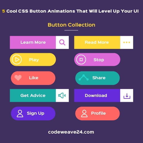
Learn 5 amazing CSS button animations to improve your website’s user experience. Step-by-step code examples for slide fills, bounce effects, 3D buttons, icon reveals, and ripple effects. Perfect for web developers.
Introduction
Each element on your website is important in today’s very competitive web environment. More importantly however, each button on your website has a much larger purpose than simply being something a visitor clicks. Your buttons guide users through your site, they encourage action from users (and therefore lead to conversions), and when done well, they contribute to creating engaging experiences for your visitors.
While a basic button will do, an animated button is where real engagement comes into play, creating memorable experiences that will keep your visitors interested in your website longer. The best part is; you do not need to have extensive knowledge of coding and/or use advanced JavaScript libraries to add animation to your buttons. Using pure CSS, you can animate your buttons to look like they were created by a pro, with smooth, professional animation, across all modern browsers.
In this article you will learn about 5 easy to implement, functional CSS button animations that will dramatically improve your website’s user experience immediately. In addition to learning how to apply them, I will provide you with ready to use examples and explanations for each one.
Why Button Animations Matter
First, let’s examine how using button animations is an investment of time to improve your web design experience for your users:
- A Better Experience: Users know that their clicks have been recorded with an animation.
- More User Involvement: The movement of the element will always attract a user’s attention.
- Easier Use: A visual cue guides the user through your webpage.
- Up-to-Date Design: A subtle animation gives the impression of a modern and professional website.
Now, let’s go over these five button animations that you can use to create a better user interface.
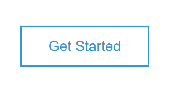
1. The Smooth Slide Fill Effect
This elegant animation features a color that slides across the button when hovered, creating a clean, professional look.
Best For: Call-to-action buttons, feature highlights, and important links.
HTML:
<button class="slide-btn">Get Started</button>CSS:
.slide-btn {
  padding: 12px 30px;
  font-size: 1rem;
  background: transparent;
  color: #3498db;
  border: 2px solid #3498db;
  cursor: pointer;
  position: relative;
  overflow: hidden;
  transition: color 0.4s;
}

.slide-btn::before {
  content: '';
  position: absolute;
  top: 0;
  left: -100%;
  width: 100%;
  height: 100%;
  background: #3498db;
  transition: left 0.4s;
  z-index: -1;
}

.slide-btn:hover {
  color: white;
}

.slide-btn:hover::before {
  left: 0;
}
Output
How It Works: A hidden background element starts outside the button and slides in when hovered, while the text color changes for better contrast.
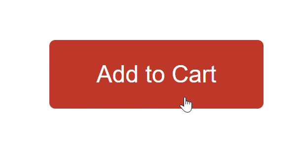
2. The Playful Bounce Animation
Add energy to your interface with this lively bounce effect that feels responsive and engaging.
Best For: “Add to Cart” buttons, download links, and primary actions.
HTML:
<button class="bounce-btn">Add to Cart</button>CSS:
.bounce-btn {
  padding: 14px 32px;
  font-size: 1rem;
  background: #e74c3c;
  color: white;
  border: none;
  border-radius: 4px;
  cursor: pointer;
  transition: background 0.3s;
}

.bounce-btn:hover {
  animation: bounce 0.5s;
  background: #c0392b;
}

@keyframes bounce {
  0%, 100% { transform: scale(1); }
  30% { transform: scale(1.1); }
  50% { transform: scale(0.95); }
  80% { transform: scale(1.05); }
}
Output
How It Works: The button scales slightly larger and smaller in sequence, creating a bouncing sensation that feels tactile and responsive.
3. The Realistic 3D Press Effect
This animation mimics a physical button being pressed, providing satisfying feedback that users love.
Best For: Submit buttons, form actions, and important confirmations.
HTML:
<button class="press-btn">Click Me</button>CSS:
.press-btn {
  padding: 15px 35px;
  font-size: 1.1rem;
  background: #9b59b6;
  color: white;
  border: none;
  border-radius: 6px;
  cursor: pointer;
  box-shadow: 0 6px 0 #8e44ad;
  position: relative;
  top: 0;
  transition: top 0.1s, box-shadow 0.1s;
}

.press-btn:active {
  top: 5px;
  box-shadow: 0 1px 0 #8e44ad;
}
Output
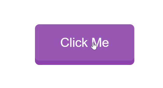
How It Works: When clicked, the button moves downward while its shadow shrinks, creating the illusion of being pressed into the surface.
4. The Sophisticated Icon Reveal
This animation smoothly introduces an icon next to the text, providing visual context for the button’s action.
Best For: “Learn More” links, navigation buttons, and download actions.
HTML:
<button class="icon-btn">
Learn More
<span>→</span>
</button>CSS:
.icon-btn {
  padding: 12px 25px;
  font-size: 1rem;
  background: #2ecc71;
  color: white;
  border: none;
  border-radius: 4px;
  cursor: pointer;
  display: flex;
  align-items: center;
  gap: 8px;
  transition: gap 0.3s;
}

.icon-btn span {
  opacity: 0;
  transition: opacity 0.3s, transform 0.3s;
  transform: translateX(-10px);
}

.icon-btn:hover {
  gap: 15px;
}

.icon-btn:hover span {
  opacity: 1;
  transform: translateX(0);
}
Output
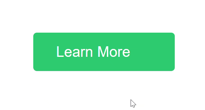
How It Works: The hidden icon gradually becomes visible and moves into position while the space between text and icon increases.
5. The Modern Ripple Effect
Made popular by Material Design, this effect creates water-like ripples that spread from the click point.
Best For: Modern interfaces, mobile apps, and minimalist designs.
HTML:
<button class="ripple-btn">Click Here</button>CSS:
.ripple-btn {
  padding: 14px 28px;
  font-size: 1rem;
  background: #3498db;
  color: white;
  border: none;
  border-radius: 4px;
  cursor: pointer;
  position: relative;
  overflow: hidden;
}

.ripple-effect {
  position: absolute;
  border-radius: 50%;
  background: rgba(255, 255, 255, 0.6);
  transform: scale(0);
  animation: ripple 0.6s linear;
}

@keyframes ripple {
  to {
    transform: scale(4);
    opacity: 0;
  }
}
Javascript
document.querySelectorAll('.ripple-btn').forEach(button => {
  button.addEventListener('click', function(e) {
    const ripple = document.createElement('span');
    ripple.classList.add('ripple-effect');

    const rect = button.getBoundingClientRect();
    const size = Math.max(rect.width, rect.height);
    const x = e.clientX - rect.left - size/2;
    const y = e.clientY - rect.top - size/2;

    ripple.style.width = ripple.style.height = size + 'px';
    ripple.style.left = x + 'px';
    ripple.style.top = y + 'px';

    this.appendChild(ripple);

    setTimeout(() => {
      ripple.remove();
    }, 600);
  });
});
Output
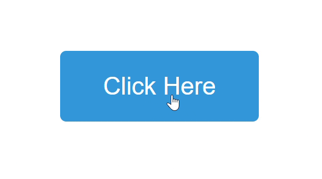
How It Works: JavaScript creates a circular element at the click position that expands and fades out, creating a ripple animation.
Best Practices for Button Animations
To get the most from your animated buttons, follow these guidelines:
Keep It Subtle
Animations should enhance, not distract. Avoid overly dramatic effects that might annoy users.
Ensure Accessibility
Some users prefer reduced motion. Respect their preferences with this code:
@media (prefers-reduced-motion: reduce) {
  * {
    animation-duration: 0.01ms !important;
    animation-iteration-count: 1 !important;
    transition-duration: 0.01ms !important;
  }
}
Maintain Performance
Stick to animating transform and opacity properties for the smoothest performance.
Provide Fallbacks
Ensure buttons remain usable if animations don’t load by maintaining good color contrast and clear labels.
Test Across Devices
Check how animations perform on different devices and browsers to ensure consistent experience.
Conclusion
Using CSS button animations on your site is a simple method to develop a better User Experience (UX) without harming your website’s overall performance. The below 5 examples are a great base of which you may alter to fit your website’s branding.
One of the most important aspects of using animations in general is to make sure they appear to be organic, and serve a purpose. If done well, animations will provide the user with useful feedback as opposed to just visual movement.
You should start by implementing one animation that meets the needs of your website, then test it with live users and add to your animation tool kit when needed. When implemented correctly, button animations can dramatically increase user interaction with your website, and may increase engagement/conversions.
The coding examples provided are ready-to-go, and easily modified. Try out different colors, timing, and effects to find the perfect buttons for your website.