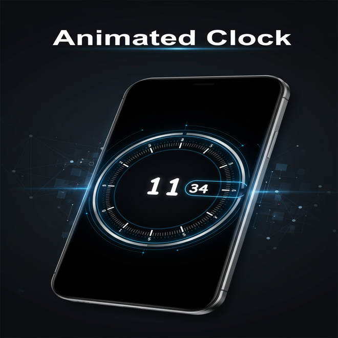
This tutorial will guide you through the process of building an animated clock using HTML, CSS and JavaScript. With a modern interface design, you will learn every step needed to create a fully functional and visually engaging clock. The tutorial includes comprehensive explanations and complete source code to ensure you can follow along effortlessly.
Introduction
Today, we are going to create a very interesting project where we will design and build an animated clock from scratch using HTML, CSS, and JavaScript. We will develop it in a way that is easy for everyone to understand, and the final result will be visually stunning.
At the end of this article, you will be able to see how the clock looks by clicking the “View Demo” button, and you can also download it by clicking the “Download Source Code” button.
Clock Features
We divide the features into two categories: 1) Visual Features and 2) Functionality.
1. Visual Features
- Analog Clock Layout – Circular dial with 60 spikes representing seconds/minutes.
- Digital Hour Display – Large, centered display of the current hour (2-digit format).
- Digital Minute Display – Bold, right-aligned 2-digit minute display with a curved border design extending leftwards.
- Stylized Dials:
- Seconds and minutes represented by rotating tick marks (
spikes). - Hour numbers displayed on every 5th spike (i.e., 12-hour format around the circle).
- Seconds and minutes represented by rotating tick marks (
- Dark Theme UI – Full black background with white foreground and transparent white (
#fff9) tick marks for a minimal, clean aesthetic. - Circular Layout – Clock is perfectly centered on the screen using
position: fixedandmargin: auto.
2. Functionality
- Real-Time Updating – Updates every second using
setInterval. - Smooth Rotation – Seconds and minutes rotate smoothly with CSS transitions.
- Stops Animation at 0 – Removes transition animation when the seconds or minutes are at
0to reset instantly (prevents jump). - Hour Formatting – Always displayed in two digits using
padStart(2, '0').
Requirements
To write and test the Codeweave24 Clock (HTML, CSS and JS), here are the requirements and setup instructions you need.
1. Tools Needed
a. Text Editor (to write code)
- Visual Studio Code, Sublime Text, Notepad++ and Others
b. Web Browser (to test)
- Google Chrome, Microsoft Edge, e.t.c.
2. Basic Knowledge
- Understand HTML Structure.
- knowing Styling with CSS.
- and adding functionality in JS.
Setting Up HTML Structure
- <!DOCTYPE html> – Declares the document type as HTML5.
- <html lang=”en”> – The root element with language set to English.
- <head> – Contains metadata and title information.
<meta charset="UTF-8">– This tag sets the character encoding of the document to UTF-8, ensuring that most characters from different languages display correctly.- <title> – Specifies the title displayed on the browser tab.
- <body> – Holds all the visible elements of the page.
- <div class=”clock”> – The main wrapper for the clock, styled with a fixed size and centered.
- <div class=”seconds”></div> – Dynamically holds 60 second spikes (
<i>elements are added via JavaScript). - <div class=”minutes”></div> – Dynamically holds 60 minute spikes (with some showing hour numbers).
- <div class=”minute”>44</div> -Displays the current minute as a two-digit number.
- <div class=”hour”></div> – Displays the current hour as a two-digit number.
- </body> </html> – Closes the body and HTML tags.
the Html complete code is waiting for you bellow-go ahead, start the building.
<!DOCTYPE html>
<html lang="en">
  <!-Coded by codeweave24->
  <head>
    <meta charset="UTF-8″>
    <title>Codeweave24 - Clock</title>
  </head>
  <body>
    <div class="clock">
      <div class="seconds"></div>   <!- Container for second ticks ->
      <div class="minutes"></div>   <!- Container for minute ticks ->
      <div class="minute">44</div>  <!- Displays the current minute ->
      <div class="hour"></div>      <!- Displays the current hour ->
    </div>
  </body>
</html>Styling with CSS
- *, *:after, *:before -> Universal box-sizing reset for consistent layout behavior.
- body, html -> Sets black background, full height, white text, and a clean font.
- .clock -> The main circular container, centered using
inset: 0andmargin: auto. - .spike -> A line representing a tick mark, positioned and rotated via CSS variables.
- .spike:nth-child(5n+1) -> Highlights hour markers with a shadow and displays hour number using
:after. - .seconds and .minutes -> Containers that rotate to show the current time using
--dRotate. - .stop-anim -> Removes animation at 0 sec/min to avoid glitchy transition.
- .hour -> Big central number for the hour.
- .minute -> Right-positioned minute number with a curved border (fancy clock edge).
- .minute:after -> Creates the arc extending left from the minute number.
The complete CSS is waiting for you bellow-go ahead, continue the building.
 *, *:after, *:before {
      box-sizing: border-box;
    }
    body, html {
      background: #000;
      margin: 0;
      height: 100vh;
      color: #fff;
      font-family: "Comfortaa", cursive;
    }
    .clock {
      -clock-size: 360px;
      width: var(-clock-size);
      height: var(-clock-size);
      position: fixed;
      inset: 0;
      margin: auto;
      border-radius: 50%;
    }
    .spike {
      position: absolute;
      width: 8px;
      height: 1px;
      background: #fff9;
      transform-origin: 50%;
      inset: 0;
      margin: auto;
      transform: rotate(var(-rotate)) translateX(var(-dail-size));
    }
    .spike:nth-child(5n+1) {
      box-shadow: -7px 0 #fff9;
    }
    .spike:nth-child(5n+1):after {
      content: attr(data-i);
      position: absolute;
      right: 22px;
      top: -10px;
      transform: rotate(calc(-1 * var(-rotate)));
    }
    .seconds {
      -dRotate: 0deg;
      -dail-size: calc((var(-clock-size)/ 2) - 8px);
      font-weight: 800;
      font-size: 18px;
      transform: rotate(calc(-1 * var(-dRotate)));
      position: absolute;
      inset: 0;
      margin: auto;
      transition: 1s linear;
    }
    .minutes {
      -dail-size: calc((var(-clock-size)/ 2) - 65px);
      font-size: 16px;
      transform: rotate(calc(-1 * var(-dRotate)));
      position: absolute;
      inset: 0;
      margin: auto;
      transition: 1s linear;
    }
    .stop-anim {
      transition: 0s linear;
    }
    .stop-anim .spike:after {
      transition: 0s linear !important;
    }
    .hour {
      font-size: 70px;
      font-weight: 900;
      position: absolute;
      left: 50%;
      top: 50%;
      transform: translate(-50%, -50%);
    }
    .minute {
      font-size: 36px;
      font-weight: 900;
      position: absolute;
      background: #000;
      z-index: 10;
      right: calc(var(-clock-size)/ 4.5);
      top: 50%;
      transform: translateY(-50%);
    }
    .minute:after {
      content: "";
      position: absolute;
      border: 2px solid #fff;
      border-right: none;
      height: 50px;
      left: -10px;
      top: 50%;
      border-radius: 40px 0 0 40px;
      width: calc(var(-clock-size)/ 2.75);
      transform: translatey(-50%);
    }
Adding Functionality with JavaScript
querySelector()=> Selects HTML elements to manipulate (.seconds,.minutes,.hour, etc.).forloop => Dynamically creates 60 ticks for both seconds and minutes.style="--rotate: ..."=> Rotates each tick based on its index (6° per tick for a full 360° circle).data-i=> Sets hour labels (12, 1–11) for every 5th minute tick.getTime()=> Retrieves the current time and updates the UI.padStart(2, '0')=> Ensures numbers are always 2 digits (e.g.,04,09).setInterval(..., 1000)=> Repeats thegetTime()function every second.stop-animclass => Prevents unwanted animation jump when time resets to0.
The complete JavaScript is waiting for you bellow-go ahead, continue the building.
const seconds = document.querySelector('.seconds');
    const minutes = document.querySelector('.minutes');
    const minute = document.querySelector('.minute');
    const hour = document.querySelector('.hour');
    for (let s = 0; s < 60; s++) {
      let mSpikeEl = document.createElement('i');
      let sSpikeEl = document.createElement('i');
      mSpikeEl.className = 'spike';
      sSpikeEl.className = 'spike';

      // Fixed template literals and rotation calculation
      mSpikeEl.style = `-rotate: ${6 * s}deg`;
      sSpikeEl.style = `-rotate: ${6 * s}deg`;
      // Correct hour numbers for minute spikes
      if (s % 5 === 0) {
        const hourNumber = s === 0 ? 12 : s / 5;
        mSpikeEl.setAttribute('data-i', hourNumber);
      }
      seconds.append(sSpikeEl);
      minutes.append(mSpikeEl);
    }
    function getTime() {
      let date = new Date();
      let s = date.getSeconds();
      let m = date.getMinutes();
      hour.textContent = date.getHours().toString().padStart(2, '0');
      minute.textContent = m.toString().padStart(2, '0');
      minutes.style = `-dRotate: ${6 * m}deg`;
      seconds.classList.toggle('stop-anim', s === 0);
      minutes.classList.toggle('stop-anim', m === 0);
      seconds.style = `-dRotate: ${6 * s}deg`;
    }
    setInterval(getTime, 1000);
    getTime();
Final Output

Conclusion
You have a fully functional, animated clock built from scratch using nothing more than HTML, CSS and JavaScript!
This project is not only visually appealing with its modern,circular design and smooth animations but it is also a great hands on way to strengthen your front end development skills. You’ve seen how to build dynamic elements, apply custom CSS styles, and handle real-time updates with JavaScript — all in one neat project.
Whether you are adding this clock to your personal website,using it as part of a dashboard UI or simply building it for fun it is a fantastic example of how creative and interactive a simple web component can be.
So you explore,customize and even challenge yourself to add more features like a date display or different themes.
Happy coding.
Codeweave24


thanks sir