
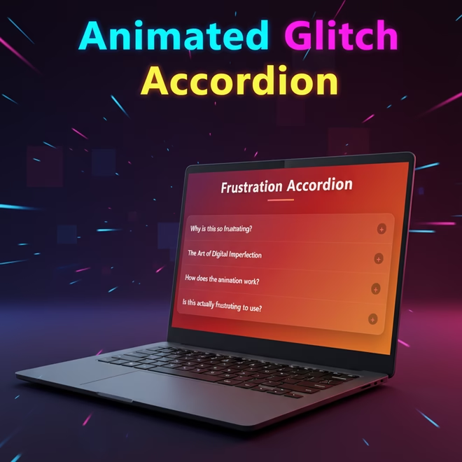
In this tutorial, we will explore the creation of a modern and interactive accordion using HTML, CSS and JavaScript. This code showcases a sleek design with smooth animations, glitch effects and small particle bursts that enhance the experience of opening each section across all devices.
Introduction
The accordion is a popular UI element that is used to group information together in a compact fashion. In this project we’re not just creating any accordion we’re going to make one that has glitchy animations that shows the theme of digital frustration.
In this tutorial I will walk through the following points as very first creating the project. Second we’ll create the HTML and after that we’ll look at adding the CSS and lastly we’ll get into a bit of JavaScript interactivity. And at the end you’ll have a nice animated accordion that’s different from the usual clean and minimal ones.
Why Build a Frustration Accordion?
Most tutorials teach you how to build perfect smooth predictable interfaces. But sometimes there is nothing more pleasing than playing with imperfection. This accordion shows how “frustration” can become a theme of the design.
- Analyse Animation Skills – You will learn how to generate glitch effects, particles, and non-linear transitions.
- Portfolio Value – This isn’t a generic accordion, it is a creative piece you will love to show to people.
- Deeper Understanding – You will gain a better feel for how multiple layers of animation can be combined together, and how small effects compliment other effects to build an experience.
Prerequisites
You should have the following available to follow along:
- Basic knowledge of HTML
- Basic knowledge of CSS
- A beginner’s knowledge of JavaScript
- A code editor (VS Code is preferable)
- A web browser (Chrome, Edge or others)
Project Setup
Create a folder called accordion-project and create these files:
- index.html → structure
- style.css → styling
- script.js → interactivity
In index.html link up the CSS and JS files. Keeping these separate is a suitable way of organizing your code.
Writing the HTML Structure
<!DOCTYPE html>
<html lang="en">- This tells the browser that this document is in HTML5.
- This marks the document as being in English.
- This makes sure that the web browser and other devices read the page correctly.
  <head>
    <meta charset="UTF-8" />
    <meta name="viewport" content="width=device-width, initial-scale=1.0" />
    <title>Frustration-Animated Accordion</title>
    <link
      rel="stylesheet"
      href="https://cdnjs.cloudflare.com/ajax/libs/font-awesome/6.4.0/css/all.min.css"
    />
    <link rel="stylesheet" href="style.css" />
</head>- The head has information that helps web browsers show the page correctly.
- The first meta tag will make sure that all letters, emojis, and symbols are shown correctly.
- The second meta tag will cause the design to adapt automatically on the phone, tablet, computers.
- The title gives the web page its name on the browser tab.
- One link loads styles for icons from outside sources, and the other link loads your own custom CSS.
<body>
    <div class="container">
<h1>Frustration Accordion</h1>- The body contains everything shown on the page.
- The container is the wrapper class that contains all content in a well-centered manner.
- The header notes what page you are on with a well determined headline.
<div class="accordion">
        <div class="accordion-item">
          <div class="glitch-effect"></div>
          <div class="loading-bar"></div>
<div class="particles" id="particles-1"></div>- Each accordion item starts here — this is one section of collapsing content.
- The glitch effect includes a shaking or broken screen effect.
- The loading bar is a digital “progress” effect when it is opened.
- The particles div is for floating or sparkling animation effects.
<div class="accordion-header">
<h2>Why is this so frustrating?</h2>
<span class="accordion-icon">+</span>
</div>- The header is the part that you click on to open or close the accordion.
- The header introduces the question or topic of the section.
- The plus sign shows that the section can be expanded to show more content.
<div class="accordion-content">
   <div class="accordion-content-inner">
         <p>
           This accordion mimics the feeling....
        </p>
          <p>
           Notice the glitch effect....
        </p>
     </div>
</div>- Until the user clicks the header, this part stays hidden.
- This shows the information or explanation for that topic.
- The inner div helps with animation and makes the content grow smoothly.
</div>- Closes one accordion item before starting with the next few.
- Keeps the layout organized and clean.
- Prevents layout/transition errors while pulling in the JavaScript.
<div class="accordion-item">
  ...
</div>
<div class="accordion-item">
  ...
</div>
<div class="accordion-item">
  ...
</div>
- The rest are a repeat of the same so they are all uniformly consistent.
- The content/effects are different in that they do the different things (particles, glitch, loading).
- Using different elements/effects allows the accordion to become a full loaded interactive experience.
- ID’s such as cells-2, cells-3 etc. allows the animations to be affected at each occurrence.
- This keeps the element necessary so all questions are formatted uniformly.
<script src="main.js"></script>
</body>
</html>- Links to the javascript file which runs the ability for the accordion’s movements.
- The script allows the click effects to functions such as animations and open/close.
- Body and html tags close the page completely.
- This clearly marks the end of your web page coding.
The complete code is waiting for you below—go ahead, copy it, and start building!
<!DOCTYPE html>
<html lang="en">
  <head>
    <meta charset="UTF-8" />
    <meta name="viewport" content="width=device-width, initial-scale=1.0" />
    <title>Frustration-Animated Accordion</title>
    <link
      rel="stylesheet"
      href="https://cdnjs.cloudflare.com/ajax/libs/font-awesome/6.4.0/css/all.min.css"
    />
    <link rel="stylesheet" href="style.css" />
  </head>
  <body>
    <div class="container">
      <h1>Frustration Accordion</h1>
      <div class="accordion">
        <div class="accordion-item">
          <div class="glitch-effect"></div>
          <div class="loading-bar"></div>
          <div class="particles" id="particles-1"></div>
          <div class="accordion-header">
            <h2>Why is this so frustrating?</h2>
            <span class="accordion-icon">+</span>
          </div>
          <div class="accordion-content">
            <div class="accordion-content-inner">
              <p>
                This accordion mimics the feeling of frustration with its
                glitchy animations and unpredictable movements. The design
                represents how technology can sometimes test our patience, yet
                still remain beautiful in its own chaotic way.
              </p>
              <p>
                Notice the glitch effect when opening - it's like a digital
                tantrum before revealing the content.
              </p>
            </div>
          </div>
        </div>

        <div class="accordion-item">
          <div class="glitch-effect"></div>
          <div class="loading-bar"></div>
          <div class="particles" id="particles-2"></div>
          <div class="accordion-header">
            <h2>The Art of Digital Imperfection</h2>
            <span class="accordion-icon">+</span>
          </div>
          <div class="accordion-content">
            <div class="accordion-content-inner">
              <p>
                In a world of perfect UIs, sometimes it's the imperfections that
                make interfaces memorable. This accordion celebrates the beauty
                in digital frustration - those moments when things don't work
                quite as expected.
              </p>
              <p>
                The animation uses custom cubic-bezier timing functions to
                create unpredictable movement, combined with a glitch effect
                that represents system instability.
              </p>
            </div>
          </div>
        </div>

        <div class="accordion-item">
          <div class="glitch-effect"></div>
          <div class="loading-bar"></div>
          <div class="particles" id="particles-3"></div>
          <div class="accordion-header">
            <h2>How does the animation work?</h2>
            <span class="accordion-icon">+</span>
          </div>
          <div class="accordion-content">
            <div class="accordion-content-inner">
              <p>
                The frustration effect is achieved through multiple layered
                animations:
              </p>
              <ul>
                <li>Glitch effect with horizontal shaking</li>
                <li>Particle explosion animation</li>
                <li>Loading bar that fills from left to right</li>
                <li>Non-linear timing functions for unpredictable motion</li>
                <li>Opacity changes that create a "struggling" effect</li>
              </ul>
              <p>
                All these elements combine to create the feeling of digital
                frustration.
              </p>
            </div>
          </div>
        </div>

        <div class="accordion-item">
          <div class="glitch-effect"></div>
          <div class="loading-bar"></div>
          <div class="particles" id="particles-4"></div>
          <div class="accordion-header">
            <h2>Is this actually frustrating to use?</h2>
            <span class="accordion-icon">+</span>
          </div>
          <div class="accordion-content">
            <div class="accordion-content-inner">
              <p>
                Paradoxically, while the design theme is frustration, the actual
                user experience is designed to be satisfying. The animations
                provide visual feedback that makes the interaction feel
                responsive and engaging.
              </p>
              <p>
                The "frustration" is purely aesthetic - like watching a dramatic
                movie scene rather than actually experiencing frustration
                yourself.
              </p>
            </div>
          </div>
        </div>
      </div>
    </div>

    <script src="main.js"></script>
  </body>
</html>

Styling with CSS
* {
  margin: 0;
  padding: 0;
  box-sizing: border-box;
  font-family: 'Segoe UI', Tahoma, Geneva, Verdana, sans-serif;
}- Removes all default spacing of any browser in order to have a clean layout.
- Makes sure that the paddings and borders don’t apply to total width or height.
- Uses a modern sans-serif font for the entire page.
body {
  background: linear-gradient(135deg, #1a2a6c, #b21f1f, #fdbb2d);
  min-height: 100vh;
  display: flex;
  justify-content: center;
  align-items: center;
  padding: 20px;
  overflow-x: hidden;
}- Creates a colourful gradient which stretches over the entire screen.
- Centers everything vertically and horizontally with flexbox.
- Hides horizontal overflow and adds padding around the edges to keep scrollbars from showing up.
- Makes sure that the layout fills the whole height of the viewport.
.container {
  max-width: 800px;
  width: 100%;
}- Limits the primary content’s width so as to improve readability, subsequently.
- Keeps the responsive layout on smaller screen sizes.
- Ensures that the accordion does not get too broad.
h1 {
  text-align: center;
  color: #fff;
  margin-bottom: 40px;
  font-size: 2.8rem;
  text-shadow: 0 2px 12px rgba(0, 0, 0, 0.4);
  letter-spacing: 2px;
  position: relative;
  padding-bottom: 15px;
}- Centers and styles the page title, in bright white.
- Adds spacing below, to keep it from the accordion.
- Adds a shadow, for depth and visual appearance.
- Used relative position for the decorative line, added later.
h1::after {
  content: '';
  position: absolute;
  bottom: 0;
  left: 50%;
  transform: translateX(-50%);
  width: 100px;
  height: 4px;
  background: linear-gradient(to right, #ff6b6b, #ff8e53);
  border-radius: 2px;
}- Adds a thin gradient line below the title.
- Centers it perfectly below the text.
- Gives a nice highlight effect that matches the colors of the theme .
.accordion {
  background: rgba(255, 255, 255, 0.08);
  backdrop-filter: blur(12px);
  border-radius: 18px;
  overflow: hidden;
  box-shadow: 0 15px 35px rgba(0, 0, 0, 0.25);
  border: 1px solid rgba(255, 255, 255, 0.1);
}- Creates a glassy transparent background effect using blur.
- Adds rounded corners and light shadows for depth.
- Captures the inner content by using hidden overflow.
- Gives the accordion a futuristic frosted glass function.
.accordion-item {
  border-bottom: 1px solid rgba(255, 255, 255, 0.1);
  position: relative;
  overflow: hidden;
}- Separates the accordion segments with a thin stripe.
- Composes elements in a relatively positional variation.
- Ensures any internal effects, such as glitch, particles, etc… remain expo within the section.
.accordion-item:last-child {
  border-bottom: none;
}- Removes the bottom border from the last section to give it a nice finish.
.accordion-header {
  padding: 22px;
  cursor: pointer;
  display: flex;
  justify-content: space-between;
  align-items: center;
  transition: all 0.4s ease;
  position: relative;
  z-index: 2;
}- Makes the sections above links which give a pointer effect.
- Aligns the title nicely using flexbox with the little graphic icon.
- Gives a smooth transition when hovered and animation.
- Sets z-index of header so it is above the other animated layers.
.accordion-header:hover {
  background: rgba(255, 255, 255, 0.05);
}- On hover gives a nice slow colour change to indicate interactivity.
.accordion-header h2 {
  color: #fff;
  font-size: 1.4rem;
  font-weight: 600;
  margin: 0;
  padding-right: 40px;
  text-shadow: 0 2px 5px rgba(0, 0, 0, 0.2);
}- Styles the sections for a nice bold readable appearance.
- Keeps the spacing on the right side for the graphics icon.
- Gives a soft shadow to improve the visual affect giving a contrast from the background.
.accordion-icon {
  color: #ff6b6b;
  font-size: 1.4rem;
  transition: all 0.5s cubic-bezier(0.68, -0.55, 0.27, 1.55);
  position: absolute;
  right: 22px;
  width: 28px;
  height: 28px;
  display: flex;
  justify-content: center;
  align-items: center;
  background: rgba(0, 0, 0, 0.3);
  border-radius: 50%;
}- The “+” icon is placed perfectly on the right side of the menu.
- It has a circular dark background for a clearer visibility.
- It has a bouncy animation curve on the rotation.
- The symbol is centered in its in its container.
.accordion-content {
  max-height: 0;
  overflow: hidden;
  transition: max-height 0.7s cubic-bezier(0.65, 0.05, 0.15, 1);
  background: rgba(0, 0, 0, 0.2);
  position: relative;
}- The content remains hidden by default using a height of zero.
- It smooth expands outwards when activated.
- It has a semi transparent dark background for contrast.
- It allows the animation layers to be put in their correct positions through relatvity positioning of the layer.
.accordion-content-inner {
  padding: 0 25px;
  color: rgba(255, 255, 255, 0.85);
  line-height: 1.7;
  font-size: 1.05rem;
  transform: translateY(10px);
  opacity: 0;
  transition: all 0.5s ease;
}- Manages the format and distance between the text in each sections.
- Actually slightly distant and faded for the animation
- Dissolved by appealing using a smooth upward motion when opened.
.accordion-item.active .accordion-header {
  background: rgba(255, 255, 255, 0.07);
}- The active header is highlighted when open by a light background.
.accordion-item.active .accordion-icon {
  transform: rotate(135deg);
  color: #ff8e53;
  background: rgba(0, 0, 0, 0.4);
  box-shadow: 0 0 10px rgba(255, 142, 83, 0.5);
}- Rotates the object making it resemble a “minus” sign.
- Changes it’s colour and glow indicating it is active.
- Keeps the circular dark background and adds a soft shinny appearance.
.accordion-item.active .accordion-content {
  max-height: 500px;
}- moothly increases the distance for the section allowing it to unfold.
- It’s height limit prevents it from expanding infinitely.
.accordion-item.active .accordion-content-inner {
  transform: translateY(0);
  opacity: 1;
  transition-delay: 0.2s;
  padding: 20px 25px;
}- Brings the text in and makes it visible.
- a slight delay added for a more soft layered animation
- Allows for more padding when content is made visible.
.glitch-effect {
  position: absolute;
  top: 0;
  left: 0;
  width: 100%;
  height: 100%;
  background: linear-gradient(45deg, #ff6b6b25, #4ecdc425, #1a2a6c25);
  z-index: 1;
  opacity: 0;
  pointer-events: none;
  mix-blend-mode: overlay;
}- This uses a clear color overlay over the accordion.
- Prepares the glitch animation with different colors.
- Keeps it non-interactive so it does not block clicks.
- Uses a mixture of blend mode gives it that distorted frustrated look.
.accordion-item.active .glitch-effect {
  animation: glitch 0.8s cubic-bezier(0.65, 0.05, 0.15, 1);
}- Triggers the glitch animation on section open.
- Timing function gives it a natural shake effect.
@keyframes glitch {
  0% { ... }
  100% { ... }
}
- Specifies shaking motion for the glitch effect.
- Moves section sideways quickly.
- Modifies opacity to look like a screen flicker.
- Returns to original position smoothly at the end.
.loading-bar {
  position: absolute;
  bottom: 0;
  left: 0;
  height: 3px;
  width: 0%;
  background: linear-gradient(to right, #ff6b6b, #ff8e53);
  transition: width 0.7s cubic-bezier(0.65, 0.05, 0.15, 1);
  z-index: 3;
}- Generates a progress-like bar underneath each section of the element.
- Starts at zero width and fills when active.
- Uses a gradient that matches the theme to keep the effects consistent.
.accordion-item.active .loading-bar {
  width: 100%;
}- When you open a section the loading bar fully expands.
.particles {
  position: absolute;
  top: 0;
  left: 0;
  width: 100%;
  height: 100%;
  pointer-events: none;
  z-index: 1;
}- Generates a container for floating particle effects.
- Will sit behind the content layer so that it does not block out the text.
- Takes up the full space of the accordion to achieve total coverage.
.particle {
  position: absolute;
  background: rgba(255, 255, 255, 0.7);
  border-radius: 50%;
  opacity: 0;
}- Defines each small animated dot used in the particle effect.
- Gives them a white glowing look to a round shape
- Start off hidden until activated by animation.
.accordion-item.active .particle {
  animation: particles 1s ease-out;
}- Runs the floating animation when the section opens
@keyframes particles {
  0% { ... }
  100% { ... }
}- Randomizes particle movement with transform values.
- Has it so they get a little bit bigger for a burst effect.
- Fades them out slowly so it is a smooth disappearance as well.
@media (max-width: 600px) {
  h1 {
    font-size: 2.2rem;
  }
  .accordion-header h2 {
    font-size: 1.2rem;
  }
  .accordion-content-inner {
    font-size: 0.95rem;
  }
  .accordion-header {
    padding: 18px;
  }
}- Adjusts text sizes and letter spacing for smaller screens.
- Makes sure the accordion is still readable and balanced on mobile
- Reduces padding so everything fits comfortably on mobile viewports.
* {
  margin: 0;
  padding: 0;
  box-sizing: border-box;
  font-family: 'Segoe UI', Tahoma, Geneva, Verdana, sans-serif;
}

body {
  background: linear-gradient(135deg, #1a2a6c, #b21f1f, #fdbb2d);
  min-height: 100vh;
  display: flex;
  justify-content: center;
  align-items: center;
  padding: 20px;
  overflow-x: hidden;
}

.container {
  max-width: 800px;
  width: 100%;
}

h1 {
  text-align: center;
  color: #fff;
  margin-bottom: 40px;
  font-size: 2.8rem;
  text-shadow: 0 2px 12px rgba(0, 0, 0, 0.4);
  letter-spacing: 2px;
  position: relative;
  padding-bottom: 15px;
}

h1::after {
  content: '';
  position: absolute;
  bottom: 0;
  left: 50%;
  transform: translateX(-50%);
  width: 100px;
  height: 4px;
  background: linear-gradient(to right, #ff6b6b, #ff8e53);
  border-radius: 2px;
}

.accordion {
  background: rgba(255, 255, 255, 0.08);
  backdrop-filter: blur(12px);
  border-radius: 18px;
  overflow: hidden;
  box-shadow: 0 15px 35px rgba(0, 0, 0, 0.25);
  border: 1px solid rgba(255, 255, 255, 0.1);
}

.accordion-item {
  border-bottom: 1px solid rgba(255, 255, 255, 0.1);
  position: relative;
  overflow: hidden;
}

.accordion-item:last-child {
  border-bottom: none;
}

.accordion-header {
  padding: 22px;
  cursor: pointer;
  display: flex;
  justify-content: space-between;
  align-items: center;
  transition: all 0.4s ease;
  position: relative;
  z-index: 2;
}

.accordion-header:hover {
  background: rgba(255, 255, 255, 0.05);
}

.accordion-header h2 {
  color: #fff;
  font-size: 1.4rem;
  font-weight: 600;
  margin: 0;
  padding-right: 40px;
  text-shadow: 0 2px 5px rgba(0, 0, 0, 0.2);
}

.accordion-icon {
  color: #ff6b6b;
  font-size: 1.4rem;
  transition: all 0.5s cubic-bezier(0.68, -0.55, 0.27, 1.55);
  position: absolute;
  right: 22px;
  width: 28px;
  height: 28px;
  display: flex;
  justify-content: center;
  align-items: center;
  background: rgba(0, 0, 0, 0.3);
  border-radius: 50%;
}

.accordion-content {
  max-height: 0;
  overflow: hidden;
  transition: max-height 0.7s cubic-bezier(0.65, 0.05, 0.15, 1);
  background: rgba(0, 0, 0, 0.2);
  position: relative;
}

.accordion-content-inner {
  padding: 0 25px;
  color: rgba(255, 255, 255, 0.85);
  line-height: 1.7;
  font-size: 1.05rem;
  transform: translateY(10px);
  opacity: 0;
  transition: all 0.5s ease;
}

/* Active state */
.accordion-item.active .accordion-header {
  background: rgba(255, 255, 255, 0.07);
}

.accordion-item.active .accordion-icon {
  transform: rotate(135deg);
  color: #ff8e53;
  background: rgba(0, 0, 0, 0.4);
  box-shadow: 0 0 10px rgba(255, 142, 83, 0.5);
}

.accordion-item.active .accordion-content {
  max-height: 500px;
}

.accordion-item.active .accordion-content-inner {
  transform: translateY(0);
  opacity: 1;
  transition-delay: 0.2s;
  padding: 20px 25px;
}

/* Frustration animation elements */
.glitch-effect {
  position: absolute;
  top: 0;
  left: 0;
  width: 100%;
  height: 100%;
  background: linear-gradient(45deg, #ff6b6b25, #4ecdc425, #1a2a6c25);
  z-index: 1;
  opacity: 0;
  pointer-events: none;
  mix-blend-mode: overlay;
}

.accordion-item.active .glitch-effect {
  animation: glitch 0.8s cubic-bezier(0.65, 0.05, 0.15, 1);
}

@keyframes glitch {
  0% {
    opacity: 0;
    transform: translateX(0);
  }
  15% {
    opacity: 0.4;
    transform: translateX(-8px);
  }
  30% {
    transform: translateX(8px);
  }
  45% {
    transform: translateX(-5px);
  }
  60% {
    transform: translateX(5px);
  }
  75% {
    transform: translateX(-3px);
  }
  90% {
    transform: translateX(3px);
  }
  100% {
    opacity: 0;
    transform: translateX(0);
  }
}

.loading-bar {
  position: absolute;
  bottom: 0;
  left: 0;
  height: 3px;
  width: 0%;
  background: linear-gradient(to right, #ff6b6b, #ff8e53);
  transition: width 0.7s cubic-bezier(0.65, 0.05, 0.15, 1);
  z-index: 3;
}

.accordion-item.active .loading-bar {
  width: 100%;
}

/* Particle animation */
.particles {
  position: absolute;
  top: 0;
  left: 0;
  width: 100%;
  height: 100%;
  pointer-events: none;
  z-index: 1;
}

.particle {
  position: absolute;
  background: rgba(255, 255, 255, 0.7);
  border-radius: 50%;
  opacity: 0;
}

.accordion-item.active .particle {
  animation: particles 1s ease-out;
}

@keyframes particles {
  0% {
    transform: translate(0, 0);
    opacity: 1;
    width: 2px;
    height: 2px;
  }
  100% {
    transform: translate(var(--tx), var(--ty));
    opacity: 0;
    width: 6px;
    height: 6px;
  }
}

/* Responsive design */
@media (max-width: 600px) {
  h1 {
    font-size: 2.2rem;
  }

  .accordion-header h2 {
    font-size: 1.2rem;
  }

  .accordion-content-inner {
    font-size: 0.95rem;
  }

  .accordion-header {
    padding: 18px;
  }
}

Adding JavaScript Interactivity
document.querySelectorAll('.accordion-header').forEach((header) => {
  header.addEventListener('click', () => {
    const item = header.parentElement
    const isActive = item.classList.contains('active')

    // Close all items
    document.querySelectorAll('.accordion-item').forEach((accItem) => {
      accItem.classList.remove('active')
    })

    // Open clicked item if it wasn't already active
    if (!isActive) {
      item.classList.add('active')

      // Create particles for the active item
      createParticles(item.querySelector('.particles'))
    }
  })
})- Picks out all the accordion headers and gives each a click event.
- Tests to see if the clicked item is already active.
- Removes the “active” class from the accordion items to close them.
- Reinstates the “active” class only on the object clicked on if it was not active.
- Calls the createParticles() function to produce animations.
function createParticles(container) {
  // Clear previous particles
  container.innerHTML = ''

  // Create new particles
  for (let i = 0; i < 15; i++) {
    const particle = document.createElement('div')
    particle.classList.add('particle')

    // Random position
    const x = Math.random() * 100
    const y = Math.random() * 100

    // Random movement direction
    const tx = (Math.random() - 0.5) * 100
    const ty = (Math.random() - 0.5) * 100

    particle.style.left = `${x}%`
    particle.style.top = `${y}%`
    particle.style.setProperty('--tx', `${tx}px`)
    particle.style.setProperty('--ty', `${ty}px`)

    // Random delay
    particle.style.animationDelay = `${Math.random() * 0.3}s`

    container.appendChild(particle)
  }
}- Cleans up and removes any particles inside the container that were there.
- Creates 15 small particle elements dynamically through loops.
- Gives them all random positions and random directions of movement to give a natural effect.
- Provides a random delay of animation so particles don’t move in unison.
- Each new particle is appended to the container to show the animation.
document.querySelectorAll('.particles').forEach((particleContainer) => {
  createParticles(particleContainer)
})- Picks out all the particles containers on the page.
- Each is made to call createParticles() at page load.
- To see that animation of particle exists from start, not just upon being clicked on.
document.querySelectorAll('.accordion-header').forEach((header) => {
  header.addEventListener('click', () => {
    const item = header.parentElement
    const isActive = item.classList.contains('active')

    // Close all items
    document.querySelectorAll('.accordion-item').forEach((accItem) => {
      accItem.classList.remove('active')
    })

    // Open clicked item if it wasn't already active
    if (!isActive) {
      item.classList.add('active')

      // Create particles for the active item
      createParticles(item.querySelector('.particles'))
    }
  })
})

function createParticles(container) {
  // Clear previous particles
  container.innerHTML = ''

  // Create new particles
  for (let i = 0; i < 15; i++) {
    const particle = document.createElement('div')
    particle.classList.add('particle')

    // Random position
    const x = Math.random() * 100
    const y = Math.random() * 100

    // Random movement direction
    const tx = (Math.random() - 0.5) * 100
    const ty = (Math.random() - 0.5) * 100

    particle.style.left = `${x}%`
    particle.style.top = `${y}%`
    particle.style.setProperty('--tx', `${tx}px`)
    particle.style.setProperty('--ty', `${ty}px`)

    // Random delay
    particle.style.animationDelay = `${Math.random() * 0.3}s`

    container.appendChild(particle)
  }
}

// Initialize particles for all items on load
document.querySelectorAll('.particles').forEach((particleContainer) => {
  createParticles(particleContainer)
})

Output

Understanding the Animation Effects
This accordion comprises several layers contributing to the feeling of “frustration.”
- Glitch – Fast horizontal movements with fading are being used.
- Loading bar – Has the effect of extending from left to right when being opened.
- Particles – Presenting dots which shoot to the outside, than disappear.
- Not linear timing – Custom cubic-bezier functions are used to get unpredictable movement.
Each of the animations alone are easy, but in combination they cause a haphazard, energetic feeling.
Conclusion
You have built a sleek interactive Frustration Accordion using HTML, Javascript and CSS.
This project provides an example of how a clever design and easy animations can make a commonplace UI element into something stylish and trendy.
During this tutorial you have learnt:
- How to create the accordion layout with a neat structure in your HTML.
- How to beautify it in CSS with animated effects, gradients and glassmorphism effects.
- How to impart interactive effects and particle animations in your Javascript.
This project is not just about the design of it but the understanding of how the animation and motion in UI’s can impart emotion.
Now go experiment with colours, speed of animations and add your own creative effects to make it your own.
Continue experimenting, trying new design ideas : each small project like this is a change to develop your front-end skills further and strengthen your confidence as a developer.
FAQs
What is this project about?
This is a creative accordion design made in HTML, CSS, and JS that features smooth animation effects, glitch type effects, and particle explosions. It is named the Frustration Accordion because the motions and effects evoke the feeling of digital “chaos,” but in an aesthetically pleasing manner.
Can I use this accordion for my own website?
Yes, by all means. You can use it or this accordion as a base for your own projects. Just be sure to link in the CSS and JS correctly for the animations to work correctly.
Why did I use the JS?
The JS takes care of the interactive features — things such as the ability to open and close sections, add or remove the active class, and the spawning of particles each time a section is opened. The accordion itself would be a static object without JavaScript.
Is this accordion user-friendly?
Yes, the CSS has responsive attributes added to adjust font sizes and spacing for smaller screens, so it works well on phones and tablets.
Can I change the colors or animations?
Absolutely yes. The colors shown in the gradient can be changed, or the transition speeds, or the number of particles in the JS file can be changed. You can easily personalize this to fit your own website’s style.