
Learn how to create an Animated and Responsive Login Page using HTML and CSS in this beginner and experience friendly tutorial. Follow step by step instructions to build Animated and Responsive login page with styling using only HTML and CSS.
Introduction
Creating an animated and responsive login page is essential for modern web applications. It enhances user experiences and add a professional touch to your website. In this tutorial, i will design modern login page with animations and ensuring it works smoothly in all devices.
Why Choose an Animated Login
- Improves User Experience.
- Upgrades Design.
- Works in All Devices(Responsive).
Requirements:
Before you starting this tutorial, you should understand a basic of HTML and CSS. Furthermore you have you will need a code editor like Sublime Text, Notepad++ or Visual studio Code to write the code and save.
Step 1 (HTML Code)
<!DOCTYPE html>this declaration at the beginning tells the browser that this is an HTML5 document.
<html lang="en">Is the root element of HTML document. The lang=”en” part specifies that the document is written in English. It help search engines, screen readers and browser understand the primary language of the content.
<head> This tag in HTML is a section of a document where you put important information that doesn’t directly appear on webpage but helps the browser and search engines understand and display the page properly. this tag contains Metadata, Title, link to Stylesheet. They can be more but now we use only this.
<meta charset="UTF-8">
<meta name="viewport" content="width=device-width, initial-scale=1.0">
<title>Animated Login Page ||Codeweave24</title>
<link rel="stylesheet" href="style.css">
<meta charset=”UTF-8″> this defines the character encoding your for your document is UTF-8.
<meta name=”viewport” content=”width=device-width, initial-scale=1.0″> ensuring the viewport properties is responsive .
<title>Animated Login Page ||Codeweave24</title> defines the the title that show up the browser tab.
<link rel=”stylesheet” href=”style.css”> links to the external CSS file for styling called=”style.css”.
<body>defines the content that directly appear(show) the webpage.
<div class="back_animation">
        <div class="login-container">
            <form autocomplete="off">

            </form>
          </div>
        </div>
<div class=”back_animation”> </div> open and close (Div with its Style) that represent the animation with the back of the login container.
<div class=”login-container”> </div> defines the the container of the login where input fields like (username, password),buttons and other elements related to user login are placed.
<form autocomplete=”off”> </form> Let’s take it apart
<Form>: this tag defines the form is essential HTML element used to collect user input on websites like login forms and others like that.
autocomplete=”off” : Prevents the browser for automatically filling in previously entered value in input fields like (username, emails and passwords).
Why to use autocomplete=”off”
1: for security reason. 2: for better user Experience.
The complete code is waiting for you below—go ahead, copy it, and start building!
<!DOCTYPE html>
<html lang="en">
    <!-- coding by codedeweave24 -->
<head>
    <meta charset="UTF-8">
    <meta name="viewport" content="width=device-width, initial-scale=1.0">
    <title>Animated Login Page ||Codeweave24</title>
    <link rel="stylesheet" href="style.css">
</head>
<body>
    <div class="back_animation">
        <div class="login-container">
            <form autocomplete="off">
              <h2>Sign in</h2>
              <div class="inputBox">
                <input type="text" required="required">
                <span>Username</span>
                <i></i>
              </div>
              <div class="inputBox">
                <input type="password" required="required">
                <span>Password</span>
                <i></i>
              </div>
              <div class="remember-me">
                <input type="checkbox" id="remember-me">
                <label for="remember-me">Remember me</label>
            </div>
              <div class="links">
                <a href="#">Forgot Password ?</a>
                <a href="#">Signup</a>
              </div>
              <input type="submit" value="Login">
            </form>
          </div>
        </div>
</body>
</html>
Step 2(CSS Code)
@import url("https://fonts.googleapis.com/css2?family=Inconsolata&display=swap");Imports the Inconsolata fonts from Google fonts to make it available for use in the website CSS.
* { }Defines universal selector that select all elements on a webpage and apply specified style to them.
body { }The body { } in CSS in a rule set that targets the <body> element in HTML document. It allows you to apply styles to the entire webpage since the body element contains all visible content.
.back_animation { }
.back_animation:before,
.back_animation:after{ }
.back_animation { } This target an <Div> element with class back_animation and apply styles like animations, background effects or positioning to the element it self.
::before and ::after called pseudo-elements and commonly used for decorative purpose such as animations, overlays or adding extra visual effects.
@keyframes@keyframes define animation by specifying styles at different points in time.
.login-container { }.login-container { } Target <Div> with class login-container and apply styles like background and other effects .
.form { } Form{ } select to style all <form> elements in HTML document like H2, Inputs, a and labels.
.h2 { }
.inputBox { }
.links { }
.input[type="submit"] { }
.H2{ } defines to style the heading text of the form.
.inputBox { } stylize the inputs like(username, password) in the form.
.links { } define to style anchor tag(a) with connected links to redirect correct page if click the link like singup and forget password.
.input[type=”submit”] { } define to style submit button of the login.
@media@media applies styles based on screen size or device type, making designs responsive.
The complete code is waiting for you below—go ahead, copy it, and continue building!
@import url("https://fonts.googleapis.com/css2?family=Inconsolata&display=swap");
* {
margin: 0;
padding: 0;
box-sizing: border-box;
font-family: "Playfair Display", serif;
}
body {
background: url("https://images.pexels.com/photos/1103970/pexels-photo-1103970.jpeg?auto=compress&cs=tinysrgb&dpr=2&h=750&w=1260") no-repeat center center;
background-size: cover;
display: flex;
justify-content: center;
align-items: center;
min-height: 100vh;
flex-direction: column;
}
.back_animation {
position: relative;
}
.back_animation:before,
.back_animation:after {
animation: orbit 5s linear infinite;
border-radius: 50%;
box-shadow: 0 0 1rem 0 rgba(0, 0, 0, 0.2);
content: "";
height: 100px;
position: absolute;
width: 100px;
}
.back_animation:before {
background: #ffe897;
background: -moz-radial-gradient(top right, #ffe897, #d7d3ce);
background: radial-gradient(to bottom left, #ffe897, #d7d3ce);
background: -webkit-radial-gradient(top right, #ffe897, #d7d3ce);
}
.back_animation:after {
animation-delay: -2.5s;
background: #e0e793;
background: -moz-radial-gradient(bottom right, #e0e793, #6dd0f1);
background: radial-gradient(to top left, #e0e793, #6dd0f1);
background: -webkit-radial-gradient(bottom right, #e0e793, #6dd0f1);
right: 0;
top: 0;
z-index: -1;
}
@keyframes orbit {
from {
transform: rotate(0deg) translateX(100px) rotate(0deg);
}
to {
transform: rotate(360deg) translateX(100px) rotate(-360deg);
}
}
.login-container {
position: relative;
width: 380px;
height: 420px;
border-radius: 8px;
overflow: hidden;
box-shadow: 0px 0px 10px 10px rgba(81, 72, 72, 0.336);
}
.login-container:before {
content: "";
z-index: 1;
position: absolute;
top: -50%;
left: -50%;
width: 380px;
height: 420px;
transform-origin: bottom right;
background: linear-gradient(0deg, transparent, #45f3ff, #45f3ff);
animation: animate 6s linear infinite;
}
.login-container:after {
content: "";
z-index: 1;
position: absolute;
top: -50%;
left: -50%;
width: 380px;
height: 420px;
transform-origin: bottom right;
background: linear-gradient(0deg, transparent, #45f3ff, #45f3ff);
animation: animate 6s linear infinite;
animation-delay: -3s;
}
@keyframes animate {
0% {
transform: rotate(0deg);
}
100% {
transform: rotate(360deg);
}
}
form {
position: absolute;
inset: 2px;
background: transparent;
backdrop-filter: blur(1px);
padding: 50px 40px;
border-radius: 8px;
z-index: 2;
display: flex;
flex-direction: column;
}
h2 {
color: #000;
font-weight: bold;
font-weight: 500;
text-align: center;
letter-spacing: 0.1em;
}
.inputBox {
position: relative;
width: 300px;
margin-top: 35px;
}
.inputBox input {
position: relative;
width: 100%;
padding: 20px 10px 10px;
background: transparent;
outline: none;
box-shadow: none;
border: none;
color: #000;
font-size: 1em;
letter-spacing: 0.05em;
transition: 0.5s;
z-index: 10;
}
.inputBox span {
position: absolute;
left: 0;
padding: 20px 0px 10px;
pointer-events: none;
font-size: 1em;
color: #000;
font-weight: bold;
letter-spacing: 0.05em;
transition: 0.5s;
}
.inputBox input:valid ~ span,
.inputBox input:focus ~ span {
color: #000;
transform: translateX(0px) translateY(-34px);
font-size: 0.75em;
}
.inputBox i {
position: absolute;
left: 0;
bottom: 0;
width: 100%;
height: 2px;
background: #45f3ff;
border-radius: 4px;
overflow: hidden;
transition: 0.5s;
pointer-events: none;
z-index: 9;
}
.inputBox input:valid ~ i,
.inputBox input:focus ~ i {
height: 44px;
}
.links {
display: flex;
justify-content: space-between;
}
.links a {
margin: 10px 0;
font-size: 0.75em;
color: #000;
text-decoration: beige;
}
.links a:hover,
.links a:nth-child(2) {
color: #45f3ff;
}
.remember-me {
display: flex;
align-items: center;
margin-top: 10px;
}
.remember-me input {
margin-right: 5px;
}
input[type="submit"] {
border: none;
outline: none;
padding: 11px 25px;
background: #45f3ff;
cursor: pointer;
border-radius: 4px;
font-weight: 600;
width: 100px;
margin-top: 10px;
}
input[type="submit"]:active {
opacity: 0.8;
}
@media screen and (max-width: 768px) {
.box {
width: 320px;
height: 4000px;
}
.inputBox {
width: 250px;
}
form {
padding: 40px 30px;
}
}
@media screen and (max-width: 480px) {
.box {
width: 280px;
height: 370px;
}
.inputBox {
width: 220px;
}
form {
padding: 30px 20px;
}
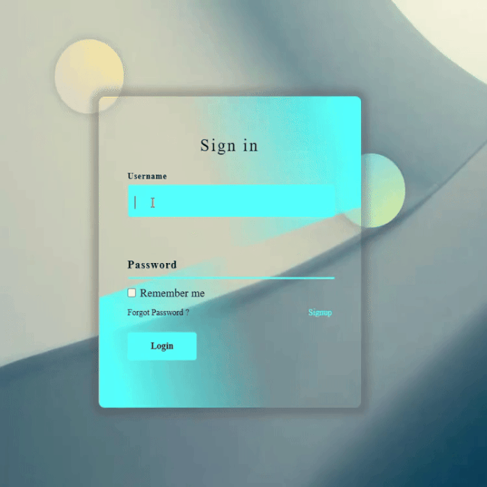
}Final Output
Conclusion
Building an animated and responsive login page using only HTML and CSS is a great way to improve both the appearance and functionality of your website. In this tutorial, I walked you through the process of structuring the HTML, styling it with CSS, and adding smooth animations to create a modern and professional login page—all without using JavaScript!
Now that you have a working design, feel free to tweak it to match your style. Try experimenting with different animations, colors, and layouts to make it truly your own. Web design is all about creativity, so don’t be afraid to explore new ideas.
I hope you found this tutorial helpful! If you did, consider sharing it with others who might benefit. Keep practicing, keep learning, and happy coding!
2 comments
It’s good login page
[…] responsive navbar is essential component of modern web design […]