
Create a modern website footer using only HTML & CSS. Learn to build a responsive, animated footer with social links, newsletter signup, and sleek design no JavaScript needed. Perfect for professional websites!
Introduction
A website’s footer is no longer simply a page’s last section, it represents design, trust and communication with the customer in all ways. A modern footer can improve the user experience, add branding and give that last bitter sweet touch of professionalism to the page to entice visitors to stay.
In this tutorial we are going to build a modern animated website footer using HTML and CSS only, no JavaScript, no frameworks, just clean responsive code. This footer has nice smooth transitions, social site icons, great gradients and a nice newsletter form. All perfect for graphics designers, programmers and anyone with a wish to add a sleek, futuristic look to their site.
By the end of this tutorial you will not only know how to make a footer which looks great on any size of device, but also discover many invaluable techniques for layout and style, which will improve the design of your whole website!
Why a Good Footer Matters in Web Design
A well-designed footer adds class and function to your website. It serves as a navigation aid, presents certain information, and lends an impression of cleanliness, simplicity and professionalism. It is also a great place to put contact information, links to your social sites or a quick link to your important pages. A good footer that is well designed makes for a better user experience and keeps the interest of the visitor right to the end. Subtle touches such as animations or gradients here and there can add visual excitement without overstating the overall impression of the rest of the page.
Requirements to build Modern Website Footer
Basic Skills Needed
- Fundamental knowledge of HTML elements,structure and forms.
- Basic understanding of CSS.
- Knowledge with responsive design principles.
Tools Required
Code Editor:
- VS Code
- Sublime Text
- Notepad++
- Atom
Web Browser
For previewing your design Chrome, Firefox, Microsoft Edge and etc.
Setup
Let’s get started on this project. First, create a new folder on your computer by pressing Ctrl+Shift+N on your keyboard or right-clicking anywhere on your screen and selecting New → Folder. Call the folder Footer so it is obvious what we are creating.
Now, open that folder in your favorite code editor, such as Visual Studio Code or Sublime Text. In that folder create the following two files:
index.html – In this file we’ll be writing the structure of our modern footer.
style.css – In this file we’ll be adding all the styles and animations to make our footer look amazing.
With those files in place, the project is ready to start coding!
HTML Code
Now it’s time to write the HTML for our footer. We’ll build it step by step, so each part is clear and easy to follow.
Footer Container
<footer class="modern-footer">.modern-footer→ Main wrapper for the entire footer.- Gives background, padding, and holds everything inside.
Decorative Wave
<div class="footer-wave"></div>.footer-wave→ Decorative top wave or curve.- Adds visual style, like the GIF background in the 404 page’s
.four_zero_four_bg. - Optional SVG or CSS shape for modern design.
Footer Wrapper / Content Grid
footer-wrapper→ Container for all columns.- Uses grid or flexbox to arrange columns neatly.
About Us Column
<div class="footer-column">
  <h3>About Us</h3>
  <p>We create digital experiences that elevate your brand.</p>
  <div class="social-icons">
    <a href="#"><i class="fab fa-facebook-f"></i></a>
    ...
  </div>
</div>- .footer-column → Each column container (like 404’s content box).
- <h3> → Small heading for the section.
- <p> → Description or intro text.
- .social-icons → Social links with hover effects for interaction.
Quick Links Column
<div class="footer-column">
  <h3>Quick Links</h3>
  <ul>
    <li><a href="#">Home</a></li>
    ...
  </ul>
</div>- List of navigation links for user convenience.
<ul>→ Keeps links organized and easy to style.- Hover effects can mimic the 404 link button feel but smaller.
Services Column
<div class="footer-column">
  <h3>Services</h3>
  <ul>
    <li><a href="#">Web Design</a></li>
    ...
  </ul>
</div>- Highlights your services, just like explaining the main message in 404’s .
- Each link clickable → improves engagement..
Newsletter Column
<div class="footer-column">
  <h3>Newsletter</h3>
  <p>Sign up for updates.</p>
  <form class="newsletter-form">
    <input type="email" placeholder="Your Email" required>
    <button type="submit"><i class="fas fa-paper-plane"></i></button>
  </form>
</div>- Input + button like CTA in the 404 page.
- Encourages interaction and user engagement.
Footer Bottom
<div class="footer-bottom">
  <p>© 2025 YourBrand. All Rights Reserved.</p>
</div>- Small copyright section.
.footer-bottom→ Text centered, separated from main footer content.
Open the Index.html file and paste the code shown below.
<!DOCTYPE html>
<html lang="en">
  <!-- Created by Codeweave24-->
  <head>
    <meta charset="UTF-8" />
    <meta name="viewport" content="width=device-width, initial-scale=1.0" />
    <title>Modern Animated Footer|Codeweave24</title>
    <link
      rel="stylesheet"
      href="https://cdnjs.cloudflare.com/ajax/libs/font-awesome/6.4.0/css/all.min.css"
    />
    <link rel="stylesheet" href="style.css" />
  </head>
  <body>
    <footer class="footer-container">
      <div class="footer-wave"></div>
      <div class="footer-content">
        <div class="footer-column">
          <h3>About Us</h3>
          <p>
            We deliver innovative solutions to transform your business and help
            you achieve your goals in the digital era.
          </p>
          <div class="social-links">
            <a href="#"><i class="fab fa-facebook-f"></i></a>
            <a href="#"><i class="fab fa-twitter"></i></a>
            <a href="#"><i class="fab fa-linkedin-in"></i></a>
            <a href="#"><i class="fab fa-instagram"></i></a>
          </div>
        </div>

        <div class="footer-column">
          <h3>Quick Links</h3>
          <ul class="footer-links">
            <li><a href="#">Home</a></li>
            <li><a href="#">Services</a></li>
            <li><a href="#">About</a></li>
            <li><a href="#">Contact</a></li>
          </ul>
        </div>

        <div class="footer-column">
          <h3>Services</h3>
          <ul class="footer-links">
            <li><a href="#">Web Design</a></li>
            <li><a href="#">App Development</a></li>
            <li><a href="#">Digital Marketing</a></li>
            <li><a href="#">SEO Services</a></li>
            <li><a href="#">UI/UX Design</a></li>
          </ul>
        </div>

        <div class="footer-column">
          <h3>Newsletter</h3>
          <p>Subscribe to our newsletter for the latest updates and offers.</p>
          <form class="newsletter-form">
            <input type="email" placeholder="Your Email" required />
            <button type="submit"><i class="fas fa-paper-plane"></i></button>
          </form>
        </div>
      </div>

      <div class="footer-bottom">
        <p>© 2025 Affigoo. All Rights Reserved.</p>
      </div>
    </footer>
  </body>
</html>

CSS Code
Now let’s start the CSS part. Open your style.css file we’ll style the footer step by step to make it modern, clean, and responsive.
Global Reset & Font Setup
* {
  margin: 0;
  padding: 0;
  box-sizing: border-box;
  font-family: 'Segoe UI', Tahoma, Geneva, Verdana, sans-serif;
}- Removes default browser spacing and sets a clean, modern font.
- Makes everything consistent across all devices and browsers.
Body Styling
body {
  min-height: 100vh;
  display: flex;
  flex-direction: column;
}- Keeps the footer at the bottom of the page and allows flexible layout.
- Ensures full height for a professional look.
Footer Container
.footer-container {
  margin-top: auto;
  background: linear-gradient(135deg, #1a1a2e 0%, #16213e 100%);
  color: #fff;
  padding: 60px 0 30px;
  position: relative;
  overflow: hidden;
}- This is the main footer wrapper.
- Adds a modern gradient, padding, and positions everything neatly.
Decorative Wave
.footer-wave {
  position: absolute;
  top: -50px;
  left: 0;
  width: 100%;
  height: 50px;
  background: url(...);
  background-size: cover;
}- Gives the footer a wavy top edge for a stylish look.
- Adds smooth separation from the main content.
Footer Grid Layout
.footer-content {
  max-width: 1200px;
  margin: 0 auto;
  padding: 0 20px;
  display: grid;
  grid-template-columns: repeat(auto-fit, minmax(250px, 1fr));
  gap: 40px;
}- Creates a responsive grid with multiple columns.
- Adapts beautifully to any screen size – no chaos, no clutter.
Column Headings
.footer-column h3 {
  font-size: 1.3rem;
  margin-bottom: 25px;
  position: relative;
  padding-bottom: 10px;
}
.footer-column h3::after {
  content: '';
  position: absolute;
  left: 0;
  bottom: 0;
  width: 50px;
  height: 2px;
  background: linear-gradient(90deg, #00dbde 0%, #fc00ff 100%);
}- Stylish headings with a glowing underline effect.
- The gradient line gives that premium “agency” vibe.
Paragraphs & Links
.footer-column p {
  color: #b3b3b3;
  margin-bottom: 20px;
  line-height: 1.6;
}
.footer-links a {
  color: #b3b3b3;
  text-decoration: none;
  transition: all 0.3s ease;
}
.footer-links a:hover {
  color: #fff;
  transform: translateX(5px);
}- Makes text readable and clean.
- Links shift slightly on hover — small motion, big impact.
Social Media Icons
.social-links {
  display: flex;
  gap: 15px;
}
.social-links a {
  width: 40px;
  height: 40px;
  border-radius: 50%;
  background: rgba(255, 255, 255, 0.1);
  color: #fff;
  display: flex;
  align-items: center;
  justify-content: center;
  transition: 0.3s;
}
.social-links a:hover {
  background: linear-gradient(135deg, #00dbde, #fc00ff);
  transform: translateY(-3px);
}- Clean, glowing icons with soft hover effects.
- Gives life to the footer — interactive and modern.
Newsletter Form
.newsletter-form {
  display: flex;
  margin-top: 20px;
}
.newsletter-form input {
  flex: 1;
  background: rgba(255, 255, 255, 0.1);
  color: #fff;
  border: none;
  padding: 12px;
}
.newsletter-form button {
  background: linear-gradient(135deg, #00dbde, #fc00ff);
  border: none;
  color: #fff;
  padding: 0 20px;
  cursor: pointer;
  transition: 0.3s;
}
.newsletter-form button:hover {
  transform: scale(1.02);
}- Smooth email signup form — subtle yet sleek.
- Perfect for engaging visitors without breaking the layout.
Footer Bottom
.footer-bottom {
  text-align: center;
  margin-top: 40px;
  padding-top: 40px;
  border-top: 1px solid rgba(255, 255, 255, 0.1);
  color: #b3b3b3;
  font-size: 0.9rem;
}- Wraps up your footer with clean copyright info.
- Balanced spacing and soft divider keep it neat.
Animation Effects
@keyframes fadeInUp { ... }
.footer-column {
  animation: fadeInUp 0.6s ease forwards;
  opacity: 0;
}- Each column fades in smoothly when loaded.
- Gives a modern “alive” feeling to your footer — not just static content.
The complete CSS is waiting for you bellow-go ahead, continue the building.
* {
  margin: 0;
  padding: 0;
  box-sizing: border-box;
  font-family: 'Segoe UI', Tahoma, Geneva, Verdana, sans-serif;
}

body {
  min-height: 100vh;
  display: flex;
  flex-direction: column;
}

.footer-container {
  margin-top: auto;
  background: linear-gradient(135deg, #1a1a2e 0%, #16213e 100%);
  color: #fff;
  padding: 60px 0 30px;
  position: relative;
  overflow: hidden;
}

.footer-wave {
  position: absolute;
  top: -50px;
  left: 0;
  width: 100%;
  height: 50px;
  background: url('data:image/svg+xml;utf8,<svg viewBox="0 0 1200 120" xmlns="http://www.w3.org/2000/svg" preserveAspectRatio="none"><path d="M0,0V46.29c47.79,22.2,103.59,32.17,158,28,70.36-5.37,136.33-33.31,206.8-37.5C438.64,32.43,512.34,53.67,583,72.05c69.27,18,138.3,24.88,209.4,13.08,36.15-6,69.85-17.84,104.45-29.34C989.49,25,1113-14.29,1200,52.47V0Z" fill="%231a1a2e" opacity=".25"/><path d="M0,0V15.81C13,36.92,27.64,56.86,47.69,72.05,99.41,111.27,165,111,224.58,91.58c31.15-10.15,60.09-26.07,89.67-39.8,40.92-19,84.73-46,130.83-49.67,36.26-2.85,70.9,9.42,98.6,31.56,31.77,25.39,62.32,62,103.63,73,40.44,10.79,81.35-6.69,119.13-24.28s75.16-39,116.92-43.05c59.73-5.85,113.28,22.88,168.9,38.84,30.2,8.66,59,6.17,87.09-7.5,22.43-10.89,48-26.93,60.65-49.24V0Z" fill="%231a1a2e" opacity=".5"/><path d="M0,0V5.63C149.93,59,314.09,71.32,475.83,42.57c43-7.64,84.23-20.12,127.61-26.46,59-8.63,112.48,12.24,165.56,35.4C827.93,77.22,886,95.24,951.2,90c86.53-7,172.46-45.71,248.8-84.81V0Z" fill="%231a1a2e"/></svg>');
  background-size: cover;
}

.footer-content {
  max-width: 1200px;
  margin: 0 auto;
  padding: 0 20px;
  display: grid;
  grid-template-columns: repeat(auto-fit, minmax(250px, 1fr));
  gap: 40px;
}

.footer-column h3 {
  font-size: 1.3rem;
  margin-bottom: 25px;
  position: relative;
  padding-bottom: 10px;
}

.footer-column h3::after {
  content: '';
  position: absolute;
  left: 0;
  bottom: 0;
  width: 50px;
  height: 2px;
  background: linear-gradient(90deg, #00dbde 0%, #fc00ff 100%);
  border-radius: 2px;
}

.footer-column p {
  margin-bottom: 20px;
  line-height: 1.6;
  color: #b3b3b3;
}

.footer-links {
  list-style: none;
}

.footer-links li {
  margin-bottom: 15px;
}

.footer-links a {
  color: #b3b3b3;
  text-decoration: none;
  transition: all 0.3s ease;
  display: inline-block;
  position: relative;
}

.footer-links a:hover {
  color: #fff;
  transform: translateX(5px);
}

.footer-links a::before {
  content: '';
  position: absolute;
  width: 0;
  height: 1px;
  bottom: -2px;
  left: 0;
  background: linear-gradient(90deg, #00dbde 0%, #fc00ff 100%);
  transition: width 0.3s ease;
}

.footer-links a:hover::before {
  width: 100%;
}

.social-links {
  display: flex;
  gap: 15px;
  margin-top: 20px;
}

.social-links a {
  display: flex;
  align-items: center;
  justify-content: center;
  width: 40px;
  height: 40px;
  background: rgba(255, 255, 255, 0.1);
  border-radius: 50%;
  color: #fff;
  transition: all 0.3s ease;
}

.social-links a:hover {
  background: linear-gradient(135deg, #00dbde 0%, #fc00ff 100%);
  transform: translateY(-3px);
  box-shadow: 0 5px 15px rgba(0, 0, 0, 0.3);
}

.footer-bottom {
  text-align: center;
  padding-top: 40px;
  margin-top: 40px;
  border-top: 1px solid rgba(255, 255, 255, 0.1);
  color: #b3b3b3;
  font-size: 0.9rem;
}

.footer-bottom p {
  position: relative;
  display: inline-block;
}

.footer-bottom p::after {
  content: '';
  position: absolute;
  width: 100%;
  height: 1px;
  bottom: -2px;
  left: 0;
  background: linear-gradient(
    90deg,
    transparent 0%,
    #00dbde 50%,
    transparent 100%
  );
  animation: underlinePulse 3s infinite;
}

@keyframes underlinePulse {
  0% {
    opacity: 0.3;
  }
  50% {
    opacity: 1;
  }
  100% {
    opacity: 0.3;
  }
}

.newsletter-form {
  display: flex;
  margin-top: 20px;
}

.newsletter-form input {
  flex: 1;
  padding: 12px;
  border: none;
  border-radius: 4px 0 0 4px;
  background: rgba(255, 255, 255, 0.1);
  color: #fff;
  outline: none;
}

.newsletter-form button {
  padding: 0 20px;
  background: linear-gradient(135deg, #00dbde 0%, #fc00ff 100%);
  color: #fff;
  border: none;
  border-radius: 0 4px 4px 0;
  cursor: pointer;
  transition: all 0.3s ease;
}

.newsletter-form button:hover {
  opacity: 0.9;
  transform: scale(1.02);
}

/* Responsive adjustments */
@media (max-width: 768px) {
  .footer-content {
    grid-template-columns: 1fr;
    gap: 30px;
  }

  .footer-column {
    text-align: center;
  }

  .footer-column h3::after {
    left: 50%;
    transform: translateX(-50%);
  }

  .social-links {
    justify-content: center;
  }

  .newsletter-form {
    flex-direction: column;
  }

  .newsletter-form input {
    border-radius: 4px;
    margin-bottom: 10px;
  }

  .newsletter-form button {
    border-radius: 4px;
    padding: 12px;
  }
}

/* Animation for footer elements */
@keyframes fadeInUp {
  from {
    opacity: 0;
    transform: translateY(20px);
  }
  to {
    opacity: 1;
    transform: translateY(0);
  }
}

.footer-column {
  animation: fadeInUp 0.6s ease forwards;
  opacity: 0;
}

.footer-column:nth-child(1) {
  animation-delay: 0.1s;
}
.footer-column:nth-child(2) {
  animation-delay: 0.3s;
}
.footer-column:nth-child(3) {
  animation-delay: 0.5s;
}
.footer-column:nth-child(4) {
  animation-delay: 0.7s;
}

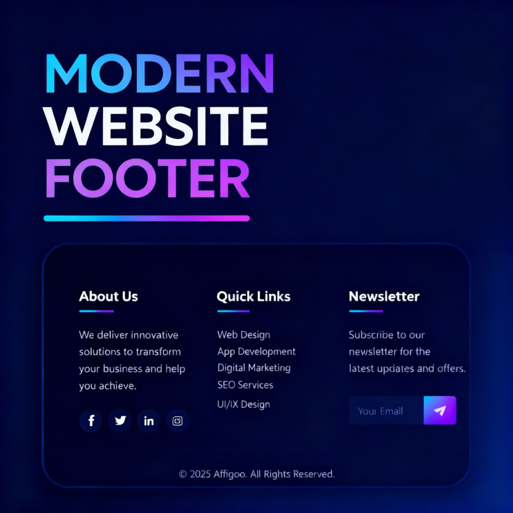
Output

Conclusion
Excellent! You have developed a nicely designed modern footer using nothing but HTML and CSS. The footer has more uses than beauty. It tells the visitors of your Web site where to look for the information they want. It assures the visitors and makes the site look as though it has been completed. Continue experimenting with colors, layouts and effects that go with the year style of your product. Each small detail that you give it adds much strength and a more finished appearance to your Web site.
FAQs
What is the function of the footer of a website?
A footer offers visitors features to the site, useful links, and most important gives a professional and finished image to your site.
Can I code a footer without using JavaScript?
Sure! You can code a modern footer, fully functional without JavaScript code.
How do I make the footer responsive?
Use CSS Grid, Flexbox, and media queries to control the responsive nature of your footer.
Can I change the design colors of the footer?
Sure! You can change the design of background colors, text colors and hover features, to help your web theme!
What is the importance of a newsletter section in the footer?
You will keep up your contacts with your audiences and allow growth by means of your community by email newsletters direct!