
Discover how to build a modern neo login & signup interface using HTML, CSS, and JavaScript. This comprehensive tutorial includes full source code, dynamic animations, and dark mode support to help you create a stunning authentication page.
Project Introduction
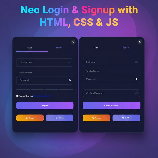
Welcome to this thrilling new project – The Neo Login & Signup Form developed using HTML, CSS and Javascript! In this tutorial we will be making a modern, futuristic looking login page, which incorporates some creativity and usability! So whether you are an absolute beginner looking for some front end design, or you are a developer looking to improve your UI development skills, then this project will lead you through presentation of each step to create what will be a glowing attractive interface which incorporates some of the trends of web design today.
You will learn about creating a responsive layout, interactivity and animations, as well as implementing Dark Mode, all using clean readable code. By the end of this tutorial you will have a complete, functional and lacquered looking login and signup form, which works well and can easily be incorporated into whatever web project you are working on.
So let’s get our code editor ready, a nice cup of coffee and set off into the neon lighting of modern day web design!
Why a Modern Neo Login UI Matters
A modern Neo Login UI now welcomes users instantly with animations, dark mode and responsive design. It creates trust with entry into a new era of authentication that reduces friction in the experience, engages the user and impacts sign in and sign up positively all while giving a great impression. Displaying a modern professional experience and enhancing the login experience is the Neo Login & Signup UI. The responsive design, smooth animations and dark mode build a seamless experience while giving them a modern professional experience. A well done and design login page is functional and builds trust by allowing for visitor engagement.
Setting Up Your Project Folder
Before we get started with writing any code, you need to set up your development environment. Create a folder for your project called neo-auth-ui, and within that folder create the following three files: index.html for your markup, style.css for your styling and lastly script.js for your implementation in JavaScript. Keeping everything organised is conducive to development, and means pages load quickly when accessed, and perform better, which is better for SEO and that is a way to gain favour with Google as well.
Let’s Start Coding
HTML code
Open your index.html file, and let’s get started! Here’s the HTML structure for the project:
<!DOCTYPE html>
<html lang="en">
<head>
    <meta charset="UTF-8">
    <meta name="viewport" content="width=device-width, initial-scale=1.0">
    <title>Neon Auth Interface</title>
    <link rel="stylesheet" href="style.css">
    <link rel="stylesheet" href="https://cdnjs.cloudflare.com/ajax/libs/font-awesome/6.0.0/css/all.min.css">
</head>
<body>
    <div class="auth-container">
        <button class="dark-mode-toggle">
            <i class="fas fa-moon"></i>
        </button>

        <div class="form-toggle">
            <div class="toggle-indicator"></div>
            <button class="toggle-btn active" data-form="login">Login</button>
            <button class="toggle-btn" data-form="signup">Sign Up</button>
        </div>

        <!-- Login Form -->
        <form id="loginForm" class="auth-form active">
            <div class="alert" id="loginAlert"></div>

            <div class="form-group">
                <input type="email" class="form-input" id="loginEmail" placeholder=" ">
                <label class="floating-label">Email Address</label>
            </div>

            <div class="form-group">
                <input type="password" class="form-input" id="loginPassword" placeholder=" ">
                <label class="floating-label">Password</label>
                <button type="button" class="password-toggle">
                    <i class="fas fa-eye"></i>
                </button>
            </div>

            <div class="form-group">
                <label class="checkbox">
                    <input type="checkbox"> Remember me
                </label>
                <a href="#forgot-password" class="text-link">Forgot Password?</a>
            </div>

            <button type="submit" class="btn-primary">Sign In</button>
        </form>

        <!-- Signup Form -->
        <form id="signupForm" class="auth-form">
            <div class="alert" id="signupAlert"></div>

            <div class="form-group">
                <input type="text" class="form-input" id="fullName" placeholder=" ">
                <label class="floating-label">Full Name</label>
            </div>

            <div class="form-group">
                <input type="email" class="form-input" id="email" placeholder=" ">
                <label class="floating-label">Email Address</label>
            </div>

            <div class="form-group">
                <input type="password" class="form-input" id="password" placeholder=" ">
                <label class="floating-label">Password</label>
                <button type="button" class="password-toggle">
                    <i class="fas fa-eye"></i>
                </button>
                <div class="strength-meter">
                    <div class="strength-segment"></div>
                    <div class="strength-segment"></div>
                    <div class="strength-segment"></div>
                    <div class="strength-segment"></div>
                </div>
            </div>

            <div class="form-group">
                <input type="password" class="form-input" id="confirmPassword" placeholder=" ">
                <label class="floating-label">Confirm Password</label>
            </div>


            <button type="submit" class="btn-primary">Create Account</button>
        </form>

        <div class="social-login">
            <button class="social-btn google">
                <i class="fab fa-google"></i>
                <span>Google</span>
            </button>
            <button class="social-btn github">
                <i class="fab fa-github"></i>
                <span>GitHub</span>
            </button>
        </div>
    </div>
    <script src="script.js"></script>
</body>
</html>
Explained
<!DOCTYPE html> & <html lang="en">
This just sets the stage for our document. It tells the browser, “Hey, this is an HTML5 document,” and that the language is English.
<head> Section: The Essentials
Inside the <head>, we’ve got the basic meta tags:
<meta charset="UTF-8">: Supports all kinds of characters (like emojis or non-English letters).<meta name="viewport"...>: Makes the layout responsive so it looks great on mobile.<title>Neon Auth Interface: This is what shows up on the browser tab.- Font Awesome CDN: We’re pulling in some sleek icons from Font Awesome (like the eye icon and moon icon). It’s all about aesthetics, right.
<body> Starts Here: The Real Deal
Now we step into the visible part of the webpage.
🔲 Main Wrapper: .auth-container
This container wraps everything — kind of like the outer box holding all the elements for login and signup.
🌗 Dark Mode Toggle
<button class="dark-mode-toggle">
    <i class="fas fa-moon"></i>
</button>
This little button lets users switch between light and dark mode. The moon icon makes it intuitive.
Form Toggle Buttons
<div class="form-toggle">
    <button class="toggle-btn active" data-form="login">Login</button>
    <button class="toggle-btn" data-form="signup">Sign Up</button>
</div>
These buttons let users switch between the Login and Sign Up forms without reloading the page. The “active” class highlights which one is currently selected.
Login Form
<form id="loginForm" class="auth-form active">auth-formis the class for styling.activemeans it’s visible by default.
Inside this form:
- Email input
- Password input with eye icon (to show/hide password)
- “Remember me” checkbox
- “Forgot Password” link
- Submit button that says “Sign In”
<form id="signupForm" class="auth-form">This form is hidden by default until the “Sign Up” button is clicked.
It includes:
- Full name
- Password with strength meter (cool!)
- Confirm Password
- Create Account button
Social Login Section
<div class="social-login">
    <button class="social-btn google">Google</button>
    <button class="social-btn github">GitHub</button>
</div>
These buttons allow users to sign up or log in using Google or GitHub. It’s optional, but a great UX feature.
CSS Styling
Alright, now let’s start styling with CSS. Open the next file, which is the CSS file.
        /* ====================== */
        /* CSS Variables */
        /* ====================== */
        :root {
            --primary: #6366f1;
            --secondary: #4f46e5;
            --accent: #a855f7;
            --text: #f8fafc;
            --bg: #0f172a;
            --card-bg: rgba(15, 23, 42, 0.95);
            --shadow: 0 4px 6px -1px rgba(0, 0, 0, 0.5);
            --error: #ef4444;
            --success: #22c55e;
            --glass: rgba(255, 255, 255, 0.1);
            --neon: 0 0 15px rgba(99, 102, 241, 0.5);
        }

        /* ====================== */
        /* Theme Overrides */
        /* ====================== */
        body.light-mode {
            --text: #0f172a;
            --bg: #f8fafc;
            --card-bg: rgba(255, 255, 255, 0.95);
            --glass: rgba(0, 0, 0, 0.1);
            --error: #dc2626;
            --success: #16a34a;
            --neon: 0 0 15px rgba(99, 102, 241, 0.3);
        }

        /* ====================== */
        /* Base Styles */
        /* ====================== */
        * {
            margin: 0;
            padding: 0;
            box-sizing: border-box;
            transition: all 0.3s cubic-bezier(0.4, 0, 0.2, 1);
        }

        body {
            font-family: 'Inter', sans-serif;
            background: var(--bg);
            color: var(--text);
            min-height: 100vh;
            display: flex;
            align-items: center;
            justify-content: center;
            background-image:
                linear-gradient(135deg, rgba(99, 102, 241, 0.1) 0%, rgba(168, 85, 247, 0.1) 100%),
                radial-gradient(circle at 50% 50%, var(--primary) 0%, transparent 60%);
            animation: bg-pulse 8s infinite;
        }

        /* ====================== */
        /* Animations */
        /* ====================== */
        @keyframes cyberPulse {
            0% { filter: drop-shadow(0 0 2px var(--primary)); }
            50% { filter: drop-shadow(0 0 10px var(--accent)); }
            100% { filter: drop-shadow(0 0 2px var(--primary)); }
        }

        @keyframes buttonFloat {
            0% { transform: translateY(0); }
            50% { transform: translateY(-10px); }
            100% { transform: translateY(0); }
        }

        @keyframes particleExplode {
            0% { transform: scale(0); opacity: 1; }
            100% { transform: scale(5); opacity: 0; }
        }

        @keyframes bg-pulse {
            0%, 100% { background-size: 100% 100%, 200% 200%; }
            50% { background-size: 120% 120%, 180% 180%; }
        }

        @keyframes formSlide {
            from { opacity: 0; transform: translateY(30px); }
            to { opacity: 1; transform: translateY(0); }
        }

        @keyframes ripple {
            from { transform: scale(0); opacity: 1; }
            to { transform: scale(10); opacity: 0; }
        }

        @keyframes fadeIn {
            from { opacity: 0; transform: translateY(20px); }
            to { opacity: 1; transform: translateY(0); }
        }

        /* ====================== */
        /* Auth Container */
        /* ====================== */
        .auth-container {
            background: var(--card-bg);
            backdrop-filter: blur(20px) saturate(180%);
            border-radius: 2rem;
            box-shadow: var(--shadow), var(--neon);
            width: 90%;
            max-width: 500px;
            padding: 3rem 2rem;
            position: relative;
            overflow: hidden;
            border: 1px solid var(--glass);
            transform-style: preserve-3d;
            animation: cyberPulse 3s infinite;
            transition: transform 0.3s ease;
        }

        /* ====================== */
        /* Form Toggle */
        /* ====================== */
        .form-toggle {
            display: flex;
            gap: 1rem;
            margin-bottom: 3rem;
            position: relative;
        }

        .toggle-indicator {
            position: absolute;
            bottom: 0;
            left: 0;
            height: 3px;
            background: linear-gradient(90deg, var(--primary), var(--accent));
            border-radius: 2px;
            transition: all 0.4s cubic-bezier(0.68, -0.55, 0.265, 1.55);
            filter: drop-shadow(0 0 5px var(--primary));
        }

        .toggle-btn {
            flex: 1;
            padding: 1.2rem;
            border: none;
            background: transparent;
            color: var(--text);
            border-radius: 0.75rem;
            cursor: pointer;
            font-weight: 600;
            position: relative;
            z-index: 1;
            transition: all 0.4s cubic-bezier(0.68, -0.55, 0.265, 1.55);
        }

        .toggle-btn.active {
            color: var(--primary);
            text-shadow: 0 0 10px rgba(99, 102, 241, 0.3);
        }

        /* ====================== */
        /* Form Elements */
        /* ====================== */
        .auth-form {
            display: none;
            opacity: 0;
            transform: translateY(20px);
        }

        .auth-form.active {
            display: block;
            opacity: 1;
            transform: translateY(0);
            animation: formSlide 0.6s cubic-bezier(0.68, -0.55, 0.265, 1.55);
        }

        .form-group {
            margin-bottom: 2rem;
            position: relative;
        }

        .form-input {
            width: 100%;
            padding: 1.2rem;
            border: 2px solid var(--glass);
            border-radius: 1rem;
            background: transparent;
            color: var(--text);
            font-size: 1rem;
            transition: all 0.3s ease;
        }

        .form-input:focus {
            outline: none;
            border-color: var(--primary);
            box-shadow: 0 0 20px rgba(99, 102, 241, 0.2);
            animation: buttonFloat 0.5s ease-out;
        }

        .floating-label {
            position: absolute;
            left: 1.2rem;
            top: 50%;
            transform: translateY(-50%);
            pointer-events: none;
            background: linear-gradient(to bottom, var(--card-bg) 60%, transparent);
            padding: 0 0.5rem;
            transition: all 0.3s cubic-bezier(0.68, -0.55, 0.265, 1.55);
            color: #94a3b8;
        }

        .form-input:focus ~ .floating-label,
        .form-input:not(:placeholder-shown) ~ .floating-label {
            top: 0;
            font-size: 0.875rem;
            color: var(--primary);
            transform: translateY(-50%) scale(0.9);
        }

        /* ====================== */
        /* Buttons & Interactions */
        /* ====================== */
        .btn-primary {
            width: 100%;
            padding: 1.2rem;
            background: linear-gradient(45deg, var(--primary), var(--accent));
            color: white;
            border: none;
            border-radius: 1rem;
            font-weight: 600;
            cursor: pointer;
            position: relative;
            overflow: hidden;
            transform: translateZ(0);
        }

        .btn-primary:hover {
            animation: buttonFloat 0.8s ease-in-out infinite;
        }

        .btn-primary::after {
            content: '';
            position: absolute;
            top: 0;
            left: -100%;
            width: 100%;
            height: 100%;
            background: linear-gradient(120deg, transparent, rgba(255, 255, 255, 0.2), transparent);
            transition: all 0.6s cubic-bezier(0.4, 0, 0.2, 1);
        }

        .btn-primary:hover::after {
            left: 100%;
        }

        .password-toggle {
            position: absolute;
            right: 1.2rem;
            top: 50%;
            transform: translateY(-50%);
            background: none;
            border: none;
            color: var(--text);
            cursor: pointer;
            z-index: 2;
            transition: all 0.3s ease;
        }

        .password-toggle:hover {
            color: var(--primary);
            transform: translateY(-50%) scale(1.1);
        }

        /* ====================== */
        /* Password Strength */
        /* ====================== */
        .strength-meter {
            display: flex;
            gap: 4px;
            height: 4px;
            margin-top: 0.5rem;
        }

        .strength-segment {
            flex: 1;
            height: 100%;
            background: #334155;
            border-radius: 2px;
            transition: all 0.3s ease;
        }

        /* ====================== */
        /* Social Login */
        /* ====================== */
        .social-login {
            display: flex;
            gap: 1rem;
            margin: 2rem 0;
            position: relative;
            z-index: 1;
        }

        .social-btn {
            flex: 1;
            padding: 1rem;
            border: 1px solid var(--glass);
            border-radius: 1rem;
            background: rgba(255, 255, 255, 0.05);
            color: var(--text);
            cursor: pointer;
            display: flex;
            align-items: center;
            justify-content: center;
            gap: 0.5rem;
            transition: all 0.3s ease;
            backdrop-filter: blur(5px);
            position: relative;
            overflow: hidden;
        }

        .social-btn::before {
            content: '';
            position: absolute;
            top: 0;
            left: -100%;
            width: 100%;
            height: 100%;
            background: linear-gradient(90deg, transparent, rgba(255, 255, 255, 0.1), transparent);
            transition: 0.5s;
        }

        .social-btn:hover::before {
            left: 100%;
        }

        .social-btn.google {
            background: linear-gradient(45deg, #F4B400, #DB4437);
            border-color: #F4B400;
        }

        .social-btn.github {
            background: linear-gradient(50deg, #7e80e0, #5b5de2);
            border-color: #333;
        }

        .social-btn:hover {
            transform: translateY(-3px);
            box-shadow: 0 4px 15px rgba(99, 102, 241, 0.3);
        }

        /* ====================== */
        /* Utility Classes */
        /* ====================== */
        .alert {
            padding: 1rem;
            border-radius: 1rem;
            margin: 1rem 0;
            display: none;
            backdrop-filter: blur(5px);
            border: 1px solid transparent;
        }

        .alert-success {
            background: rgba(34, 197, 94, 0.15);
            border-color: var(--success);
            color: var(--success);
        }

        .alert-error {
            background: rgba(239, 68, 68, 0.15);
            border-color: var(--error);
            color: var(--error);
        }

        .dark-mode-toggle {
            position: absolute;
            top: 1rem;
            right: 1rem;
            background: var(--glass);
            border: none;
            color: var(--text);
            padding: 0.75rem;
            border-radius: 50%;
            cursor: pointer;
            transition: all 0.3s ease;
            backdrop-filter: blur(5px);
        }

        .dark-mode-toggle:hover {
            transform: rotate(15deg) scale(1.1);
            box-shadow: var(--neon);
        }

        /* ====================== */
        /* Particle Effects */
        /* ====================== */
        .particle {
            position: absolute;
            background: radial-gradient(var(--primary), transparent);
            border-radius: 50%;
            pointer-events: none;
            animation: particleExplode 1s forwards;
        }

        /* ====================== */
        /* Media Queries */
        /* ====================== */
        @media (max-width: 480px) {
            .auth-container {
                padding: 1.5rem;
                border-radius: 1rem;
            }

            .form-toggle {
                flex-direction: column;
            }

            .toggle-btn {
                padding: 1rem;
            }

            .social-login {
                flex-direction: column;
            }
        }
Explained
CSS Variables
At the top, we define a bunch of custom variables using :root. These make our design more flexible and consistent.
:root {
  --primary: #6366f1;
  --secondary: #4f46e5;
  --accent: #a855f7;
  ...
}
Variables like --primary or --text help us apply colors throughout the design. If we want to change the color scheme later, we only need to update it in one place.
Base Style
* {
  margin: 0;
  padding: 0;
  box-sizing: border-box;
  transition: al
We set some global defaults: remove padding/margin, apply box-sizing, and make transitions smooth.
Animations
There are custom animations like cyberPulse, buttonFloat, formSlide, and more.
For example:
@keyframes cyberPulse {
  0% { filter: drop-shadow(0 0 2px var(--primary)); }
  ...
}
These animations are used to create smooth effects for buttons, form inputs, background pulsing, etc.
Auth Container
.auth-container {
  backdrop-filter: blur(20px);
  border-radius: 2rem;
  box-shadow: var(--shadow), var(--neon);
  ...
}- This is the main form box with a blurred glassy background, rounded corners, and a glowing neon-like border.
- It also uses the
cyberPulseanimation for a subtle glowing effect.
Form Toggle Buttons
.form-toggle {
  display: flex;
  gap: 1rem;
  ...
}- This section handles the “Sign In / Sign Up” tab switching.
- It includes a fancy underline indicator that slides smoothly when toggling between forms.
Responsive Design
@media (max-width: 480px) {
  .form-toggle {
    flex-direction: column;
  }
}
we use media queries to ensure the form looks good on small screens. It stacks toggle buttons and social logins vertically.

JavaScript Functionality
Now let’s add some interactivity with JavaScript. Open the next file, which is the JavaScript file. This is where the real magic happens—switching between login and signup, toggling password visibility, handling themes, and validating user input.
        // Dark Mode Toggle with Local Storage
        const darkModeToggle = document.querySelector('.dark-mode-toggle');
        const currentTheme = localStorage.getItem('theme') || 'dark';

        if (currentTheme === 'light') {
            document.body.classList.add('light-mode');
            darkModeToggle.querySelector('i').classList.replace('fa-moon', 'fa-sun');
        }

        darkModeToggle.addEventListener('click', () => {
            document.body.classList.toggle('light-mode');
            const isLight = document.body.classList.contains('light-mode');
            localStorage.setItem('theme', isLight ? 'light' : 'dark');
            darkModeToggle.querySelector('i').classList.toggle('fa-sun');
            darkModeToggle.querySelector('i').classList.toggle('fa-moon');
        });

        // Password Toggle Functionality
document.querySelector('.auth-container').addEventListener('click', (e) => {
    const passwordToggle = e.target.closest('.password-toggle');
    if (passwordToggle) {
        const formGroup = passwordToggle.closest('.form-group');
        const input = formGroup.querySelector('input[type="password"], input[type="text"]');
        const icon = passwordToggle.querySelector('i');

        input.type = input.type === 'password' ? 'text' : 'password';
        icon.classList.toggle('fa-eye-slash');
        passwordToggle.classList.toggle('active');
    }
});

        // Form Toggle with Animated Indicator
        const toggleBtns = document.querySelectorAll('.toggle-btn');
        const toggleIndicator = document.querySelector('.toggle-indicator');
        const forms = document.querySelectorAll('.auth-form');

        function updateToggleIndicator(activeBtn) {
            const { left, width } = activeBtn.getBoundingClientRect();
            const containerLeft = document.querySelector('.form-toggle').getBoundingClientRect().left;
            toggleIndicator.style.width = `${width}px`;
            toggleIndicator.style.transform = `translateX(${left - containerLeft}px)`;
        }

        toggleBtns.forEach(btn => {
            btn.addEventListener('click', () => {
                toggleBtns.forEach(b => b.classList.remove('active'));
                btn.classList.add('active');
                updateToggleIndicator(btn);

                const formId = btn.dataset.form;
                forms.forEach(form => {
                    form.classList.remove('active');
                    if(form.id === `${formId}Form`) {
                        setTimeout(() => form.classList.add('active'), 200);
                    }
                });
            });
        });

        // Initialize toggle indicator
        updateToggleIndicator(document.querySelector('.toggle-btn.active'));

        // Password Strength Check
        document.getElementById('password')?.addEventListener('input', function(e) {
            const password = e.target.value;
            const segments = document.querySelectorAll('.strength-segment');

            const strength = Math.min(4,
                (password.length >= 8) +
                (/[A-Z]/.test(password)) +
                (/[0-9]/.test(password)) +
                (/[^A-Za-z0-9]/.test(password))
            );

            segments.forEach((seg, index) => {
                seg.style.backgroundColor = index < strength ?
                    (strength < 2 ? 'var(--error)' :
                     strength < 4 ? '#f59e0b' : 'var(--success)') :
                    '#334155';
                seg.style.transform = index < strength ? 'scaleY(1.5)' : 'scaleY(1)';
            });
        });

        // Form Validation
        const validateEmail = (email) => /^[^\s@]+@[^\s@]+\.[^\s@]+$/.test(email);
        const validatePassword = (password) => password.length >= 8;
        const validateConfirmPassword = (pass, confirm) => pass === confirm;

        // Alert System
        function showAlert(containerId, message, type) {
            const alert = document.getElementById(containerId);
            alert.textContent = message;
            alert.className = `alert alert-${type}`;
            alert.style.display = 'block';
            alert.style.animation = 'fadeIn 0.3s ease';
            setTimeout(() => {
                alert.style.display = 'none';
                alert.style.animation = '';
            }, 5000);
        }

        // Login Form Submission
        document.getElementById('loginForm').addEventListener('submit', (e) => {
            e.preventDefault();
            const email = document.getElementById('loginEmail').value;
            const password = document.getElementById('loginPassword').value;

            if (!validateEmail(email)) {
                showAlert('loginAlert', 'Invalid email address', 'error');
                return;
            }

            if (!validatePassword(password)) {
                showAlert('loginAlert', 'Password must be 8+ characters', 'error');
                return;
            }

            showAlert('loginAlert', 'Logging in...', 'success');
            setTimeout(() => window.location.href = 'https://codeweave24.com/', 1500);
        });

        // Signup Form Submission
        document.getElementById('signupForm').addEventListener('submit', (e) => {
            e.preventDefault();
            const fullName = document.getElementById('fullName').value;
            const email = document.getElementById('email').value;
            const password = document.getElementById('password').value;
            const confirmPassword = document.getElementById('confirmPassword').value;


            if (!fullName.trim()) {
                showAlert('signupAlert', 'Full name required', 'error');
                return;
            }

            if (!validateEmail(email)) {
                showAlert('signupAlert', 'Invalid email address', 'error');
                return;
            }

            if (!validatePassword(password)) {
                showAlert('signupAlert', 'Password must be 8+ characters', 'error');
                return;
            }

            if (!validateConfirmPassword(password, confirmPassword)) {
                showAlert('signupAlert', 'Passwords don\'t match', 'error');
                return;
            }


            showAlert('signupAlert', 'Creating account...', 'success');
            setTimeout(() => window.location.href = 'https://codeweave24.com/', 2000);
        });

        // Social Login Handlers
        document.querySelectorAll('.social-btn').forEach(btn => {
            btn.addEventListener('click', (e) => {
                e.preventDefault();
                const provider = btn.classList.contains('google') ? 'Google' : 'GitHub';
                showAlert('loginAlert', `Redirecting to ${provider}...`, 'success');
            });
        });

        // Ripple Effect
        document.querySelectorAll('button').forEach(btn => {
            btn.addEventListener('click', function(e) {
                const ripple = document.createElement('div');
                ripple.style.cssText = `
                    position: absolute;
                    width: 20px;
                    height: 20px;
                    background: rgba(255, 255, 255, 0.4);
                    border-radius: 50%;
                    transform: translate(-50%, -50%);
                    pointer-events: none;
                    animation: ripple 0.6s ease-out;
                `;
                ripple.style.left = `${e.offsetX}px`;
                ripple.style.top = `${e.offsetY}px`;
                this.appendChild(ripple);
                setTimeout(() => ripple.remove(), 600);
            });
        });

        // Input Field Interactions
        document.querySelectorAll('.form-input').forEach(input => {
            input.addEventListener('focus', () => {
                input.previousElementSibling.style.color = 'var(--primary)';
            });

            input.addEventListener('blur', () => {
                if (!input.value) {
                    input.previousElementSibling.style.color = '#64748b';
                }
            });
        });

        // Forgot Password Handler
        document.querySelector('a[href="#forgot-password"]').addEventListener('click', (e) => {
            e.preventDefault();
            showAlert('loginAlert', 'Password reset email sent', 'success');
        });

         // Add particle animation to buttons
         function createParticles(e) {
            const particles = [];
            for(let i = 0; i < 20; i++) {
                const particle = document.createElement('div');
                particle.className = 'particle';
                particle.style.cssText = `
                    left: ${e.clientX}px;
                    top: ${e.clientY}px;
                    width: ${Math.random() * 10 + 5}px;
                    height: ${Math.random() * 10 + 5}px;
                    animation-delay: ${Math.random() * 0.5}s;
                `;
                document.body.appendChild(particle);
                particles.push(particle);
            }

            particles.forEach(particle => {
                setTimeout(() => particle.remove(), 1000);
            });
        }

        // Add 3D hover effect
        let timeout;
        document.addEventListener('mousemove', (e) => {
            const container = document.querySelector('.auth-container');
            const { left, top, width, height } = container.getBoundingClientRect();
            const centerX = left + width/2;
            const centerY = top + height/2;

            const rotateX = (e.clientY - centerY) / 15;
            const rotateY = (e.clientX - centerX) / -15;

            container.style.transform = `
                perspective(1000px)
                rotateX(${rotateX}deg)
                rotateY(${rotateY}deg)
            `;

            clearTimeout(timeout);
            timeout = setTimeout(() => {
                container.style.transform = 'perspective(1000px) rotateX(0) rotateY(0)';
            }, 1000);
        });

        // Add particle effect to form submission
        document.querySelectorAll('button').forEach(btn => {
            btn.addEventListener('click', function(e) {
                createParticles(e);
                // Existing ripple effect code...
            });
        });

        // Enhanced password strength animation
        document.getElementById('password')?.addEventListener('input', function(e) {
            // Existing strength check code...
            segments.forEach((seg, index) => {
                if(index < strength) {
                    seg.style.animation = `cyberPulse 0.5s ${index * 0.1}s`;
                }
            });
        });
Explained
Dark Mode Toggle with Local Storage
const darkModeToggle = document.querySelector('.dark-mode-toggle');
const currentTheme = localStorage.getItem('theme') || 'dark';
Checks local storage for a saved theme (light or dark). Defaults to dark.
If the theme is light, it updates the UI accordingly:
if (currentTheme === 'light') {
    document.body.classList.add('light-mode');
    darkModeToggle.querySelector('i').classList.replace('fa-moon', 'fa-sun');
}
Clicking the toggle button switches themes and updates local storage:
darkModeToggle.addEventListener('click', () => {
    document.body.classList.toggle('light-mode');
    const isLight = document.body.classList.contains('light-mode');
    localStorage.setItem('theme', isLight ? 'light' : 'dark');
    darkModeToggle.querySelector('i').classList.toggle('fa-sun');
    darkModeToggle.querySelector('i').classList.toggle('fa-moon');
});
Password Show/Hide Toggle
document.querySelector('.auth-container').addEventListener('click', (e) => {
    const passwordToggle = e.target.closest('.password-toggle');
    ...
});
Listens for clicks inside the auth container.
If the clicked element is a password toggle button, it toggles between 'password' and 'text' types and switches the icon (fa-eye/fa-eye-slash).
Form Switch (Login / Signup) with Animation
const toggleBtns = document.querySelectorAll('.toggle-btn');
const toggleIndicator = document.querySelector('.toggle-indicator');
...
Adds click listeners to toggle buttons.
When clicked, it:
- Highlights the selected button.
- Moves the animated indicator.
- Switches the visible form (
loginForm,signupForm, etc.).
Password Strength Meter
document.getElementById('password')?.addEventListener('input', function(e) {
    ...
});- Checks the password as the user types and updates 4 strength bars.
- Rules:
- Min 8 characters
- Contains uppercase
- Contains numbers
- Has special characters
The color of the bars changes based on strength level:
- Weak → Red
- Medium → Yellow
- Strong → Green
Form Validation Functions
const validateEmail = (email) => /^[^\s@]+@[^\s@]+\.[^\s@]+$/.test(email);
const validatePassword = (password) => password.length >= 8;
const validateConfirmPassword = (pass, confirm) => pass === confirm;
Used in both Login and Signup forms to ensure valid input.
his JavaScript ties together every visual and functional aspect of your authentication UI. From toggles and animations to form validation and feedback—this is a well-rounded, interactive experience users will love.
Final output

Conclusion
Congratulations! You created a super-modern Neo Login & Signup interface with HTML, CSS & Javascript. This is not just a fancy interface but a fully functional responsive user-friendly authentication interface. It features dark mode capability with smooth animations, password strength and social logins.
This interface increases user engagement, trust and retaining users as well as keeping your website modern and professional. It is fast, lightweight, SEO-friendly and it can be fully customized to your needs. Portfolios, apps or clients.
The next thing to do is to connect it to a backend interface for it to be fully functional. Maybe change the colors and animation effects to suit your branding as well as your users so that they will have a smooth, interactive and useful experience with it which makes it an interesting piece for the digital world out there.
FAQs
Is the Neo Login UI reusable in any project?
Certainly! The Neo Login UI is completely responsive and scalable. It can be pasted into applications, portfolios and even client sites. You will need to copy the HTML, CSS and JS documents.
Is the login secure?
Although the UI and front-end controls are properly functional, real security must be enlisted through back-end methods. This would entail having your login working from a server, using https and safely and securely storing passwords (hashed and salted). The tutorial deals with the front-end experience only and the beauty of the design.
Does it work on mobiles and every device?
Yes! The responsive style means that your login/signup areas are set out just nicely on different devices which can include desktop, tablet and mobile. Also media queries can adjust styles and positioning of buttons for smaller devices.
Can the colors and animations be changed?
Absolutely! The UI is created through variables in CSS so all the colors, gradients and neon effects can be changed simply by changing a few lines in your style.css. The animations cyberPulse and formSlide can be altered for your branding also.
Here you can see how the project works by clicking the View Demo button. You can also download all the project resources by clicking the Download Resources button. Enjoy and happy coding keep learning!