
In this tutorial, you will learn how to create a cool modernized login form responsive using html css javascript for interactivity. We shall go step by step to build a beautiful interface that takes full advantage of using glassmorphism effects, animated particles, gradient buttons and animation to toggle password visibility. This is a great tutorial for web developers who want a polished looking login page that works on desktops and mobile devices efficiently without the help of heavy libraries or frameworks.
Introduction
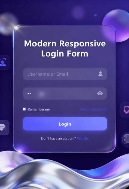
The login form is usually the first point of contact for the users coming to your website so it is of utmost importance that you make it not only functional but also very appealing to the eye. The NeoAccess Login Form implements the more modern forms of web design such as glassmorphism, smooth gradient buttons, and subtle animations to enhance the user experience. It is also fully responsive which means that it looks great on any desktop, tablet or smartphone.In this tutorial, we will go over how you can build this form step by step, starting with the HTML structure, the CSS layout and finally the JavaScript interactions. By the end of it, you will have your own professional looking login form which you can integrate into any web project.
Why Responsive Login Forms Are Essential
Users today switch from device to device using phones, tablets and computers. A responsive login form allows your design to transition smoothly to any screen size without looking breaking. Not only does it aesthetically look better, but responsiveness improves accessibility, improves user trust and drives engagement.
A non-responsive login form is furthermore frustrating to use and looks outdated. The NeoAccess Login Form accounts for every kind of layout or input field or animation. This allows for optimal usability because it allows every component of industry-standard practices, while allowing full efficiency of the users agenda to sign-in, and prevents the somewhat archaic method existing user interface implementation.
Prerequisites
Before setting out, you ought to assemble a number of necessary tools. Do not panic. You do not need to be an expert in coding, but should have a layman’s knowledge of the web as well as tools of the proper kind.
Before you set out upon your journey, you should collect the following good things.
- Basic knowledge of HTML, CSS and of JavaScript.
- A Code Editor like Visual Studio Code, Sublime Text or Others.
- A Modern Browser such as Chrome, Firefox, Edge or Safari for testing.
- A Project Folder in which to put your files.
- Creative Spirit because we are adding style and not just structure.
Tools & Libraries
To start putting together the NeoAccess login form we will need some very good tools and libraries to help us build it and get at the same time a good looking design.
- Font Awesome – Icons such as user avatar, toggle icons and social icons.
- CSS Animations & Transitions – To get delightful hover effect, glowing backgrounds and shake effects for output.
- JavaScript – To provide us interactivity, toggle password form validation, film actions etc.
- Text Editor & Browser VS Code, Sublime Text or Atom and a modern browser for live previews.
- This array of tools will keep our project minimal and produce professional results.
Project Setup
Before we start the code let’s set up our project, so it all stays neat and tidy. What’s the word, if we are putting your login form into a home.
Here what you need to do:
- Create a folder – Something like neoaccess-login so we can keep all files together.
- Create an HTML file – index.html will hold the structure of your form.
- Create a CSS file – style.css will take care of colour, fonts and animations.
- Create a JS file – main.js will take care of the end user interaction such as toggle passwords and validations.
- Link the files – Both the CSS and JS needs to be linked to the index.html so that it all works together.
This way your project will be a lot odder and easier to manage whilst building.
HTML Code
The HTML is what powers our login page. It makes all of the content and structure. Let’s examine each part:
1. TML Template
<!DOCTYPE html>
<html lang="en">
  <head>
    <meta charset="UTF-8" />
    <meta name="viewport" content="width=device-width, initial-scale=1.0" />
    <title>NeoAccess | Modern Login</title>
    <link
      rel="stylesheet"
      href="https://cdnjs.cloudflare.com/ajax/libs/font-awesome/6.4.0/css/all.min.css"
    />
    <link rel="stylesheet" href="style.css" />
  </head>
Explanation
- The doctype html states that this document uses HTML5.
- The html lang equals en opens the webpage and sets language to English.
- The meta charset equals utf-8 allows special characters to be displayed correctly.
- The meta name equals viewport allow the page to be displayed on all screen sizes such as phones and computers.
- The title element sets the name of the page that displays in the unxaps of the screen.
- The link element connects to external files such as Font Awesome for icons or style.css for layouts.
2. Body & Background Glow Elements
  <body>
    <!-- Animated background elements -->
    <div class="glow" style="top: 10%; left: 10%"></div>
    <div
      class="glow"
      style="bottom: 15%; right: 15%; animation-delay: -2s"
    ></div>
    <div class="glow" style="top: 30%; right: 20%; animation-delay: -4s"></div>

    <div class="particles" id="particles"></div>
Explanation
- These <div> elements provide the animated glowing effect and particles in the background.
- .glow divs are large blurred circles that move slightly for a modern dreamy effect.
- #particles will hold jittering little dots, which float around; this will be done with JavaScript, to give some extra liveliness.
Think of these as, “the vibe” of your page — they help to make the login form dynamic and interesting.
3. Main Login Container
<div class="container">
 <div class="login-box">
 <h2>Welcome Back</h2>
Explanation
- The .container centers everything on the page.
- The .login-box is the actual glassmorphic login form. It has background blur, rounded corners, and shadow.
- <h2> is the heading that goes at the top — it welcomes the user.
4. Login Form Fields
        <form id="loginForm">
          <div class="input-box">
            <input
              type="text"
              id="username"
              required
              placeholder="Username or Email"
            />
            <i class="fas fa-user"></i>
          </div>
          <div class="input-box">
            <input
              type="password"
              id="password"
              required
              placeholder="Password"
            />
            <i class="fas fa-eye" id="togglePassword"></i>
          </div>
Explanation
- <form> holds all the input fields and buttons.
- The .input-box wraps each input so it can be styled.
- The input type=”text” is for username or email.
- The input type=”password” is for secure password input.
- The icons (from Font Awesome) throw in a user icon and an eye icon to toggle the visibility of the password.
This all gives a polished and user friendly appearance.
5. Remember Me & Forgot Password
<div class="remember-forgot">
 <label> <input type="checkbox" /> Remember me </label>
  <a href="#">Forgot Password?</a>
 </div>
Explanation
- Checkbox lets a user keep their login active.
- “Forgot Password?” link lets users regain their signed in status.
- .remember-forgot is styled such that both appear side by side.
6. Login Button & Register Link
<button type="submit" class="btn">Login</button>
 <div class="register-link">
   Don't have an account? <a href="#">Register</a>
     </div>
     </form>
     </div>
   </div>
Explanation
- .btn is the login button—styled using gradients and hover effects with CSS.
- .register-link allows new users to register and make the webpage friendly and all encompassing.
7. Linking JavaScript
<script src="main.js"></script>
</body>
</html>
Explanation
- <script src=”main.js”></script> Adds interactivity: password toggles, shake effects for empty fields, etc. aside the usual particles and simulated pulsating login.
- This leaves HTML clean and adds dynamic behaviour.
<!DOCTYPE html>
<html lang="en">
  <head>
    <meta charset="UTF-8" />
    <meta name="viewport" content="width=device-width, initial-scale=1.0" />
    <title>NeoAccess | Modern Login</title>
    <link
      rel="stylesheet"
      href="https://cdnjs.cloudflare.com/ajax/libs/font-awesome/6.4.0/css/all.min.css"
    />
    <link rel="stylesheet" href="style.css" />
  </head>
  <body>
    <!-- Animated background elements -->
    <div class="glow" style="top: 10%; left: 10%"></div>
    <div
      class="glow"
      style="bottom: 15%; right: 15%; animation-delay: -2s"
    ></div>
    <div class="glow" style="top: 30%; right: 20%; animation-delay: -4s"></div>

    <div class="particles" id="particles"></div>

    <div class="container">
      <div class="login-box">
        <h2>Welcome Back</h2>
        <form id="loginForm">
          <div class="input-box">
            <input
              type="text"
              id="username"
              required
              placeholder="Username or Email"
            />
            <i class="fas fa-user"></i>
          </div>
          <div class="input-box">
            <input
              type="password"
              id="password"
              required
              placeholder="Password"
            />
            <i class="fas fa-eye" id="togglePassword"></i>
          </div>
          <div class="remember-forgot">
            <label> <input type="checkbox" /> Remember me </label>
            <a href="#">Forgot Password?</a>
          </div>
          <button type="submit" class="btn">Login</button>
          <div class="register-link">
            Don't have an account? <a href="#">Register</a>
          </div>
        </form>
      </div>
    </div>

    <script src="main.js"></script>
  </body>
</html>
CSS Styling
This is the CSS that makes our NeoAccess Login Form very modern look — glowing and animated. Without it our plain HTML would not have the total futuristic feel.
1. Global Reset
* {
  margin: 0;
  padding: 0;
  box-sizing: border-box;
  font-family: 'Segoe UI', Tahoma, Geneva, Verdana, sans-serif;
}
This removes the default browser styles removing any unwanted gaps and sizing, It also includes the basic and modern font applied throughout.
2. Body Styling
body {
  min-height: 100vh;
  display: flex;
  justify-content: center;
  align-items: center;
  background: linear-gradient(135deg, #0f0c29, #302b63, #24243e);
  overflow: hidden;
  padding: 20px;
}- This centers the login box vertically as well as horizontally.
- The gradient background gives a moody space like purple appearance.
- overflow: hidden hides scrollbars from animations spilling over.
3. Container
.container {
  position: relative;
  width: 100%;
  max-width: 450px;
  z-index: 10;
}
This keeps the form centered and gives it a limit to the width so it does not stretch to wide on any wide screen.
4. Login Box (Main Card
.login-box {
  background: rgba(255, 255, 255, 0.05);
  backdrop-filter: blur(10px);
  border-radius: 20px;
  padding: 50px 40px;
  box-shadow: 0 15px 35px rgba(0, 0, 0, 0.5);
  border: 1px solid rgba(255, 255, 255, 0.1);
  overflow: hidden;
  position: relative;
  transform-style: preserve-3d;
  perspective: 1000px;
}- This is your glassmorphism effect — soft blur + transparent white overlay.
- With rounded corners and a shadow it has a floating card feel.
- Gives it that futuristic yet clean design.
5. Light Rotation Animation
.login-box::before {
  content: '';
  position: absolute;
  top: -50%;
  left: -50%;
  width: 200%;
  height: 200%;
  background: linear-gradient(
    45deg,
    transparent,
    rgba(255, 255, 255, 0.1),
    rgba(255, 255, 255, 0.2),
    rgba(255, 255, 255, 0.1),
    transparent
  );
  transform: rotate(0deg);
  animation: rotateLight 8s linear infinite;
  z-index: -1;
}
This creates a soft rotating light that shimmers across the login box for that subtle “tech glow” movement.
6. Heading
h2 {
  text-align: center;
  color: #fff;
  font-size: 2.5em;
  margin-bottom: 30px;
  letter-spacing: 2px;
  font-weight: 600;
  text-shadow: 0 2px 10px rgba(0, 0, 0, 0.2);
}
Big bold and centered — makes “welcome back” stand out like a mantra of a warm greeting.
7. Input Fields
.input-box input {
  width: 100%;
  padding: 15px 50px 15px 20px;
  background: rgba(255, 255, 255, 0.08);
  border: none;
  outline: none;
  border-radius: 15px;
  color: #fff;
  font-size: 1.1em;
  letter-spacing: 1px;
  box-shadow: inset 0 2px 5px rgba(0, 0, 0, 0.2);
  transition: all 0.3s ease;
}- The input fields are smooth with white text on smooth glass VR styled round-cornered boxes.
- When focusing on them they softly glow, thanks to the hover and focus effects they have.
8. Input Icons
.input-box i {
  position: absolute;
  right: 20px;
  top: 50%;
  transform: translateY(-50%);
  color: rgba(255, 255, 255, 0.5);
  font-size: 1.2em;
  cursor: pointer;
  transition: color 0.3s ease;
}- The icons (like users, eyes etc.) are cleanly in the input-fields.
- They light-up while hovering.
9. Remember & Forgot Section
.remember-forgot {
  display: flex;
  justify-content: space-between;
  margin-bottom: 25px;
}- The “Remember Me” checkbox and “Forgot password?” link are side-by-side extremely neat.
10. Login Button
.btn {
  width: 100%;
  padding: 15px;
  background: linear-gradient(45deg, #5e63ff, #8a90ff);
  border: none;
  border-radius: 15px;
  color: #fff;
  font-size: 1.2em;
  font-weight: 600;
  letter-spacing: 1px;
  cursor: pointer;
  box-shadow: 0 5px 15px rgba(94, 99, 255, 0.4);
  transition: all 0.3s ease;
  position: relative;
  overflow: hidden;
}- It creates the vibrant purple gradient button with hover and creates light up and bounce affects on it.
- It literally feels clickable.
11. Register Link
.register-link {
  text-align: center;
  margin-top: 25px;
  color: rgba(255, 255, 255, 0.7);
  font-size: 0.9em;
}- Add a bit of text on the bottom inviting new users to register.
- Clean, minimal, and color scheme.
12. Particles
.particles {
  position: absolute;
  top: 0;
  left: 0;
  width: 100%;
  height: 100%;
  z-index: 1;
}

.particle {
  position: absolute;
  background: rgba(255, 255, 255, 0.3);
  border-radius: 50%;
  animation: float 15s infinite linear;
}
Tiny little points float slowly in the background — gives a nice, soft, living movement to the page.
13. Glow Effects
.glow {
  position: absolute;
  width: 250px;
  height: 250px;
  background: radial-gradient(rgba(94, 99, 255, 0.6), transparent 70%);
  border-radius: 50%;
  filter: blur(60px);
  z-index: 0;
  animation: pulse 8s infinite alternate;
}
It’s the floating blobs of color that flow and move a bit, to give a depth and calm energy.
14. Error Shake
.error-shake {
  animation: shake 0.5s linear;
}
Used when someone submits an empty form — the box jiggles as feedback (”Hey fill that in!).”
15. Responsive Design
@media (max-width: 500px) {
  .login-box {
    padding: 30px 25px;
  }

  h2 {
    font-size: 2em;
  }

  .input-box input {
    padding: 12px 45px 12px 15px;
    font-size: 1em;
  }
}
Makes the form resize nicely and look beautiful on smaller screens — phones tablets, etc.
* {
  margin: 0;
  padding: 0;
  box-sizing: border-box;
  font-family: 'Segoe UI', Tahoma, Geneva, Verdana, sans-serif;
}

body {
  min-height: 100vh;
  display: flex;
  justify-content: center;
  align-items: center;
  background: linear-gradient(135deg, #0f0c29, #302b63, #24243e);
  overflow: hidden;
  padding: 20px;
}

.container {
  position: relative;
  width: 100%;
  max-width: 450px;
  z-index: 10;
}

.login-box {
  background: rgba(255, 255, 255, 0.05);
  backdrop-filter: blur(10px);
  border-radius: 20px;
  padding: 50px 40px;
  box-shadow: 0 15px 35px rgba(0, 0, 0, 0.5);
  border: 1px solid rgba(255, 255, 255, 0.1);
  overflow: hidden;
  position: relative;
  transform-style: preserve-3d;
  perspective: 1000px;
}

.login-box::before {
  content: '';
  position: absolute;
  top: -50%;
  left: -50%;
  width: 200%;
  height: 200%;
  background: linear-gradient(
    45deg,
    transparent,
    rgba(255, 255, 255, 0.1),
    rgba(255, 255, 255, 0.2),
    rgba(255, 255, 255, 0.1),
    transparent
  );
  transform: rotate(0deg);
  animation: rotateLight 8s linear infinite;
  z-index: -1;
}

@keyframes rotateLight {
  0% {
    transform: rotate(0deg);
  }
  100% {
    transform: rotate(360deg);
  }
}

h2 {
  text-align: center;
  color: #fff;
  font-size: 2.5em;
  margin-bottom: 30px;
  letter-spacing: 2px;
  font-weight: 600;
  text-shadow: 0 2px 10px rgba(0, 0, 0, 0.2);
}

.input-box {
  position: relative;
  margin-bottom: 30px;
}

.input-box input {
  width: 100%;
  padding: 15px 50px 15px 20px;
  background: rgba(255, 255, 255, 0.08);
  border: none;
  outline: none;
  border-radius: 15px;
  color: #fff;
  font-size: 1.1em;
  letter-spacing: 1px;
  box-shadow: inset 0 2px 5px rgba(0, 0, 0, 0.2);
  transition: all 0.3s ease;
}

.input-box input:focus {
  background: rgba(255, 255, 255, 0.12);
  box-shadow: inset 0 2px 10px rgba(0, 0, 0, 0.3),
    0 0 15px rgba(87, 91, 255, 0.5);
}

.input-box input::placeholder {
  color: rgba(255, 255, 255, 0.5);
}

.input-box i {
  position: absolute;
  right: 20px;
  top: 50%;
  transform: translateY(-50%);
  color: rgba(255, 255, 255, 0.5);
  font-size: 1.2em;
  cursor: pointer;
  transition: color 0.3s ease;
}

.input-box i:hover {
  color: #fff;
}

.remember-forgot {
  display: flex;
  justify-content: space-between;
  margin-bottom: 25px;
}

.remember-forgot label {
  color: rgba(255, 255, 255, 0.7);
  font-size: 0.9em;
  cursor: pointer;
  display: flex;
  align-items: center;
}

.remember-forgot input[type='checkbox'] {
  margin-right: 8px;
  accent-color: #5e63ff;
}

.remember-forgot a {
  color: #5e63ff;
  text-decoration: none;
  font-size: 0.9em;
  transition: color 0.3s ease;
}

.remember-forgot a:hover {
  color: #8a90ff;
  text-decoration: underline;
}

.btn {
  width: 100%;
  padding: 15px;
  background: linear-gradient(45deg, #5e63ff, #8a90ff);
  border: none;
  border-radius: 15px;
  color: #fff;
  font-size: 1.2em;
  font-weight: 600;
  letter-spacing: 1px;
  cursor: pointer;
  box-shadow: 0 5px 15px rgba(94, 99, 255, 0.4);
  transition: all 0.3s ease;
  position: relative;
  overflow: hidden;
}

.btn::before {
  content: '';
  position: absolute;
  top: 0;
  left: -100%;
  width: 100%;
  height: 100%;
  background: linear-gradient(
    90deg,
    transparent,
    rgba(255, 255, 255, 0.3),
    transparent
  );
  transition: all 0.5s ease;
}

.btn:hover::before {
  left: 100%;
}

.btn:hover {
  transform: translateY(-3px);
  box-shadow: 0 8px 20px rgba(94, 99, 255, 0.6);
}

.btn:active {
  transform: translateY(0);
  box-shadow: 0 3px 10px rgba(94, 99, 255, 0.4);
}

.register-link {
  text-align: center;
  margin-top: 25px;
  color: rgba(255, 255, 255, 0.7);
  font-size: 0.9em;
}

.register-link a {
  color: #5e63ff;
  text-decoration: none;
  font-weight: 600;
  transition: color 0.3s ease;
}

.register-link a:hover {
  color: #8a90ff;
  text-decoration: underline;
}

/* Frustra-tic Animation Elements */
.particles {
  position: absolute;
  top: 0;
  left: 0;
  width: 100%;
  height: 100%;
  z-index: 1;
}

.particle {
  position: absolute;
  background: rgba(255, 255, 255, 0.3);
  border-radius: 50%;
  animation: float 15s infinite linear;
}

@keyframes float {
  0% {
    transform: translateY(0) translateX(0) rotate(0deg);
    opacity: 0;
  }
  10% {
    opacity: 1;
  }
  90% {
    opacity: 1;
  }
  100% {
    transform: translateY(-1000%) translateX(100%) rotate(360deg);
    opacity: 0;
  }
}

.glow {
  position: absolute;
  width: 250px;
  height: 250px;
  background: radial-gradient(rgba(94, 99, 255, 0.6), transparent 70%);
  border-radius: 50%;
  filter: blur(60px);
  z-index: 0;
  animation: pulse 8s infinite alternate;
}

@keyframes pulse {
  0% {
    transform: translate(0, 0) scale(1);
    opacity: 0.4;
  }
  50% {
    transform: translate(100px, -50px) scale(1.2);
    opacity: 0.6;
  }
  100% {
    transform: translate(-100px, 50px) scale(0.8);
    opacity: 0.3;
  }
}

.error-shake {
  animation: shake 0.5s linear;
}

@keyframes shake {
  0%,
  100% {
    transform: translateX(0);
  }
  20%,
  60% {
    transform: translateX(-10px);
  }
  40%,
  80% {
    transform: translateX(10px);
  }
}

/* Frustra-tic effects */
.frustra-tic-element {
  position: absolute;
  pointer-events: none;
  z-index: 5;
}

.frustra-tic-animation {
  animation: frustraTic 1.5s ease-out;
}

@keyframes frustraTic {
  0% {
    transform: scale(0) rotate(0deg);
    opacity: 1;
  }
  100% {
    transform: scale(1) rotate(360deg);
    opacity: 0;
  }
}

/* Responsive Design */
@media (max-width: 500px) {
  .login-box {
    padding: 30px 25px;
  }

  h2 {
    font-size: 2em;
  }

  .input-box input {
    padding: 12px 45px 12px 15px;
    font-size: 1em;
  }
}
JavaScript Functionality
This is the JavaScript to get our NeoAccess login page animated and running. It embues it with animations, toggle on password, form validations and floating effects.
1. Creating Floating Particles
function createParticles() {
  const particlesContainer = document.getElementById('particles')
  const particleCount = 30

  for (let i = 0; i < particleCount; i++) {
    const particle = document.createElement('div')
    particle.classList.add('particle')

    // Random properties
    const size = Math.random() * 15 + 5
    const posX = Math.random() * 100
    const posY = Math.random() * 100
    const delay = Math.random() * 15
    const duration = Math.random() * 10 + 15

    particle.style.width = `${size}px`
    particle.style.height = `${size}px`
    particle.style.left = `${posX}%`
    particle.style.top = `${posY}%`
    particle.style.animationDelay = `${delay}s`
    particle.style.animationDuration = `${duration}s`

    // Random color
    const colors = [
      'rgba(94, 99, 255, 0.6)',
      'rgba(138, 144, 255, 0.6)',
      'rgba(255, 255, 255, 0.4)',
      'rgba(192, 195, 255, 0.6)',
    ]
    particle.style.background =
      colors[Math.floor(Math.random() * colors.length)]

    particlesContainer.appendChild(particle)
  }
}- Produces small floating dots randomly in the background to create a dynamic visual.
- Each particle has a randomized size, color, position in space, and animation speed.
- Makes the background less static and more alive in appearance.
2. Toggle Password Visibility
document
  .getElementById('togglePassword')
  .addEventListener('click', function () {
    const passwordInput = document.getElementById('password')
    const type =
      passwordInput.getAttribute('type') === 'password' ? 'text' : 'password'
    passwordInput.setAttribute('type', type)

    // Toggle eye icon
    this.classList.toggle('fa-eye')
    this.classList.toggle('fa-eye-slash')

    // Add frustra-tic effect
    createFrustraTicElement(this)
  })
- When you click the eye icon it pits the password either in a hidden or visible mode.
- Changes the icon to represent the toggle.
- Gives it a nice animation (frustra-tic effect) to give it character.
3. Frustra-tic Animation
function createFrustraTicElement(element) {
  const rect = element.getBoundingClientRect()
  const x = rect.left + rect.width / 2
  const y = rect.top + rect.height / 2

  for (let i = 0; i < 5; i++) {
    const frustraTicEl = document.createElement('div')
    frustraTicEl.classList.add('frustra-tic-element')
    frustraTicEl.innerHTML =
      '<i class="fas fa-bolt" style="color: #5e63ff;"></i>'
    frustraTicEl.style.left = `${x}px`
    frustraTicEl.style.top = `${y}px`
    frustraTicEl.style.fontSize = `${Math.random() * 20 + 10}px`
    frustraTicEl.style.opacity = '0'

    document.body.appendChild(frustraTicEl)

    // Animate
    setTimeout(() => {
      frustraTicEl.classList.add('frustra-tic-animation')
      const angle = Math.random() * Math.PI * 2
      const distance = Math.random() * 100 + 50
      const xOffset = Math.cos(angle) * distance
      const yOffset = Math.sin(angle) * distance

      frustraTicEl.style.transform = `translate(${xOffset}px, ${yOffset}px) rotate(${
        Math.random() * 360
      }deg)`
      frustraTicEl.style.opacity = '0'

      // Remove element after animation
      setTimeout(() => {
        frustraTicEl.remove()
      }, 1500)
    }, i * 100)
  }
}- Generates little animated things such as bolts or stars that pop out from the clicked icon.
- Makes use of random angles, distances, and rotations so it is lively.
- Elements disappear by themselves after animation ends.
- Gives a playful, futuristic effect everytime a user interacts with the form.
4. Form Validation & Animation
document.getElementById('loginForm').addEventListener('submit', function (e) {
  e.preventDefault()

  const username = document.getElementById('username').value
  const password = document.getElementById('password').value

  if (!username || !password) {
    // Add shake animation to empty fields
    if (!username) {
      document.getElementById('username').classList.add('error-shake')
      setTimeout(() => {
        document.getElementById('username').classList.remove('error-shake')
      }, 500)
    }

    if (!password) {
      document.getElementById('password').classList.add('error-shake')
      setTimeout(() => {
        document.getElementById('password').classList.remove('error-shake')
      }, 500)
    }

    return
  }

  // Simulate login process
  const btn = document.querySelector('.btn')
  btn.textContent = 'Logging in...'
  btn.style.opacity = '0.8'

  setTimeout(() => {
    btn.innerHTML = '<i class="fas fa-check"></i> Success!'
    btn.style.background = 'linear-gradient(45deg, #4cd964, #5ac8fa)'

    setTimeout(() => {
      // Redirect to codeweave24.com
      window.location.href = 'https://codeweave24.com'
    }, 1000)
  }, 1500)
})- Tests if fields for username or password are blank.
- If blank, the fields “shake” to inform the user (using the .error-shake CSS animation).
- If filled in, a login procedure is simulated:
- Changes button text to “Logging in…”
- And finally, after a brief interval, provides a success message with green gradient.
- Then redirects to codeweave24.com.
- And finally, after a brief interval, provides a success message with green gradient.
- Changes button text to “Logging in…”
5. Random Frustra-tic Effects
function addRandomFrustraTicEffects() {
  setInterval(() => {
    const x = Math.random() * window.innerWidth
    const y = Math.random() * window.innerHeight

    const element = document.createElement('div')
    element.classList.add('frustra-tic-element')
    element.innerHTML = '<i class="fas fa-star" style="color: #ffcc00;"></i>'
    element.style.left = `${x}px`
    element.style.top = `${y}px`
    element.style.fontSize = `${Math.random() * 15 + 5}px`

    document.body.appendChild(element)

    setTimeout(() => {
      element.classList.add('frustra-tic-animation')
      const angle = Math.random() * Math.PI * 2
      const distance = Math.random() * 50 + 20
      const xOffset = Math.cos(angle) * distance
      const yOffset = Math.sin(angle) * distance

      element.style.transform = `translate(${xOffset}px, ${yOffset}px) rotate(${
        Math.random() * 360
      }deg)`
      element.style.opacity = '0'

      setTimeout(() => {
        element.remove()
      }, 1500)
    }, 100)
  }, 3000)
}
- Creates random stars or sparkles that show up anywhere on the page every few seconds.
- Adds extra movement to the page so that it is visually dynamic.
- Gives a magical sense and modern tech feel.
6. Initializing on Page Load
window.addEventListener('load', function () {
  createParticles()
  addRandomFrustraTicEffects()
})- When the page is loaded, it automatically:
- Creates floating particles in the background.
- Begins random frustratic animations.
- Makes it so the page appears alive from the first moment it is on.
function createParticles() {
  const particlesContainer = document.getElementById('particles')
  const particleCount = 30

  for (let i = 0; i < particleCount; i++) {
    const particle = document.createElement('div')
    particle.classList.add('particle')

    // Random properties
    const size = Math.random() * 15 + 5
    const posX = Math.random() * 100
    const posY = Math.random() * 100
    const delay = Math.random() * 15
    const duration = Math.random() * 10 + 15

    particle.style.width = `${size}px`
    particle.style.height = `${size}px`
    particle.style.left = `${posX}%`
    particle.style.top = `${posY}%`
    particle.style.animationDelay = `${delay}s`
    particle.style.animationDuration = `${duration}s`

    // Random color
    const colors = [
      'rgba(94, 99, 255, 0.6)',
      'rgba(138, 144, 255, 0.6)',
      'rgba(255, 255, 255, 0.4)',
      'rgba(192, 195, 255, 0.6)',
    ]
    particle.style.background =
      colors[Math.floor(Math.random() * colors.length)]

    particlesContainer.appendChild(particle)
  }
}

// Toggle password visibility
document
  .getElementById('togglePassword')
  .addEventListener('click', function () {
    const passwordInput = document.getElementById('password')
    const type =
      passwordInput.getAttribute('type') === 'password' ? 'text' : 'password'
    passwordInput.setAttribute('type', type)

    // Toggle eye icon
    this.classList.toggle('fa-eye')
    this.classList.toggle('fa-eye-slash')

    // Add frustra-tic effect
    createFrustraTicElement(this)
  })

// Create frustra-tic animation elements
function createFrustraTicElement(element) {
  const rect = element.getBoundingClientRect()
  const x = rect.left + rect.width / 2
  const y = rect.top + rect.height / 2

  for (let i = 0; i < 5; i++) {
    const frustraTicEl = document.createElement('div')
    frustraTicEl.classList.add('frustra-tic-element')
    frustraTicEl.innerHTML =
      '<i class="fas fa-bolt" style="color: #5e63ff;"></i>'
    frustraTicEl.style.left = `${x}px`
    frustraTicEl.style.top = `${y}px`
    frustraTicEl.style.fontSize = `${Math.random() * 20 + 10}px`
    frustraTicEl.style.opacity = '0'

    document.body.appendChild(frustraTicEl)

    // Animate
    setTimeout(() => {
      frustraTicEl.classList.add('frustra-tic-animation')
      const angle = Math.random() * Math.PI * 2
      const distance = Math.random() * 100 + 50
      const xOffset = Math.cos(angle) * distance
      const yOffset = Math.sin(angle) * distance

      frustraTicEl.style.transform = `translate(${xOffset}px, ${yOffset}px) rotate(${
        Math.random() * 360
      }deg)`
      frustraTicEl.style.opacity = '0'

      // Remove element after animation
      setTimeout(() => {
        frustraTicEl.remove()
      }, 1500)
    }, i * 100)
  }
}

// Form validation with animation
document.getElementById('loginForm').addEventListener('submit', function (e) {
  e.preventDefault()

  const username = document.getElementById('username').value
  const password = document.getElementById('password').value

  if (!username || !password) {
    // Add shake animation to empty fields
    if (!username) {
      document.getElementById('username').classList.add('error-shake')
      setTimeout(() => {
        document.getElementById('username').classList.remove('error-shake')
      }, 500)
    }

    if (!password) {
      document.getElementById('password').classList.add('error-shake')
      setTimeout(() => {
        document.getElementById('password').classList.remove('error-shake')
      }, 500)
    }

    return
  }

  // Simulate login process
  const btn = document.querySelector('.btn')
  btn.textContent = 'Logging in...'
  btn.style.opacity = '0.8'

  setTimeout(() => {
    btn.innerHTML = '<i class="fas fa-check"></i> Success!'
    btn.style.background = 'linear-gradient(45deg, #4cd964, #5ac8fa)'

    setTimeout(() => {
      // Redirect to codeweave24.com
      window.location.href = 'https://codeweave24.com'
    }, 1000)
  }, 1500)
})

// Add random frustra-tic effects on page
function addRandomFrustraTicEffects() {
  setInterval(() => {
    const x = Math.random() * window.innerWidth
    const y = Math.random() * window.innerHeight

    const element = document.createElement('div')
    element.classList.add('frustra-tic-element')
    element.innerHTML = '<i class="fas fa-star" style="color: #ffcc00;"></i>'
    element.style.left = `${x}px`
    element.style.top = `${y}px`
    element.style.fontSize = `${Math.random() * 15 + 5}px`

    document.body.appendChild(element)

    setTimeout(() => {
      element.classList.add('frustra-tic-animation')
      const angle = Math.random() * Math.PI * 2
      const distance = Math.random() * 50 + 20
      const xOffset = Math.cos(angle) * distance
      const yOffset = Math.sin(angle) * distance

      element.style.transform = `translate(${xOffset}px, ${yOffset}px) rotate(${
        Math.random() * 360
      }deg)`
      element.style.opacity = '0'

      setTimeout(() => {
        element.remove()
      }, 1500)
    }, 100)
  }, 3000)
}

// Initialize particles on load
window.addEventListener('load', function () {
  createParticles()
  addRandomFrustraTicEffects()
})

Output

Conclusion
There you go: a modern, animated login page that is really alive! The glowing gradients, floating particles and the neat password toggle come together to create a user experience that is both sleek, modern and at the same time, practical to use.
The point of this exercise is not to create something beautiful and stunning with the use of a lot of over-complicated frameworks and libraries, but to see how your lovely experience can be created through simple HTML, CSS and a few bits of JavaScript. You can make the user experience lovely that is also professional looking and that is nice and smooth working on any device.
This projects aim is not so much the coding side of things, but more to demonstrate how design is influenced and created by function. You learnt about the balance of aesthetics with usability which is what GREAT UI design consists of!
Keep experimenting, keep learning and remember, every great developer started with a first project like this one!
Frequently Asked Questions
1. Can I use this login page for my own site?
Yes! You can!!! The login design is ready. All you need to do is link it to your back-end for actual user log in.
2. Will it work on mobile devices?
Yes! The layout is completely responsive – smaller screen sizes (such as mobiles and tablets) will ensure that everything is resized correctly and fitted nicely to work in with your design, without ruining it.
3. Can I change the colours or animations?
Certainly! You can go into the style.css and change the colour of the gradient colour, glows or the speed in which they animate. Everything is flexible, and the code is easy to play around with.
4. Why is it called “Frustra-tic Effects”?
Simply because that is a name we chose to give to these simple animations which appear whenever you press icons or buttons. It helps with the vibrancy and feel of the UI.
5. What happens when the Login button is pressed?
At the moment it is a simulated log in – meaning it only checks for text being entered and then does a success animation followed by a redirect. You would just replace this with your own back-end log in procedures.
6. What are the tools or libraries that I would need?
Not too much! Only HTML, CSS and vanilla Javascript. The only outside file that is used is Font Awesome for your icons.
7. How can I make the log in page faster to load?
You could remove the amount of animations or particles if required. Also make sure that any images or links used externally are well optimized and hosted correctly.