
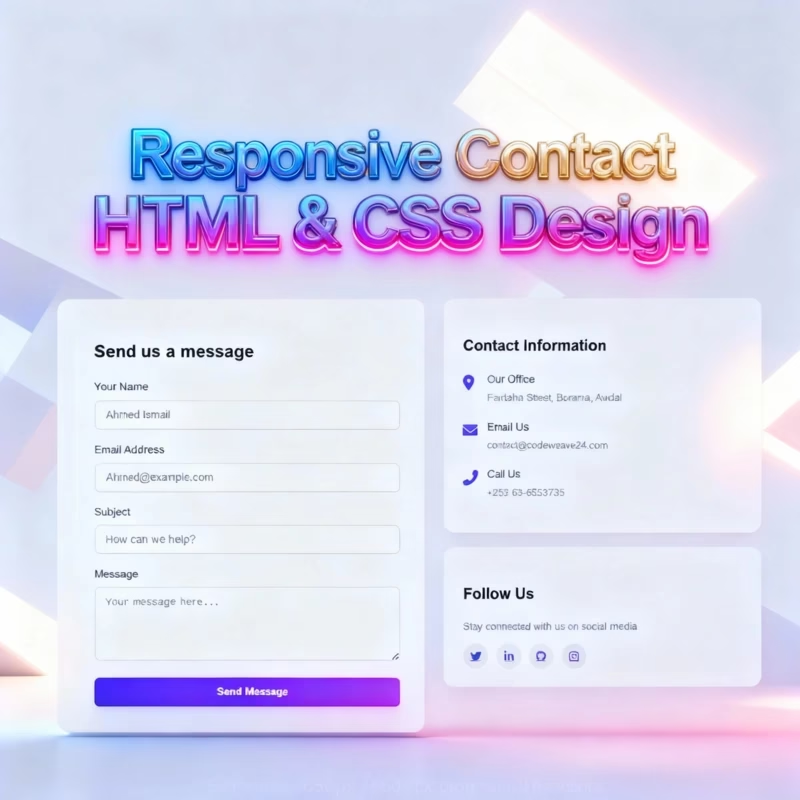
Learn how to build a modern, fully responsive contact form using pure HTML and CSS. Includes animations, gradient design and social media icons using only CSS. No JavaScript needed!
Introduction
This tutorial covers how to implement a modern, responsive contact form with just HTML and CSS. A contact form with an attractive design can help you connect with your visitors, whether you are building either a portfolio or a business-related site.
When you’ve completed this guide, you will:
- Develop an easy-to-use layout that works on both computer and mobile devices.
- Implement smooth fade-in animations that make your page look finished and feel interactive.
- Add social media icons as part of the site that allows visitors to contact you for another way.
- Use Flexbox to structure your layout correctly on any screen size.
All skill levels can benefit from the project, including the complete novice wanting to build their HTML and CSS skills, the experiences developer looking to increase usability and overall design, and anyone in between. Not only is this tutorial about code; it also discusses how to leverage design principles to create a useful and visually appealing contact page to entice users to engage with it.
Your contact page will do so much more than gather messages. It will provide a nice mix of aesthetics, usability, and responsiveness, giving a professional look and feel to your site while improving the user experience, giving your visitors a reason to refer and engage.
Why Responsive Forms Matter in Modern Web Design
As users visit sites using desktop, tablet, and mobile devices, a non-responsive contact form could drive your visitors to another site and you may lose a lead. Responsive forms will make sure the field, button and layout look and work great on all devices with less usability friction and better engagement.
Bonus: responsive forms are smart and legitimate looking forms. This helps your site look appealing, productive, and legitimate. Lastly, mobile forms may help your overall SEO efforts because it can rank your site higher in search results.
Overall responsive forms look good but are available to be user friendly, accessible and efficient on your contact forms.
Basic Requirements
To create a modern, responsive contact form, you will need:
- HTML
This is used for the structure of your contact form, which includes input areas, buttons, and contact information sections. This level helps provides the framework of your layout. - CSS
This is used for styling, animations, and responsiveness with CSS you can provide visual updates such as, gradients, shadows, spacing, and smooth transitions, for the contact form, value to make an eloquently functional alongside visually appealing form.
Development Tools
To create your responsive contact form, you will need the following tools to complete the exercise:
1. Code Editor
A code editor will help you get the most from your HTML and CSS code quickly. Some of the more popular code editors are:
- Visual Studio Code – this editor is rich with features. It even offers extensions that allow you to see a live preview and format the code.
- Sublime Text – this is a fast and light-weight editor which is great for quickly changing something.
- Notepad++ – this editor is simple, but very basic and works great for relative novices.
2. Web Browser
You will need a modern browser to view and test your design properties. We suggest the following browsers:
- Google Chrome – great developer tools and performance.
- Mozilla Firefox – great at debugging CSS transitions and animation.
- Microsoft Edge – decent browser that is compliant and adheres to almost all modern web standards.
Tip: Be sure to check that the contact form looks the same across multiple browsers to test consistency and responsive style.
Setup
1. Create a folder for the project
Create a new folder and name it ContactPage.
2. Open in code editor
You can use whichever code editor you’d like, Visual Studio Code , or Sublime Text.
3. Create your files
Create the following files in the folder:
index.html – this is where we will create the layout of the contact form.
style.css – this is where we will style our form.
Tip: Storing all your files properly will help you build into your project and make it larger in the future.
HTML Code
Before we can go into more detail, we need to first create a very simple HTML file. This will be the main form for our Contact form. Let’s talk through the HTML code, piece by piece:
<!DOCTYPE html>- Declares this document as HTML5.
- Ensures browsers render your page correctly using modern standards.
<html lang="en">lang="en"sets the language to English, helping SEO and accessibility tools.
head section
<head>- Contains meta information about your page, such as title, styles, and scripts.
- Not visible in the main browser window.
<meta charset="UTF-8" />- Sets character encoding to UTF-8.
- Ensures all text, including special characters, displays correctly.
<meta name="viewport" content="width=device-width, initial-scale=1.0" />- Makes your page responsive.
- Ensures it scales correctly on desktops, tablets, and mobile devices.
<title>Contact CodeWeave24</title>- Sets the browser tab title.
- Important for SEO and helps visitors quickly identify your page.
External CSS & Fonts
<link rel="stylesheet" href="style.css" />- Links your CSS file, where all your styling and layout rules are written.
<link rel="stylesheet" href="https://cdnjs.cloudflare.com/ajax/libs/font-awesome/6.0.0/css/all.min.css" />- Imports Font Awesome icons for social media, phone, email, and location icons.
body section
<body>- Opens the body section where all visible page content goes.
Main container
<div class="cw-container">- Main wrapper for the entire contact page.
- Helps with layout and styling via CSS.
<div class="cw-header">- Container for the logo and tagline.
- Helps separate header content visually from the form.
<div class="cw-logo">CodeWeave24</div>- Displays the site or brand logo.
- Can be styled with CSS for size, color, and font.
<p class="cw-tagline">
    Get in touch with our team. We would love to hear from you!
</p>- Adds a short message encouraging users to reach out.
- Improves engagement and user friendliness.
<div class="cw-contact-container">- Wraps both the contact form and contact info section.
- Allows side-by-side layout using CSS.
<form class="cw-contact-form">- Starts the contact form.
.cw-contact-formclass is used for styling the form with CSS.
<h2 class="cw-form-title">Send us a message</h2>- Form heading to tell users what the form is for.
- Improves readability and user engagement.
Name Field
<div class="cw-form-group">
    <label for="name" class="cw-form-label">Your Name</label>
    <input type="text" id="name" class="cw-form-input" placeholder="Ahmed Ismail" />
</div>cw-form-groupgroups the label and input together for spacing.
<label>helps screen readers and improves accessibility.
<input type="text">collects the user’s name.
placeholdershows example text inside the input.
Email Field
<div class="cw-form-group">
    <label for="email" class="cw-form-label">Email Address</label>
    <input type="email" id="email" class="cw-form-input"
placeholder="Ahmed@example.com" />
</div>- Similar to the name field.
type="email"ensures valid email format.- Accessible and user-friendly.
Subject Field
<div class="cw-form-group">
    <label for="subject" class="cw-form-label">Subject</label>
    <input type="text" id="subject" class="cw-form-input" placeholder="How can we help?" />
</div>- Lets the user enter a subject line for the message.
- Placeholder guides users on what to type.
Message Field
<div class="cw-form-group">
    <label for="message" class="cw-form-label">Message</label>
    <textarea id="message" class="cw-form-input cw-form-textarea" placeholder="Your message here..."></textarea>
</div><textarea>allows users to type multi-line messages..cw-form-textareacan be styled with CSS to match other inputs.
Submit Button
<button type="submit" class="cw-submit-btn">Send Message</button>- Button to submit the form.
- Styled with CSS for visibility and usability.
Contact Information Section
<div class="cw-contact-info">
    <div class="cw-info-card">
<h3 class="cw-info-title">Contact Information</h3>.cw-contact-infocontains both contact details and social media links.
.cw-info-cardseparates contact info from social links visually.
- Heading
.cw-info-titleintroduces the section.
Office Address
<div class="cw-info-item">
    <div class="cw-info-icon"><i class="fas fa-map-marker-alt"></i></div>
    <div class="cw-info-text">
        <div class="cw-info-label">Our Office</div>
        <div class="cw-info-value">Fardaha Street, Borama, Awdal</div>
    </div>
</div>.cw-info-itemwraps each contact detail.- Icon visually indicates the type of info (location).
- Label and value clearly show the information.
Email Address
<div class="cw-info-item">
    <div class="cw-info-icon"><i class="fas fa-envelope"></i></div>
    <div class="cw-info-text">
        <div class="cw-info-label">Email Us</div>
        <div class="cw-info-value">contact@codeweave24.com</div>
    </div>
</div>- Same structure as address.
fa-envelopeicon shows it’s an email.
Phone Number
<div class="cw-info-item">
    <div class="cw-info-icon"><i class="fas fa-phone-alt"></i></div>
    <div class="cw-info-text">
        <div class="cw-info-label">Call Us</div>
        <div class="cw-info-value">+252 63-6563735</div>
    </div>
</div>- Icon indicates phone.
- Value shows the contact number.
Social Media Section
<div class="cw-info-card">
    <h3 class="cw-info-title">Follow Us</h3>
    <p>Stay connected with us on social media</p>
    <div class="cw-social-links">
        <a href="#" class="cw-social-link"><i class="fab fa-twitter"></i></a>
        <a href="#" class="cw-social-link"><i class="fab fa-linkedin-in"></i></a>
        <a href="#" class="cw-social-link"><i class="fab fa-github"></i></a>
        <a href="#" class="cw-social-link"><i class="fab fa-instagram"></i></a>
    </div>
</div>- Shows links to social media accounts.
- Icons make it visually clear which platform.
- Encourages engagement beyond the contact form.
<!DOCTYPE html>
<html lang="en">
  <!--Created by Codeweave24-->
  <head>
    <meta charset="UTF-8" />
    <meta name="viewport" content="width=device-width, initial-scale=1.0" />
    <title>Contact CodeWeave24</title>
    <!-- styling-->
    <link rel="stylesheet" href="style.css" />
    <link
      rel="stylesheet"
      href="https://cdnjs.cloudflare.com/ajax/libs/font-awesome/6.0.0/css/all.min.css"
    />
  </head>
  <body>
    <div class="cw-container">
      <div class="cw-header">
        <div class="cw-logo">CodeWeave24</div>
        <p class="cw-tagline">
          Get in touch with our team. We would love to hear from you!
        </p>
      </div>

      <div class="cw-contact-container">
        <form class="cw-contact-form">
          <h2 class="cw-form-title">Send us a message</h2>

          <div class="cw-form-group">
            <label for="name" class="cw-form-label">Your Name</label>
            <input
              type="text"
              id="name"
              class="cw-form-input"
              placeholder="Ahmed Ismail"
            />
          </div>

          <div class="cw-form-group">
            <label for="email" class="cw-form-label">Email Address</label>
            <input
              type="email"
              id="email"
              class="cw-form-input"
              placeholder="Ahmed@example.com"
            />
          </div>

          <div class="cw-form-group">
            <label for="subject" class="cw-form-label">Subject</label>
            <input
              type="text"
              id="subject"
              class="cw-form-input"
              placeholder="How can we help?"
            />
          </div>

          <div class="cw-form-group">
            <label for="message" class="cw-form-label">Message</label>
            <textarea
              id="message"
              class="cw-form-input cw-form-textarea"
              placeholder="Your message here..."
            ></textarea>
          </div>

          <button type="submit" class="cw-submit-btn">Send Message</button>
        </form>

        <div class="cw-contact-info">
          <div class="cw-info-card">
            <h3 class="cw-info-title">Contact Information</h3>

            <div class="cw-info-item">
              <div class="cw-info-icon">
                <i class="fas fa-map-marker-alt"></i>
              </div>
              <div class="cw-info-text">
                <div class="cw-info-label">Our Office</div>
                <div class="cw-info-value">Fardaha Street, Borama, Awdal</div>
              </div>
            </div>

            <div class="cw-info-item">
              <div class="cw-info-icon">
                <i class="fas fa-envelope"></i>
              </div>
              <div class="cw-info-text">
                <div class="cw-info-label">Email Us</div>
                <div class="cw-info-value">contact@codeweave24.com</div>
              </div>
            </div>

            <div class="cw-info-item">
              <div class="cw-info-icon">
                <i class="fas fa-phone-alt"></i>
              </div>
              <div class="cw-info-text">
                <div class="cw-info-label">Call Us</div>
                <div class="cw-info-value">+252 63-6563735</div>
              </div>
            </div>
          </div>

          <div class="cw-info-card">
            <h3 class="cw-info-title">Follow Us</h3>
            <p style="color: #6b7280; margin-bottom: 1rem">
              Stay connected with us on social media
            </p>

            <div class="cw-social-links">
              <a href="#" class="cw-social-link">
                <i class="fab fa-twitter"></i>
              </a>
              <a href="#" class="cw-social-link">
                <i class="fab fa-linkedin-in"></i>
              </a>
              <a href="#" class="cw-social-link">
                <i class="fab fa-github"></i>
              </a>
              <a href="#" class="cw-social-link">
                <i class="fab fa-instagram"></i>
              </a>
            </div>
          </div>
        </div>
      </div>
    </div>
  </body>
</html>
CSS Code
After you have the basic HTML structure of the Contact form, you can begin styling the form with CSS. Here’s a section-by-section explanation:
Base Styles for body
body {
  font-family: 'Inter', -apple-system, BlinkMacSystemFont, sans-serif;
  margin: 0;
  padding: 0;
  background-color: #f8f9fa;
  color: #333;
  line-height: 1.6;
  min-height: 100vh;
}- Sets a modern, clean font across the page.
- Removes default browser margin and padding.
- Adds a light background for better readability.
line-heightimproves text readability.min-height: 100vhensures the page always fills the viewport.
Container Styles
.cw-container {
  max-width: 1200px;
  margin: 0 auto;
  padding: 1.5rem;
  box-sizing: border-box;
}- Centers page content using
margin: 0 auto. - Limits the width to
1200pxfor readability. - Adds padding for spacing inside the container.
box-sizing: border-boxensures padding does not break the layout.
Header Section
.cw-header {
  text-align: center;
  margin-bottom: 2rem;
  opacity: 0;
  transform: translateY(20px);
  animation: cw-fadeIn 0.8s ease-out forwards;
  padding: 0 1rem;
}

.cw-logo {
  font-size: clamp(2rem, 5vw, 2.5rem);
  font-weight: 800;
  color: #4f46e5;
  margin-bottom: 0.75rem;
  background: linear-gradient(90deg, #4f46e5, #8b5cf6);
  -webkit-background-clip: text;
  background-clip: text;
  -webkit-text-fill-color: transparent;
}

.cw-tagline {
  font-size: clamp(1rem, 3vw, 1.2rem);
  color: #6b7280;
  max-width: 600px;
  margin: 0 auto;
}
.cw-headercenters the content and adds fade-in animation..cw-logouses a gradient effect and dynamic font size withclamp()for responsiveness..cw-taglineis styled to complement the logo with readable color and width.
Contact Form Container
.cw-contact-container {
  display: flex;
  flex-wrap: wrap;
  gap: 2rem;
  justify-content: center;
}- Uses Flexbox to layout form and contact info side by side.
flex-wrap: wrapensures stacking on smaller screens.gapdefines spacing between form and info cards.
Contact Form Styles
.cw-contact-form {
  flex: 1;
  min-width: 280px;
  background: white;
  padding: clamp(1.5rem, 3vw, 2.5rem);
  border-radius: 16px;
  box-shadow: 0 10px 30px rgba(0, 0, 0, 0.05);
  opacity: 0;
  transform: translateY(20px);
  animation: cw-fadeIn 0.8s ease-out 0.2s forwards;
  box-sizing: border-box;
}

.cw-form-title {
  font-size: clamp(1.5rem, 4vw, 1.8rem);
  margin-bottom: 1.25rem;
  color: #111827;
}

.cw-form-group {
  margin-bottom: 1.25rem;
}

.cw-form-label {
  display: block;
  margin-bottom: 0.5rem;
  font-weight: 500;
  color: #374151;
  font-size: clamp(0.9rem, 2vw, 1rem);
}

.cw-form-input {
  width: 100%;
  padding: 0.8rem 1rem;
  border: 1px solid #e5e7eb;
  border-radius: 8px;
  font-size: clamp(0.9rem, 2vw, 1rem);
  transition: all 0.3s ease;
  box-sizing: border-box;
}

.cw-form-input:focus {
  outline: none;
  border-color: #4f46e5;
  box-shadow: 0 0 0 3px rgba(79, 70, 229, 0.1);
}

.cw-form-textarea {
  min-height: 120px;
  resize: vertical;
}

.cw-submit-btn {
  background: linear-gradient(90deg, #4f46e5, #8b5cf6);
  color: white;
  border: none;
  padding: 0.9rem 2rem;
  font-size: clamp(0.9rem, 2vw, 1rem);
  font-weight: 600;
  border-radius: 8px;
  cursor: pointer;
  width: 100%;
  transition: transform 0.2s ease, box-shadow 0.2s ease;
}

.cw-submit-btn:hover {
  transform: translateY(-2px);
  box-shadow: 0 5px 15px rgba(79, 70, 229, 0.3);
}
.cw-contact-formcard design with rounded corners and shadow..cw-form-titlestyles the heading of the form..cw-form-groupseparates each input field..cw-form-inputand.cw-form-textareahave focus effects for better UX..cw-submit-btnis a gradient button with hover feedback.
Contact Info Styles
.cw-contact-info {
  flex: 1;
  min-width: 280px;
  opacity: 0;
  transform: translateY(20px);
  animation: cw-fadeIn 0.8s ease-out 0.4s forwards;
}

.cw-info-card {
  background: white;
  padding: clamp(1.5rem, 3vw, 2rem);
  border-radius: 16px;
  box-shadow: 0 10px 30px rgba(0, 0, 0, 0.05);
  margin-bottom: 1.5rem;
  box-sizing: border-box;
}

.cw-info-title {
  font-size: clamp(1.3rem, 3.5vw, 1.5rem);
  margin-bottom: 1.25rem;
  color: #111827;
}

.cw-info-item {
  display: flex;
  align-items: flex-start;
  margin-bottom: 1.25rem;
}

.cw-info-icon {
  margin-right: 1rem;
  color: #4f46e5;
  font-size: clamp(1.2rem, 3vw, 1.5rem);
  min-width: 24px;
}

.cw-info-text {
  flex: 1;
}

.cw-info-label {
  font-weight: 500;
  color: #374151;
  margin-bottom: 0.25rem;
  font-size: clamp(0.9rem, 2vw, 1rem);
}

.cw-info-value {
  color: #6b7280;
  font-size: clamp(0.85rem, 2vw, 0.95rem);
  word-break: break-word;
}
.cw-contact-infocontainer for contact details..cw-info-cardadds card-style background, padding, and shadow..cw-info-itemuses Flexbox for icons and text side by side.- Labels and values are styled for readability and hierarchy.
Social Links
.cw-social-links {
  display: flex;
  gap: 0.8rem;
  margin-top: 1rem;
  flex-wrap: wrap;
}

.cw-social-link {
  display: flex;
  align-items: center;
  justify-content: center;
  width: clamp(36px, 8vw, 40px);
  height: clamp(36px, 8vw, 40px);
  border-radius: 50%;
  background: #f3f4f6;
  color: #4f46e5;
  transition: all 0.3s ease;
  font-size: clamp(0.9rem, 2vw, 1rem);
}

.cw-social-link:hover {
  background: #4f46e5;
  color: white;
  transform: translateY(-3px);
}- Flex container for social icons with spacing.
- Circular icons with hover effect for interactivity.
- Ensures clickable areas are visually appealing.
Animations
@keyframes cw-fadeIn {
  to {
    opacity: 1;
    transform: translateY(0);
  }
}- Defines fade-in effect used on header, form, and info cards.
- Smoothly brings elements into view from below.
Responsive Breakpoints
@media (max-width: 768px) {
  .cw-container { padding: 1rem; }
  .cw-contact-container { gap: 1.5rem; }
  .cw-contact-form, .cw-contact-info { min-width: 100%; }
  .cw-info-item { flex-direction: column; }
  .cw-info-icon { margin-bottom: 0.5rem; }
}

@media (max-width: 480px) {
  .cw-header { margin-bottom: 1.5rem; }
  .cw-contact-form { padding: 1.25rem; }
  .cw-info-card { padding: 1.25rem; }
  .cw-form-input { padding: 0.7rem 0.9rem; }
  .cw-submit-btn { padding: 0.8rem; }
}
- Adjusts layout for tablets (
max-width: 768px) and mobiles (max-width: 480px). - Ensures form and info cards stack properly.
- Adjusts padding and spacing for smaller screens.
body {
  font-family: 'Inter', -apple-system, BlinkMacSystemFont, sans-serif;
  margin: 0;
  padding: 0;
  background-color: #f8f9fa;
  color: #333;
  line-height: 1.6;
  min-height: 100vh;
}

.cw-container {
  max-width: 1200px;
  margin: 0 auto;
  padding: 1.5rem;
  box-sizing: border-box;
}

/* Header Section */
.cw-header {
  text-align: center;
  margin-bottom: 2rem;
  opacity: 0;
  transform: translateY(20px);
  animation: cw-fadeIn 0.8s ease-out forwards;
  padding: 0 1rem;
}

.cw-logo {
  font-size: clamp(2rem, 5vw, 2.5rem);
  font-weight: 800;
  color: #4f46e5;
  margin-bottom: 0.75rem;
  background: linear-gradient(90deg, #4f46e5, #8b5cf6);
  -webkit-background-clip: text;
  background-clip: text;
  -webkit-text-fill-color: transparent;
}

.cw-tagline {
  font-size: clamp(1rem, 3vw, 1.2rem);
  color: #6b7280;
  max-width: 600px;
  margin: 0 auto;
}

/* Contact Form */
.cw-contact-container {
  display: flex;
  flex-wrap: wrap;
  gap: 2rem;
  justify-content: center;
}

.cw-contact-form {
  flex: 1;
  min-width: 280px;
  background: white;
  padding: clamp(1.5rem, 3vw, 2.5rem);
  border-radius: 16px;
  box-shadow: 0 10px 30px rgba(0, 0, 0, 0.05);
  opacity: 0;
  transform: translateY(20px);
  animation: cw-fadeIn 0.8s ease-out 0.2s forwards;
  box-sizing: border-box;
}

.cw-form-title {
  font-size: clamp(1.5rem, 4vw, 1.8rem);
  margin-bottom: 1.25rem;
  color: #111827;
}

.cw-form-group {
  margin-bottom: 1.25rem;
}

.cw-form-label {
  display: block;
  margin-bottom: 0.5rem;
  font-weight: 500;
  color: #374151;
  font-size: clamp(0.9rem, 2vw, 1rem);
}

.cw-form-input {
  width: 100%;
  padding: 0.8rem 1rem;
  border: 1px solid #e5e7eb;
  border-radius: 8px;
  font-size: clamp(0.9rem, 2vw, 1rem);
  transition: all 0.3s ease;
  box-sizing: border-box;
}

.cw-form-input:focus {
  outline: none;
  border-color: #4f46e5;
  box-shadow: 0 0 0 3px rgba(79, 70, 229, 0.1);
}

.cw-form-textarea {
  min-height: 120px;
  resize: vertical;
}

.cw-submit-btn {
  background: linear-gradient(90deg, #4f46e5, #8b5cf6);
  color: white;
  border: none;
  padding: 0.9rem 2rem;
  font-size: clamp(0.9rem, 2vw, 1rem);
  font-weight: 600;
  border-radius: 8px;
  cursor: pointer;
  width: 100%;
  transition: transform 0.2s ease, box-shadow 0.2s ease;
}

.cw-submit-btn:hover {
  transform: translateY(-2px);
  box-shadow: 0 5px 15px rgba(79, 70, 229, 0.3);
}

/* Contact Info */
.cw-contact-info {
  flex: 1;
  min-width: 280px;
  opacity: 0;
  transform: translateY(20px);
  animation: cw-fadeIn 0.8s ease-out 0.4s forwards;
}

.cw-info-card {
  background: white;
  padding: clamp(1.5rem, 3vw, 2rem);
  border-radius: 16px;
  box-shadow: 0 10px 30px rgba(0, 0, 0, 0.05);
  margin-bottom: 1.5rem;
  box-sizing: border-box;
}

.cw-info-title {
  font-size: clamp(1.3rem, 3.5vw, 1.5rem);
  margin-bottom: 1.25rem;
  color: #111827;
}

.cw-info-item {
  display: flex;
  align-items: flex-start;
  margin-bottom: 1.25rem;
}

.cw-info-icon {
  margin-right: 1rem;
  color: #4f46e5;
  font-size: clamp(1.2rem, 3vw, 1.5rem);
  min-width: 24px;
}

.cw-info-text {
  flex: 1;
}

.cw-info-label {
  font-weight: 500;
  color: #374151;
  margin-bottom: 0.25rem;
  font-size: clamp(0.9rem, 2vw, 1rem);
}

.cw-info-value {
  color: #6b7280;
  font-size: clamp(0.85rem, 2vw, 0.95rem);
  word-break: break-word;
}

/* Social Links */
.cw-social-links {
  display: flex;
  gap: 0.8rem;
  margin-top: 1rem;
  flex-wrap: wrap;
}

.cw-social-link {
  display: flex;
  align-items: center;
  justify-content: center;
  width: clamp(36px, 8vw, 40px);
  height: clamp(36px, 8vw, 40px);
  border-radius: 50%;
  background: #f3f4f6;
  color: #4f46e5;
  transition: all 0.3s ease;
  font-size: clamp(0.9rem, 2vw, 1rem);
}

.cw-social-link:hover {
  background: #4f46e5;
  color: white;
  transform: translateY(-3px);
}

/* Animations */
@keyframes cw-fadeIn {
  to {
    opacity: 1;
    transform: translateY(0);
  }
}

/* Responsive Breakpoints */
@media (max-width: 768px) {
  .cw-container {
    padding: 1rem;
  }

  .cw-contact-container {
    gap: 1.5rem;
  }

  .cw-contact-form,
  .cw-contact-info {
    min-width: 100%;
  }

  .cw-info-item {
    flex-direction: column;
  }

  .cw-info-icon {
    margin-bottom: 0.5rem;
  }
}

@media (max-width: 480px) {
  .cw-header {
    margin-bottom: 1.5rem;
  }

  .cw-contact-form {
    padding: 1.25rem;
  }

  .cw-info-card {
    padding: 1.25rem;
  }

  .cw-form-input {
    padding: 0.7rem 0.9rem;
  }

  .cw-submit-btn {
    padding: 0.8rem;
  }
}

Output

Conclusion
The clean, responsive contact section you’ve created here, using only HTML and CSS with no JavaScript, looks very good. Your form retains a modern and professional appearance owing to the use of gradients, smooth hovers and elegant icons. This simple but effective design shows that with only some code you are still able to achieve a maximum effect. It is a great example of how the creativeness along with simplicity can work side by side in order to produce something really impressive.
FAQs
Do I need Javascript to use this form?
No. It is all html and css. You will have to have a backend, like php ot a service like formspree to send the sent messages.
Is this form for mobile?
Yes. It is completely responsive and works on tablets and phones.
Can I change the colors and the fonts?
Yes. Make changes in the css to the fonts, colors, backgrounds, or buttons to have it reflect your own brand.
How do I add more social links?
Make a new tag in .cw-social-links, and put in a font awesome icon.