
Step by step, learn how to make a modern, beautifull website loading animation with HTML, CSS, and JavaScript. Create a beautiful preloader with glowing gradients, shapes that move around, particles that float, and a progress bar that works on all devices, is light, and is great for web developers and designers who want to make a good first impression.
Introduction
It’s true that first impressions count — especially online. Before a scrap of content is downloaded, your visitor’s brain is already forming an opinion. That is to say, you need a loading animation; one that is not just a filler, but a piece of art, a manifestation of creativity and care.
In this project, we will produce an awesome, galaxy-type preloading graphic based entirely on HTML, CSS and JavaScript. We will have particles drifting up and down, a shimmering ball of energy and a slick loading bar, all working together in divine orchesis. Once the animation is over, your main website fades in nicely from this preloader, clean, seamless and unforgettable.
This is not just about the look — it is about the experience. A well conceived preloading graphic keeps users’ interest, reduces loading times and enforces the corporate identity before the site has even started to be investigated. Whether your site is something like a portfolio, or a creative agency or a tech brand home page, this loading animation gives it that professional gloss that stops people in their tracks and says “Whoa, this looks respectable.”
Why Loading Animations Are Important
Let’s face it: No one enjoys waiting but if you have no choice but to make them at least make it worth their while. It’s then that loading animation goes from being just a simple buffer to a branding experience.
A well-planned pre-loader keeps your audience curious and interested while the rest of the site loads in the background. Instead of a blank screen, it gives motion, light and life — all of which says: “Good things come to those who wait.”
Here’s why loading animations are more important than you may think.
It increases user experience: It takes waiting time and makes it watching time, which reduces bouncy behavior.
It suggests sophistication: A clean polished animation gives your site a clean high quality feel.
It lends strength to brand identity: Color, shape and action communicates the character of your brand.
It smoothes transisitions: A loader acts as a natural bridge between pages or states of the application.
It improves the perceived performance: While one site may take a little longer to load, through the loading, users will think it’s faster because until loading is completed, there’s activity.
Loading animation isn’t a fluf, after all — it’s part of the experience. It’s the handshake before the conversation, it’s the message to your audience that “this site was designed with care.”
Requirements
Before we get into the loading animation let’s make sure you are ready to dive into this tutorial. You will not need any fancy things or huge software to follow along.
Here what you will need:
- Basic knowledge of HTML, CSS and of JavaScript.
- A code editor like VS Code or Sublime text.
- A web browser such as Chrome or Firefox to check on your work.
- A folder on your computer where you would want to keep all your project files.
- An Internet connection if you want to use the Font Awesome icons for the center animation.
That’s all you need. No other software or frameworks involved! Just the basics.
This project is simple and light weight. It is a good project for beginners who are looking to do something that looks advanced without using any huge code!
Tools & Resources
Creating this loading animation takes just a few simple things. Nothing too hard.
We need:
- A code editor like VS Code Or Other code editors to write the code.
- A web browser like Chrome or Other Browsers to see our work.
- Font Awesome to make the icon in the middle (optional).
- Your imagination to change colors, shapes and effects.
That’s all, these few simple tools are enough to make a cool, functional loader for any website.
Project Initialization
In order to set up a project to build your loading animation, you will need to follow these professional steps:
- Create a project folder for all of your files.
- Add index.html to give the main HTML structure.
- Add style.css to take care of all of the styling.
- Add script.js to take care of the animation and interactive logic.
- Open index.html in your code editor and in your web browser to check out the changes being made in real time.
This set up is sure to make for a nice and orderly workflow while you are working through your project.
HTML Structure
1. DOCTYPE and HTML Tag
<!DOCTYPE html>
<html lang="en">- The doctype html signifies that this document uses HTML5.
- The html lang equals en starts the web page and sets language to English.
2. Head Section
  <head>
    <meta charset="UTF-8" />
    <meta name="viewport" content="width=device-width, initial-scale=1.0" />
    <title>Stunning Loading Animation</title>
    <link
      rel="stylesheet"
      href="https://cdnjs.cloudflare.com/ajax/libs/font-awesome/6.4.0/css/all.min.css"
    />
    <link rel="stylesheet" href="style.css" />
</head- The meta charset equals UTF-8 allows special characters to be displayed correctly.
- The meta name equals viewport allows the page to be displayed at any screen size such as phones and computers.
- The title element signifies the name of the page that is shown in the unxaps of the screen.
- The link element connects the page to external files such as Font Awesome for icons or style.css for layout.
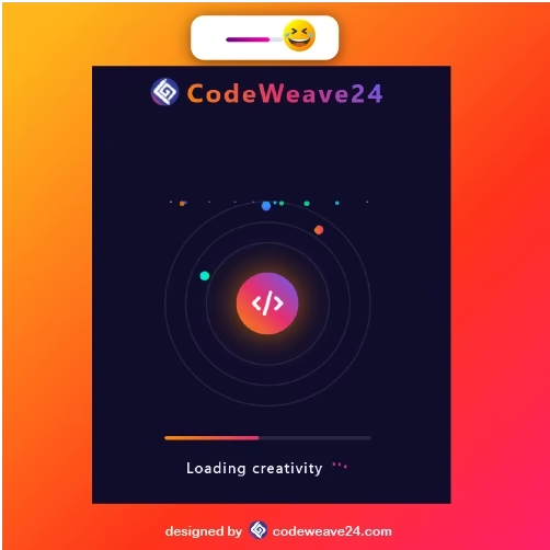
3. Loader Container
<div class="loader-container" id="loader">- This wraps everything around this loader and takes up the whole screen.
- You can hide it after the page loads completely.
4. Logo Section
<div class="logo">
        <img
          src="https://codeweave24.com/wp-content/uploads/2025/09/fav.png"
          alt="Logo"
          style="height: 40px; margin-right: 10px"
        />
        <span>CodeWeave24</span>
</div>- Shows your logo and brand name at the top of the loading screen.
- Helps users recognize your site right away.
5. Loader Animation
<div class="loader">
  <div class="orbits">
  <div class="orbit">
   <div class="orbit-particle"></div>
   </div>
     <div class="orbit">
       <div class="orbit-particle"></div>
     </div>
      <div class="orbit">
         <div class="orbit-particle"></div>
       </div>
 </div>
- Orbits: 3 free-moving rings spinning and moving small dots around them.
- Core Sphere: A small glowing sphere with a code icon on it pulsating in the middle and a surrounding.
- Particles: Flotating dots across the screen for lively effect.
This is the visual part of the loading animation of what the users at the base see while the page loads.
6. Progress Bar
<div class="progress">
  <div class="progress-bar" id="progress-bar"></div>
</div>- Show what percentage of the page load has finished.
- The progress-bar inside expands from 0% width to 100% width using JavaScript.
7. Loading Text and Dots
<div class="loading-text">
   Loading creativity
     <div class="dots">
       div class="dot"></div>
       <div class="dot"></div>
       <div class="dot"></div>
     </div>
</div>- Alerts the user with a message “Loading creativity”.
- The three dots produce an animated effect of bouncing for some added style.
8. Completion Text
<div class="completed-text" id="completed-text">
   Ready! Redirecting to CodeWeave
</div>- Shows a closing message when the loader is finishing.
- Alerts the user that the main website is about to load.
9. Website Frame
<div class="website-frame" id="website-frame">
   <iframe
     src="https://codeweave24.com/"
     id="website-iframe"
     title="CodeWeave Website"
    ></iframe>
</div>- After the loader disappears, the iframe then shows the real website.
- Keeps the loading screen separate from the main site so the transition is smooth.
10. JavaScript Link
<script src="main.js"></script>
</body>
</html>- Links to your JavaScript file.
- Handles the creation of the particles, the animation of the progress-bar and hiding and showing of the loader.
<!DOCTYPE html>
<html lang="en">
  <head>
    <meta charset="UTF-8" />
    <meta name="viewport" content="width=device-width, initial-scale=1.0" />
    <title>Stunning Loading Animation</title>
    <link
      rel="stylesheet"
      href="https://cdnjs.cloudflare.com/ajax/libs/font-awesome/6.4.0/css/all.min.css"
    />
    <link rel="stylesheet" href="style.css" />
  </head>
  <body>
    <div class="loader-container" id="loader">
      <div class="logo">
        <img
          src="https://codeweave24.com/wp-content/uploads/2025/09/fav.png"
          alt="Logo"
          style="height: 40px; margin-right: 10px"
        />
        <span>CodeWeave24</span>
      </div>

      <div class="loader">
        <div class="orbits">
          <div class="orbit">
            <div class="orbit-particle"></div>
          </div>
          <div class="orbit">
            <div class="orbit-particle"></div>
          </div>
          <div class="orbit">
            <div class="orbit-particle"></div>
          </div>
        </div>

        <div class="center-sphere">
          <i class="fas fa-code"></i>
        </div>

        <div class="particles" id="particles"></div>
      </div>

      <div class="progress">
        <div class="progress-bar" id="progress-bar"></div>
      </div>

      <div class="loading-text">
        Loading creativity
        <div class="dots">
          <div class="dot"></div>
          <div class="dot"></div>
          <div class="dot"></div>
        </div>
      </div>

      <div class="completed-text" id="completed-text">
        Ready! Redirecting to CodeWeave
      </div>
    </div>

    <div class="website-frame" id="website-frame">
      <iframe
        src="https://codeweave24.com/"
        id="website-iframe"
        title="CodeWeave Website"
      ></iframe>
    </div>

    <script src="main.js"></script>
  </body>
</html>
CSS Design & Styling
1. Basic Reset and Page Setup
* {
  margin: 0;
  padding: 0;
  box-sizing: border-box;
  font-family: 'Segoe UI', Tahoma, Geneva, Verdana, sans-serif;
}

body {
  background: linear-gradient(135deg, #0f0c29, #302b63, #24243e);
  color: #fff;
  min-height: 100vh;
  display: flex;
  flex-direction: column;
  justify-content: center;
  align-items: center;
  overflow: hidden;
}
- Gets rid of default browser spacing.
- Sets a dark gradient background for a modern look.
- Use flexbox to center everything and make it full height.
2. Loader Container
.loader-container {
  position: fixed;
  top: 0;
  left: 0;
  width: 100%;
  height: 100%;
  display: flex;
  flex-direction: column;
  justify-content: center;
  align-items: center;
  background: rgba(15, 12, 41, 0.95);
  z-index: 100;
  transition: opacity 0.8s ease, visibility 0.8s;
}

.loader-container.hidden {
  opacity: 0;
  visibility: hidden;
}- It covers the whole screen when being loaded.
- Dark semi-transparent background makes animations stand out.
- Smoothly fades away using transition when page finished loading.
3. Logo
.logo {
  position: absolute;
  top: 30px;
  left: 50%;
  transform: translateX(-50%);
  font-size: 2.2rem;
  font-weight: 700;
  letter-spacing: 3px;
  color: #fff;
  display: flex;
  align-items: center;
}

.logo span {
  background: linear-gradient(45deg, #ff8a00, #e52e71, #5e5eff);
  -webkit-background-clip: text;
  background-clip: text;
  color: transparent;
}- Displays your brand name and logo on top.
- Gradient text for glowing colourful effect.
4. Main Loader & Orbits
.loader {
  position: relative;
  width: 280px;
  height: 280px;
}

.orbits {
  position: absolute;
  top: 50%;
  left: 50%;
  transform: translate(-50%, -50%);
  width: 100%;
  height: 100%;
}- Creates three rotating circles (orbits).
- Each orbit rotates in a different direction and with its own speed. This gives some sort of three-dimensional motion.
- Bright glowing particles travel along the edge of each orbit.
5. Center Sphere
.center-sphere {
  position: absolute;
  top: 50%;
  left: 50%;
  transform: translate(-50%, -50%);
  width: 80px;
  height: 80px;
  background: linear-gradient(45deg, #ff8a00, #e52e71, #5e5eff);
  border-radius: 50%;
  animation: pulse 3s ease-in-out infinite;
  box-shadow: 0 0 40px rgba(255, 138, 0, 0.6);
  display: flex;
  justify-content: center;
  align-items: center;
  color: white;
  font-size: 2rem;
}- A glowing centered ball that either grows or shrinks in a slow steady manner using the pulse animation.
- This adds depth and motion to the design as well.
- The icon for code inside of it gives the design a ‘techy’ and creative flair.
6. Progress Bar
.progress {
  margin-top: 40px;
  width: 280px;
  height: 6px;
  background: rgba(255, 255, 255, 0.1);
  border-radius: 10px;
  overflow: hidden;
}

.progress-bar {
  height: 100%;
  width: 0%;
  background: linear-gradient(to right, #ff8a00, #e52e71);
  border-radius: 10px;
  transition: width 0.4s ease;
}- The progress of loading is visually displayed.
- The inner progress-bar fills smoothly as the loading of the site occurs.
7. Loading Text & Dots
.loading-text {
  margin-top: 25px;
  font-size: 1.2rem;
  letter-spacing: 2px;
  text-align: center;
  display: flex;
  gap: 5px;
}

.dots {
  display: flex;
  align-items: flex-end;
  height: 20px;
  margin-left: 5px;
}- Displays the message “Loading creativity…” on your website.
- The three animated bouncing dots bounce into the screen at varying speeds from friendly input.
8. Particles
.particles {
  position: absolute;
  top: 0;
  left: 0;
  width: 100%;
  height: 100%;
}- Little dots are floating upwards giving a space or galaxy feel!
- They are randomly spread and animated for realism and color stimulation.
9. Website Frame
.website-frame {
  position: absolute;
  top: 0;
  left: 0;
  width: 100%;
  height: 100%;
  opacity: 0;
  visibility: hidden;
  transition: opacity 0.8s ease;
  z-index: 5;
}

.website-frame.visible {
  opacity: 1;
  visibility: visible;
}- There will also be colored coalesce particles scattered around with varying animation patterns. All done for a great visual effect!
- Keeps your main site hidden until loading is complete.
10. Completed Text
.completed-text {
  position: absolute;
  bottom: 30px;
  left: 50%;
  transform: translateX(-50%);
  font-size: 1rem;
  opacity: 0;
  transition: opacity 0.5s ease;
}- Smooth flowing fade-in process using transitions.
- When loading is complete, your main site appears.
- Goes through a descent fade-in process that gives a nice finishing effect.
* {
  margin: 0;
  padding: 0;
  box-sizing: border-box;
  font-family: 'Segoe UI', Tahoma, Geneva, Verdana, sans-serif;
}

body {
  background: linear-gradient(135deg, #0f0c29, #302b63, #24243e);
  color: #fff;
  min-height: 100vh;
  display: flex;
  flex-direction: column;
  justify-content: center;
  align-items: center;
  overflow: hidden;
}

.loader-container {
  position: fixed;
  top: 0;
  left: 0;
  width: 100%;
  height: 100%;
  display: flex;
  flex-direction: column;
  justify-content: center;
  align-items: center;
  background: rgba(15, 12, 41, 0.95);
  z-index: 100;
  transition: opacity 0.8s ease, visibility 0.8s;
}

.loader-container.hidden {
  opacity: 0;
  visibility: hidden;
}

.logo {
  position: absolute;
  top: 30px;
  left: 50%;
  transform: translateX(-50%);
  font-size: 2.2rem;
  font-weight: 700;
  letter-spacing: 3px;
  color: #fff;
  display: flex;
  align-items: center;
}

.logo span {
  background: linear-gradient(45deg, #ff8a00, #e52e71, #5e5eff);
  -webkit-background-clip: text;
  background-clip: text;
  color: transparent;
}

.loader {
  position: relative;
  width: 280px;
  height: 280px;
}

.orbits {
  position: absolute;
  top: 50%;
  left: 50%;
  transform: translate(-50%, -50%);
  width: 100%;
  height: 100%;
}

.orbit {
  position: absolute;
  top: 50%;
  left: 50%;
  transform: translate(-50%, -50%);
  border: 2px solid rgba(255, 255, 255, 0.1);
  border-radius: 50%;
  animation: orbit-rotate 20s linear infinite;
}

.orbit:nth-child(1) {
  width: 100%;
  height: 100%;
  animation-duration: 40s;
}

.orbit:nth-child(2) {
  width: 80%;
  height: 80%;
  animation-duration: 30s;
  animation-direction: reverse;
}

.orbit:nth-child(3) {
  width: 60%;
  height: 60%;
  animation-duration: 20s;
}

.orbit-particle {
  position: absolute;
  width: 12px;
  height: 12px;
  border-radius: 50%;
  background: linear-gradient(45deg, #ff8a00, #e52e71);
}

.orbit:nth-child(1) .orbit-particle {
  top: 10px;
  left: 50%;
  transform: translateX(-50%);
}

.orbit:nth-child(2) .orbit-particle {
  top: 10px;
  right: 10px;
  background: linear-gradient(45deg, #5e5eff, #00c3ff);
}

.orbit:nth-child(3) .orbit-particle {
  bottom: 10px;
  left: 10px;
  background: linear-gradient(45deg, #00deff, #00ff95);
}

.center-sphere {
  position: absolute;
  top: 50%;
  left: 50%;
  transform: translate(-50%, -50%);
  width: 80px;
  height: 80px;
  background: linear-gradient(45deg, #ff8a00, #e52e71, #5e5eff);
  border-radius: 50%;
  animation: pulse 3s ease-in-out infinite;
  box-shadow: 0 0 40px rgba(255, 138, 0, 0.6);
  display: flex;
  justify-content: center;
  align-items: center;
  color: white;
  font-size: 2rem;
}

.progress {
  margin-top: 40px;
  width: 280px;
  height: 6px;
  background: rgba(255, 255, 255, 0.1);
  border-radius: 10px;
  overflow: hidden;
}

.progress-bar {
  height: 100%;
  width: 0%;
  background: linear-gradient(to right, #ff8a00, #e52e71);
  border-radius: 10px;
  transition: width 0.4s ease;
}

.loading-text {
  margin-top: 25px;
  font-size: 1.2rem;
  letter-spacing: 2px;
  text-align: center;
  display: flex;
  gap: 5px;
}

.dots {
  display: flex;
  align-items: flex-end;
  height: 20px;
  margin-left: 5px;
}

.dot {
  width: 4px;
  height: 4px;
  background: #e52e71;
  border-radius: 50%;
  margin: 0 2px;
  animation: dot-bounce 1.5s ease-in-out infinite;
}

.dot:nth-child(2) {
  animation-delay: 0.2s;
}

.dot:nth-child(3) {
  animation-delay: 0.4s;
}

.particles {
  position: absolute;
  top: 0;
  left: 0;
  width: 100%;
  height: 100%;
}

.particle {
  position: absolute;
  width: 6px;
  height: 6px;
  background: rgba(255, 255, 255, 0.6);
  border-radius: 50%;
  animation: float 15s linear infinite;
}

.website-frame {
  position: absolute;
  top: 0;
  left: 0;
  width: 100%;
  height: 100%;
  opacity: 0;
  visibility: hidden;
  transition: opacity 0.8s ease;
  z-index: 5;
}

.website-frame.visible {
  opacity: 1;
  visibility: visible;
}

iframe {
  width: 100%;
  height: 100%;
  border: none;
}

@keyframes orbit-rotate {
  0% {
    transform: translate(-50%, -50%) rotate(0deg);
  }
  100% {
    transform: translate(-50%, -50%) rotate(360deg);
  }
}

@keyframes pulse {
  0% {
    transform: translate(-50%, -50%) scale(1);
    box-shadow: 0 0 20px rgba(255, 138, 0, 0.6);
  }
  50% {
    transform: translate(-50%, -50%) scale(1.1);
    box-shadow: 0 0 60px rgba(255, 138, 0, 0.8);
  }
  100% {
    transform: translate(-50%, -50%) scale(1);
    box-shadow: 0 0 20px rgba(255, 138, 0, 0.6);
  }
}

@keyframes dot-bounce {
  0%,
  100% {
    transform: translateY(0);
  }
  50% {
    transform: translateY(-10px);
  }
}

@keyframes float {
  0% {
    transform: translateY(100vh) translateX(0) rotate(0deg);
    opacity: 0;
  }
  10% {
    opacity: 1;
  }
  90% {
    opacity: 1;
  }
  100% {
    transform: translateY(-100px) translateX(calc(-100px + 200px * var(--x)))
      rotate(360deg);
    opacity: 0;
  }
}

.completed-text {
  position: absolute;
  bottom: 30px;
  left: 50%;
  transform: translateX(-50%);
  font-size: 1rem;
  opacity: 0;
  transition: opacity 0.5s ease;
}

.completed-text.show {
  opacity: 1;
}

JavaScript functionality
1. Creating Particles
const particlesContainer = document.getElementById('particles')
const particleCount = 60
- Finds the element where all floating particles will appear.
- Sets the total number of particles to 60.
2. Generating Random Particles
for (let i = 0; i < particleCount; i++) {
  const particle = document.createElement('div')
  particle.classList.add('particle')
  ...
  particlesContainer.appendChild(particle)
}- Loops 60 times to create 60 individual particles.
- Individual particles are tiny glowing dots which are dynamically added to the page.
- This makes the background animated and alive looking.
3. Randomizing Appearance
particle.style.setProperty('--x', Math.random())
particle.style.left = `${Math.random() * 100}%`
particle.style.animationDuration = `${15 + Math.random() * 10}s`
particle.style.animationDelay = `${Math.random() * 5}s`
particle.style.width = `${2 + Math.random() * 6}px`
- Gives each particle a random position, size, speed, and delay.
- This randomness prevents anything to become a pattern making the animation look natural, smooth.
- The –x property helps control the horizontal movement of each particle.
4. Adding Random Colors
const colors = [
  'rgba(255, 138, 0, 0.8)',
  'rgba(229, 46, 113, 0.8)',
  'rgba(94, 94, 255, 0.8)',
  'rgba(0, 222, 255, 0.8)',
  'rgba(0, 255, 149, 0.8)',
]
particle.style.background = colors[Math.floor(Math.random() * colors.length)]- Every dot gets a random glowing color from the palette.
- The gradient-like mixing of colors makes the background feel alive and vibrant.
5. Progress Bar Setup
const progressBar = document.getElementById('progress-bar')
const loader = document.getElementById('loader')
const websiteFrame = document.getElementById('website-frame')
const completedText = document.getElementById('completed-text')- Links JavaScript with HTML elements that are responsible for loading progress and screen transitions.
6. Simulating the Loading Process
let progress = 0
const interval = setInterval(() => {
  progress += Math.random() * 8
  ...
}, 300)- Synthetic loading timer setup that refreshes every 300ms.
- Some random values are added to make the loading appear more realistic (rather than mechanical).
7. Finishing the Loading
if (progress >= 100) {
  progress = 100
  clearInterval(interval)
  completedText.classList.add('show')
  setTimeout(() => {
    loader.classList.add('hidden')
    websiteFrame.classList.add('visible')
  }, 1500)
}
progressBar.style.width = `${progress}%`}, 300)- When the progress hits 100% then loading is finished.
- “Ready! – Redirecting…” text appears.
- Then it fades the loader out and reveals the web site smoothly.
- This gives a professional seamless transition from animation to the actual site.
const particlesContainer = document.getElementById('particles')
const particleCount = 60

for (let i = 0; i < particleCount; i++) {
  const particle = document.createElement('div')
  particle.classList.add('particle')
  particle.style.setProperty('--x', Math.random())
  particle.style.left = `${Math.random() * 100}%`
  particle.style.animationDuration = `${15 + Math.random() * 10}s`
  particle.style.animationDelay = `${Math.random() * 5}s`
  particle.style.width = `${2 + Math.random() * 6}px`
  particle.style.height = particle.style.width

  // Randomize particle colors
  const colors = [
    'rgba(255, 138, 0, 0.8)',
    'rgba(229, 46, 113, 0.8)',
    'rgba(94, 94, 255, 0.8)',
    'rgba(0, 222, 255, 0.8)',
    'rgba(0, 255, 149, 0.8)',
  ]
  particle.style.background = colors[Math.floor(Math.random() * colors.length)]

  particlesContainer.appendChild(particle)
}

// Simulate loading progress
const progressBar = document.getElementById('progress-bar')
const loader = document.getElementById('loader')
const websiteFrame = document.getElementById('website-frame')
const completedText = document.getElementById('completed-text')

let progress = 0
const interval = setInterval(() => {
  progress += Math.random() * 8
  if (progress >= 100) {
    progress = 100
    clearInterval(interval)

    // Show completion text
    completedText.classList.add('show')

    // Hide loader and show website after a delay
    setTimeout(() => {
      loader.classList.add('hidden')
      websiteFrame.classList.add('visible')
    }, 1500)
  }
  progressBar.style.width = `${progress}%`
}, 300)

Output

Conclusion
You have just created a stunning futuristic loading animation with nothing but HTML, CSS and JavaScript. Even better,it shows just how powerful clean front-end design can be:
CSS does the heavy lifting – the gradients and glow effects and smooth animations.
JavaScript gives it life – with floating particles, progress indicators, and page transitions.
And HTML ties it all together with a well organized, flexible design.
But the best part of all: It’s lightweight, professional looking, and totally customizable – great for personal portfolios, start-up websites, or for all those projects deserving of a nice, polished loading screen.
Keep playing with color, speed or icons in order to customize the animations to your own taste. Because while web design is function, sure, it’s also about giving life to a moment.
FAQs
1. What is the purpose of this loader animation?
It shows a great animated page when your site is loading, and gives the user a wonderful first impression of your site.
2. Do I have to download anything?
No downloads are necessary. You use only HTML, CSS and JavaScript.
3. Can I change the colors or act of animation?
Sure you can! Simply go into the CSS to change the gradient and animation time.
4. Will it work in all devices?
Yes, it works very well on all screen sizes.
5. How do I get this on our site?
You will open the iframe and replace the current URL with yours.
6. Can I use this on other projects?
Yes, you can You just must change the logo text and colors to fit your style.
7. Will this work for adsense or other ads?
Yes, it will! It is fast loading and does not hinder your content.
Good animation